
Table of Contents
- TL;DR
- One company, one year of decisions
- Design decisions you make before day one
- The statistics, quickly
- Power: the price list for knowledge
- Peeking: the failure mode with the best intentions
- Trust before results: A/A tests and sample ratio mismatch
- Buying back sensitivity: variance reduction
- Ratio metrics: when the unit you randomize is not the unit you count
- Reading results without fooling yourself
- The long game: retention, proxies, and holdouts
- Culture: the part that doesn’t fit in a formula
- When an A/B test is the wrong tool
- Conclusion
- Appendix: the derivation toolbox
- 1. The variance of a difference in means
- 2. The two-proportion z-test
- 3. Where the sample-size formula comes from
- 4. CUPED: unbiasedness, the optimal theta, and the variance discount
- 5. Why peeking inflates the false-positive rate
- 6. The SRM check is a one-proportion z-test in disguise
- 7. The delta method for a ratio of means
- Sources & further reading
Nothing identifies a causal effect like randomization: a coin flip deletes selection bias instead of arguing with it, which is why the causal inference post spent its whole length engineering around the absence of one. This post lives inside that privilege and discovers it is not a free lunch. Running online controlled experiments well, at a real company, on a real subscription product, is a discipline with its own mathematics (power, sequential boundaries, variance reduction, ratio metrics), its own failure modes (peeking, sample ratio mismatch, Simpson’s paradox, novelty effects, immature metrics), and its own hard scarcity: your traffic is finite and the effects worth detecting are small. We work through all of it on one running example, a streaming subscription service with a 14-day free trial, drawing throughout on what the companies that industrialized experimentation (Microsoft, Netflix, Spotify, Booking.com, LinkedIn, Airbnb) have published about how they do it and where they got burned.
TL;DR
- Experimentation is the cheapest humility money can buy. At Microsoft, only about a third of tested ideas improved the metrics they were designed to improve, and in well-optimized products like Bing the success rate is more like 10-20%. The corollary cuts both ways: your intuition is a poor judge of ideas, and a single experiment (Bing’s ad-title change, worth over \$100M a year) can pay for the whole program. You cannot know which experiment that is in advance; that is the point.
- The design decisions happen before a single user is assigned. Choose the randomization unit to match how the product is experienced and paid for (accounts, not cookies, for a subscription), analyze only triggered users but dilute effects back to the whole population, and write down the metric that decides the launch (the OEC) plus the guardrails that can veto it, before you see any data.
- Sensitivity is bought with time, and the prices are brutal. Detecting a 1% relative lift on our trial-to-paid conversion rate costs 128,436 users per arm, about 51 weeks of the service’s entire trial inflow; a 5% lift costs two weeks. Since typical real wins at mature companies are in the 0.1%-1% range, the power calculation is not paperwork, it decides what is knowable at all. CUPED-style variance reduction (about 50% variance gone in both the original Microsoft paper and our simulation) and outlier capping are how you buy sensitivity without buying traffic.
- Most experiment “wins” die under scrutiny you should have applied yourself. Checking daily and stopping at the first \(p < 0.05\) turns a nominal 5% false-positive rate into 27% in our simulation (Evan Miller’s classic essay gets 26.1% from a test checked after every observation); the fix is a pre-committed horizon or a proper sequential design. A sample ratio mismatch (a 50/50 split that comes back 50.3/49.7) invalidates the experiment outright, and hit ~6% of experiments at Microsoft. And a significant result is not “95% likely real”: if 10% of your ideas work and your tests run at 80% power, roughly one in five of your significant wins is a false positive.
- Subscription businesses add a specific trap: the metrics you care about are slow. Trial-to-paid takes a full trial to mature (our simulated reminder email looks like +7.1 points on day 5 and is genuinely +0.5 at maturity), retention takes billing cycles, and lifetime value takes years. The industry answer is a metric hierarchy: sensitive short-term engagement proxies validated against the slow truth (Netflix), surrogate indices, and long-term holdouts (Spotify, Meta, Google).
- The last mile is culture, not statistics: A/A tests to earn trust in the platform, guardrailed ship criteria, replication of surprising results, and an institutional memory of what failed, because at Booking.com scale (over 1,000 concurrent experiments) the bottleneck is not running tests but not fooling yourselves with them.
One company, one year of decisions
To keep every formula concrete, here is the business we will experiment on for the rest of the post. A streaming subscription service charges \$9.99 a month after a 14-day free trial. About 5,000 new trials start each week, roughly 55% of trialists convert to paid at the end of the trial, and a few percent of paying subscribers cancel each month. The product team’s idea backlog looks like every product team’s idea backlog: a redesigned paywall that leads with the annual plan, a reminder email on day 3 of the trial, a new “continue watching” row on the home screen, a cheaper ad-supported tier, a price change in one market.
Every one of those ideas will move some numbers. The question a controlled experiment answers is the one a dashboard cannot: did this change move them, or did the season, the marketing push, and the mix of who signed up move them while the change watched? The causal inference post derived exactly why randomization answers it: assigning users to treatment by coin flip makes treatment independent of their potential outcomes, which zeroes the selection-bias and heterogeneity terms in the naive comparison, so a difference in means estimates the average treatment effect with no further assumptions. That derivation is done and we will not repeat it; this post is about everything that comes after the coin flip.
It is worth internalizing, before any mathematics, why the companies that can experiment at scale bother. The published numbers on how often ideas work are humbling. Evaluating experiments at Microsoft that were designed to improve a key metric, “only about one-third were successful at improving the key metric”; in well-optimized domains like Bing and Google the success rate is more like 10-20%.1 Netflix frames the same fact culturally: rather than deciding by executive opinion or copying competitors, “experimentation gives all our members the opportunity to vote, with their actions,” on what the product should become. The economics work not because most ideas win but because occasionally one wins enormously and the experiment is how you notice. The canonical story is Bing’s ad-title change: an idea from 2012 that sat in the backlog for more than six months because it was prioritized low, took one engineer a few days to implement, and within hours of starting the test set off a revenue-too-high alert. It raised revenue 12%, worth over \$100M annually in the US at the time, without significantly hurting user-experience metrics, and it remains one of the best revenue ideas in Bing’s history. The lesson Kohavi, Tang and Xu draw in their book is not “look for ad-title changes”; it is that nobody, including the people who built it, knew this was the valuable idea, so the cheap thing to be systematically wrong about is which ideas to test first, and the expensive thing to be wrong about is whether to test at all.
A note on the word “test”: industry says A/B test, statisticians say randomized controlled trial, and Kohavi’s community says online controlled experiment (OCE). They are the same design. This post uses them interchangeably.
Design decisions you make before day one
The randomization unit is a product decision
The first question is not statistical: what gets randomized? The default answer for a subscription product is the account, and the reasons are worth spelling out because each one fails in a specific way if you choose differently.
- Consistency of experience. A subscription is experienced across devices (TV, phone, laptop) over weeks. Randomizing by cookie or device means the same household sees the new paywall on the phone and the old one on the TV, which contaminates both arms and confuses customers. Account-level assignment, keyed on a stable id and hashed deterministically (so the same account always lands in the same arm, in every session, on every device), is what makes “the treatment experience” a coherent thing.
- The metrics live at the account level. Conversion, renewal, and cancellation are account events. If you randomize sessions but measure conversion per account, your randomization unit and analysis unit disagree, and the naive statistics are wrong in a way the ratio-metrics section below makes precise.
- The logged-out edge. Prospects browsing the marketing page have no account yet. There you randomize on a device identifier and accept its weaknesses (cookie clearing, cross-device leakage), but the moment of account creation should stitch the identity so the user does not flip arms mid-trial. Identity stitching bugs are a classic source of the sample ratio mismatches covered later.
Triggering: analyze the users the change could have touched
Suppose the day-3 reminder email only goes to trialists who have not yet converted by day 3. Users who converted on day 1 could never be affected; including them in the analysis adds pure noise, diluting the measured effect. The standard practice, which LinkedIn’s experimentation papers describe in detail, is triggered analysis: include only users who actually reached the code path where the arms diverge. The gain is real. On any given day LinkedIn might have 20 million users, of whom only 2 million visit the jobs page an experiment actually changes; analyzing all 20 million would bury the effect under 18 million users of zero.
Triggering has a bookkeeping obligation attached: the triggered effect is a local effect, and decisions are made about the whole business, so you must dilute it back. For an additive metric like revenue per user, if a fraction \(w\) of the population triggers and the effect on triggered users is \(\Delta\), the overall per-user effect is approximately \(w \cdot \Delta\): a +2% lift on the 20% of trialists who see the reminder email is +0.4% on trialists overall.2 Skipping the dilution step is how “our experiment showed +2%” quietly becomes a forecast that is five times too optimistic. LinkedIn’s platform computes a “site-wide impact” for exactly this reason, and their papers show the two numbers can even disagree in sign for percentage metrics: one connection-request email experiment, targeted at members with few connections, measured a -9.4% local effect on click-through rate alongside a +0.5% site-wide impact, an instance of Simpson’s paradox arising because triggered users are not a random slice of the population.
One more design rule from the same family: make sure the triggering condition itself is identical in both arms. If the treatment changes who reaches the trigger point (say, the new paywall changes who starts a trial at all), then comparing triggered populations compares different kinds of people, and you have reinvented selection bias inside your own experiment. The clean design triggers on the last common moment before the arms diverge.
The OEC: decide what “better” means before the data arrives
Every experiment needs a pre-declared answer to “what number decides this?” Kohavi’s community calls it the overall evaluation criterion (OEC): a single metric, or a fixed weighting of a few, that stands in for the long-term good of the business and is measurable within an experiment.3 The two halves of that sentence pull against each other, and the tension is the whole art. The book’s worked example is a search engine: raw query volume looks like success, but a worse search engine can drive queries up short-term, because users have to query more to find anything. This actually happened: a Bing experiment with a bug that degraded search results sent distinct queries per user up over 10% and revenue per user up over 30%. Ship “improvements” like that and you are, in the authors’ analogy, a retailer celebrating the revenue effects of raising prices. Their recommendation is an OEC built from things that predict long-term value (sessions per user, repeat visits) rather than things that monetize confusion.
For a subscription business, the long-term good has a name and a formula: retention, and behind it customer lifetime value, which the CLV post built up as a discounted sum of survival probabilities. The problem is that retention is a terrible experiment metric in the short run, for reasons Netflix has documented unusually well. Their experimentation papers state plainly that “the primary business metric of interest is current user cancellation rate or retention rate,” and then immediately explain why experiments rarely read it directly: for a new member it takes a whole billing month to observe even one retention decision, and retention is buffeted by external factors an experiment cannot control. Their answer is a hierarchy: engagement metrics (streaming hours, in their case) that are highly correlated with retention but more statistically sensitive serve as the decision metrics, with the correlation itself validated against the slow truth.4 There is even structure inside the proxy: Netflix found the engagement-retention relationship strongly nonlinear, with an extra hour meaning far more for a barely-streaming member on the fence of cancellation than for an enthusiast, so their metrics emphasize moving low-engagement members past thresholds rather than raising the average.
Our streaming service inherits the same shape. Here is its metric sheet for the paywall experiment, in the four-role taxonomy Spotify’s experimentation team uses (success metrics you hope to move, guardrails you must not hurt, deterioration alarms, and data-quality checks):
| role | metric | timescale | notes |
|---|---|---|---|
| success (OEC) | trial-to-paid conversion | 14+ days | the decision metric |
| success (secondary) | revenue per visitor at 30 days | 30 days | catches annual-plan mix shifts |
| guardrail | trial starts per visitor | immediate | a pushier paywall could suppress entry |
| guardrail | early cancellation rate (first 30 days) | 30 days | conversions that instantly churn are not wins |
| guardrail | support contacts per 1,000 users | days | confusion shows up here first |
| quality | sample ratio, pre-exposure bias checks | immediate | covered in the trust section |
Two details in Spotify’s treatment of this taxonomy deserve wider adoption. Guardrails are tested for non-inferiority (is the harm bounded above by a margin we pre-declared?) rather than for superiority, because “we could not detect a regression” is not the same claim as “we bounded the regression.” And the multiple-testing correction runs in opposite directions for the two roles: success metrics need their false-positive rates controlled (you ship on them), while guardrails need their false-negative rates controlled (they exist to catch harm, and ten independent guardrails each with 80% power have only \(0.8^{10} \approx 11\%\) probability of all simultaneously detecting their regressions, so unadjusted guardrails are mostly theater).
The cost of getting this section wrong is not hypothetical. Duolingo has described testing a promotion for its subscription tier that increased subscription signups and decreased retention and daily active users; they shut the feature down despite the revenue gain. That is guardrail discipline working exactly as designed: a metric sheet where retention outranks short-term revenue, agreed before launch, is what lets a team kill its own revenue win without a month of relitigating.
Warning: the OEC is decided before the experiment, in writing. Choosing among twenty metrics after seeing which moved is not decision-making, it is p-hacking with a corporate vocabulary, and the false-positive arithmetic later in this post shows exactly how expensive it is.
The statistics, quickly
The estimator itself is almost embarrassingly simple, which is precisely the property randomization buys. With \(n\) users per arm, treatment mean \(\bar{Y}_t\) and control mean \(\bar{Y}_c\), the effect estimate and its standard error are
\[\hat{\Delta} = \bar{Y}_t - \bar{Y}_c, \qquad \widehat{\mathrm{se}}(\hat{\Delta}) = \sqrt{ \frac{s_t^2}{n} + \frac{s_c^2}{n} }\]where \(s_t^2, s_c^2\) are the sample variances (tool 1 derives the variance of a difference of independent means; independence across arms is exactly what randomized assignment provides). By the central limit theorem \(\hat{\Delta}\) is approximately normal at experiment scale, so \(z = \hat{\Delta} / \widehat{\mathrm{se}}\) is compared against a standard normal: a two-sided p-value of \(2\Phi(-\lvert z \rvert)\) and a 95% confidence interval of \(\hat{\Delta} \pm 1.96\, \widehat{\mathrm{se}}\). For a conversion rate, \(Y\) is a 0/1 indicator, the variance is \(p(1-p)\), and everything specializes to the two-proportion z-test (tool 2). Netflix’s explainer series is a good public statement of the conventions everyone shares: a 5% false-positive rate, so about one in twenty truly-null experiments will look significant, and 80% power against the effect size you actually care about.
That is the whole test. Nothing else in this post changes it; everything else is about the conditions under which trusting it is justified, and about how much data it needs, which is where the trouble starts.
Power: the price list for knowledge
Before launching, you must answer: how small an effect do I need to be able to see? That number is the minimum detectable effect (MDE), and combined with your traffic it determines the experiment’s duration. The sample size formula, derived in full in tool 3, is
\[n \;\text{per arm} \;=\; \frac{2\sigma^2\,(z_{1-\alpha/2} + z_{1-\beta})^2}{\delta^2}\]where \(\delta\) is the MDE in absolute units, \(\sigma^2\) the metric’s variance, and the two normal quantiles encode the error rates. At the conventional \(\alpha = 0.05\) and 80% power, \((1.960 + 0.842)^2 = 7.85 \approx 8\), giving the memorable planning shortcut \(n \approx 16\sigma^2 / \delta^2\) per arm.5 Read the formula’s exponents like a price list: halving the detectable effect quadruples the sample size, and the only discounts available are reducing \(\sigma^2\) (the variance-reduction section) or relaxing the error rates.
For our streaming service, with a 55% baseline conversion (\(\sigma^2 = 0.55 \times 0.45 = 0.2475\)) and 5,000 trials a week split 50/50:
from scipy.stats import norm

def n_per_arm(p_base, rel_lift, alpha=0.05, power=0.80):
    delta = p_base * rel_lift
    z = norm.ppf(1 - alpha / 2) + norm.ppf(power)
    return 2 * p_base * (1 - p_base) * z**2 / delta**2

for lift in [0.01, 0.02, 0.05]:
    n = n_per_arm(0.55, lift)
    print(f"{lift:.0%} lift: {n:>8,.0f} per arm  = {2 * n / 5_000:4.1f} weeks of every trial we start")
1% lift:  128,436 per arm  = 51.4 weeks of every trial we start
2% lift:   32,109 per arm  = 12.8 weeks of every trial we start
5% lift:    5,137 per arm  =  2.1 weeks of every trial we start
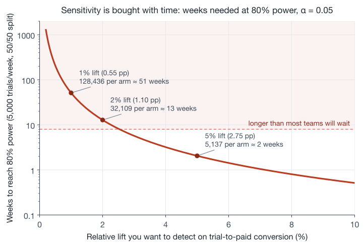
Now put those prices next to the published effect sizes. Kohavi’s “Seven Rules of Thumb” paper reports that at Bing the changes that succeed typically improve key metrics by 0.1% to 1.0% once diluted to the whole population. Against our price list, it takes essentially an entire year of this company’s trial traffic to detect even the top of that range on conversion, and the rest of the range is out of reach. That is not a reason to give up; it is the actual strategic landscape, and it forces three honest responses. First, run experiments where the metric is sensitive enough to answer within your traffic (this is a large part of why engagement proxies beat retention as decision metrics). Second, buy back variance with the techniques two sections down. Third, accept that some experiments are run not to detect small wins but to bound harm: “we can rule out a regression worse than 2%” is a real and often sufficient conclusion, and it is exactly the non-inferiority logic of guardrails.
Three duration rules ride along with the power calculation. Run whole weeks, because weekday and weekend users are different populations; Kohavi’s 2009 survey paper recommends at least one to two weeks and then extending in weekly multiples, and Airbnb’s experimentation post makes the same point for travel’s stronger seasonality. Run whole cycles of the product: an experiment touching the trial must cover the full 14-day trial plus a maturity buffer, and an experiment touching renewal must span billing boundaries, or the metric is structurally censored (the delayed-metrics section makes this concrete). And if you ramp an experiment up gradually for safety, remember the power math is unforgiving about unequal splits: a 99/1 split needs about 25 times the duration of a 50/50 split for the same sensitivity, and changing the split mid-experiment corrupts the analysis in a way the Simpson’s paradox section below demonstrates, so complete the ramp, then start the measurement clock.
Tip: the power calculation is also where hard scarcity forces prioritization. If a test needs 13 weeks of all your traffic, it is competing with every other test you could run in those 13 weeks. Mature platforms interleave many experiments on disjoint random slices (Microsoft, Netflix and Booking.com all run hundreds to thousands concurrently), but the traffic each one gets is still bounded, and deciding which hypotheses deserve the users is a portfolio decision, not a statistics one.
Peeking: the failure mode with the best intentions
Here is the most natural thing in the world. The dashboard updates daily; you look daily; the day the p-value dips under 0.05 you declare the result and move on. Every step is reasonable and the procedure is statistically broken.
The p-value’s 5% guarantee is a promise about one look at a pre-committed sample size. Look repeatedly and you give randomness repeated chances to clear the bar; the minimum of many p-values is not a p-value. This is easy to state and much more convincing to watch, so we simulated it: 20,000 A/A experiments (both arms identical, so every “significant” result is false by construction), 350 users per arm arriving daily for 28 days, a z-test after each day.
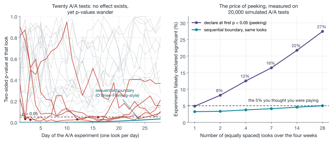
One committed look costs the advertised 4.9%. Checking twice costs 8.2%. Daily checks for four weeks cost 27.4%: more than a quarter of do-nothing changes get declared winners. Evan Miller’s classic essay “How Not To Run an A/B Test” computes 26.1% for a 150-observation experiment checked after every observation and stopped the moment it first shows significance, and summarizes the fix in one sentence: decide the sample size in advance and wait. The numbers are not a simulation artifact; tool 5 works out the two-look case exactly (8.31%, matching the simulation’s 8.2%), and with unbounded patience the inflation goes all the way to certainty: under the null, the z-statistic is guaranteed to cross any fixed threshold eventually, a phenomenon Anscombe named in 1954, “sampling to a foregone conclusion.”
Nor is it hypothetical in industry. Airbnb published a plot of a real pricing experiment whose p-value curve hit 0.05 on day 7 with a 4% effect; they kept it running and it ended neutral, a pattern they noted “is quite common in our system.” Optimizely’s early product showed near-real-time results and customers stopped at first significance;6 when the company later simulated its own A/A behavior it found that checking after every visitor pushed the realized false-positive rate past 57%, and it rebuilt its statistics engine around always-valid inference in response.
The honest responses form a short menu:
- Fixed horizon, no peeking on the decision metric. The classical answer. Cheap, correct, and psychologically miserable, which is why it fails in practice: someone senior will look. Peeking for safety (is the treatment catastrophically broken?) is fine and encouraged; the sin is deciding on peeked significance.
- Group sequential tests (GST). Pre-plan a small number of interim analyses and spend the 5% error budget across them deliberately, using boundaries like O’Brien-Fleming’s, which demand near-miraculous evidence at early looks and relax toward the ordinary threshold at the final one (this is the teal curve above; the general budgeting machinery is Lan-DeMets alpha spending, imported wholesale from clinical trials, which have run sequential designs under regulatory supervision for decades). You keep 5% overall and gain a legitimate early exit for large effects.
- Always-valid inference (AVI). Methods like the mixture sequential probability ratio test produce p-values and confidence sequences valid at every moment simultaneously, so continuous monitoring is simply allowed. This is the family behind Optimizely’s stats engine and Statsig’s sequential option.7
- Choose by whether you know your sample size. Spotify’s experimentation team published a careful comparison and a clear recommendation: when you can estimate the sample size in advance (the normal case for a planned product experiment), group sequential tests dominate, with materially higher power at the same error rate; always-valid methods win when the horizon is genuinely unknown or when you are monitoring a stream indefinitely for regressions. Their simulations put GST near 90% power, provided the expected sample size was estimated correctly, in a setting where the always-valid alternatives reached roughly 72-76%; overestimate the sample size and GST’s advantage evaporates.
For our streaming service the translation is: paywall and email experiments get a pre-registered horizon from the power calculation, plus an O’Brien-Fleming-style interim look at the halfway point in case the effect is huge; the infrastructure-style monitors (did the new player build hurt playback?) run always-valid tests forever. The foldable block reproduces the simulation behind the figure exactly.
Reproduce the peeking simulation (numpy only)
Generates the 20,000 A/A z-statistic paths, the naive peeking false-positive rates, and the calibrated sequential boundary from the figure. Runs in a few seconds.
import numpy as np

N_LOOKS, N_SIMS, M = 28, 20000, 350          # days, simulations, users/day/arm
rng = np.random.default_rng(7)

# daily treatment-minus-control sums of a unit-variance metric
inc = rng.normal(0.0, np.sqrt(2 * M), size=(N_SIMS, N_LOOKS))
cum = np.cumsum(inc, axis=1)
n_cum = M * np.arange(1, N_LOOKS + 1)
z = cum / n_cum / np.sqrt(2.0 / n_cum)       # z after each daily look

from math import erf
norm_cdf = lambda x: 0.5 * (1 + np.vectorize(erf)(x / np.sqrt(2)))
pvals = 2 * (1 - norm_cdf(np.abs(z)))

for looks in [1, 2, 4, 7, 14, 28]:
    idx = np.linspace(N_LOOKS / looks, N_LOOKS, looks).astype(int) - 1
    fpr = np.mean(np.any(pvals[:, idx] <= 0.05, axis=1))
    print(f"{looks:>2} looks: false positive rate {fpr:.3f}")

# calibrate c so the O'Brien-Fleming-style boundary |Z_k| >= c*sqrt(K/k)
# has overall 5% error across all 28 looks
k = np.arange(1, N_LOOKS + 1)
lo, hi = 1.0, 6.0
for _ in range(60):
    c = (lo + hi) / 2
    fpr = np.mean(np.any(np.abs(z) >= c * np.sqrt(N_LOOKS / k), axis=1))
    lo, hi = (c, hi) if fpr > 0.05 else (lo, c)
print(f"boundary constant c = {c:.3f}")

#  1 looks: false positive rate 0.049
#  2 looks: false positive rate 0.082
#  4 looks: false positive rate 0.125
#  7 looks: false positive rate 0.164
# 14 looks: false positive rate 0.217
# 28 looks: false positive rate 0.274
# boundary constant c = 2.139
Trust before results: A/A tests and sample ratio mismatch
Before believing any effect an experimentation system reports, you need evidence the system tells the truth when there is no effect. The standard instrument is the A/A test: run the full machinery with both arms serving the identical experience. Kohavi’s survey paper gives the two jobs of an A/A test: it measures the metric’s real-world variability for power calculations, and it audits the platform, which should reject the null about 5% of the time at 95% confidence. More than that, and something upstream is broken: biased assignment, corrupted logging, a variance formula that ignores clustering (the ratio-metrics section shows exactly how that happens). The survey’s recommendation is blunt: run A/A tests continuously, in parallel with everything else, as a canary that never stops singing.
The second trust check is so cheap and catches so much that it has become the field’s favorite guardrail: compare the number of users in each arm against the split you configured. A 50/50 experiment that lands on 821,588 versus 815,482 looks close (50.2% versus 49.8%), but with those denominators chance alone essentially never produces that gap, and a chi-squared test makes it precise:
from scipy.stats import chisquare

stat, p = chisquare([821_588, 815_482])   # configured split: 50/50
print(f"chi2 = {stat:.2f}   p = {p:.2e}")
chi2 = 22.77 p = 1.82e-06
That example, with those exact counts, is from Fabijan et al.’s KDD 2019 paper on sample ratio mismatch (SRM): the probability of a gap that large by chance is below one in five hundred thousand (tool 6 shows the chi-squared statistic is just the squared z-test on the assignment proportion). Their headline findings are the reason this check is mandatory: about 6% of experiments at Microsoft exhibited an SRM, LinkedIn reported roughly 10% of triggered analyses affected, and “sample ratio mismatch in most cases completely invalidates experiment results.” The paper’s metaphor is the right mental model: an SRM is a fever, one symptom with many possible diseases, all of which break randomization. Bots crawling one arm’s URLs but not the other’s; a redirect in one arm that loses slow connections; telemetry that fires earlier in the treatment; a triggering condition accidentally correlated with the treatment; an identity-stitching bug that reassigns returning users. Every one of those deletes users asymmetrically, which means the surviving populations are no longer exchangeable, which means the effect estimate is comparing different kinds of people, exactly the disease randomization was supposed to cure.
For our streaming service, at existing-subscriber scale: a homepage experiment enrolls 140,732 accounts in two weeks, split 70,744 / 69,988. That is 50.27/49.73, and the same test gives \(\chi^2 = 4.06\), \(p = 0.044\). Small enough to shrug at, and you must not: the policy that works in practice is an automatic, platform-level SRM check on every experiment, with failing results treated as invalid rather than eyeballed (Spotify’s metric taxonomy files it under quality checks with exactly that veto role). The p-value on the effect is meaningless while the p-value on the denominator is failing.
Warning: the instinct when an SRM appears is to “fix” the data by dropping the excess users. Resist it. The missing users were not random, so no rebalancing of counts restores exchangeability. An SRM is a bug report, and the experiment restarts after the bug is fixed.
Buying back sensitivity: variance reduction
The power section priced sensitivity in users. This section is about paying less. Recall \(n \approx 16\sigma^2/\delta^2\): every percent of variance you remove is a percent of sample size (equivalently, duration) you do not need. The techniques all share one legality condition, so it is worth stating once: anything you adjust by must be unaffected by treatment, which in practice means measured before assignment. Adjusting by post-treatment variables reintroduces the selection bias randomization deleted, a mistake the causal post’s mediator discussion already covers.
CUPED: your best covariate is the user’s own past
For experiments on existing subscribers, the most informative fact about a user’s watch hours this week is their watch hours last month. CUPED (controlled-experiment using pre-experiment data) turns that into a variance discount.8 Take the metric \(Y\) and any pre-experiment covariate \(X\) (canonically, the same metric over a pre-period), and analyze the adjusted metric
\[Y^{\mathrm{cv}} = Y - \theta\,(X - \bar{X}), \qquad \theta = \frac{\mathrm{cov}(Y, X)}{\mathrm{var}(X)}\]Because randomization balances \(X\) across arms, subtracting any multiple of it leaves the treatment effect estimate unbiased; the specific \(\theta\) above is the variance-minimizing choice, and it delivers
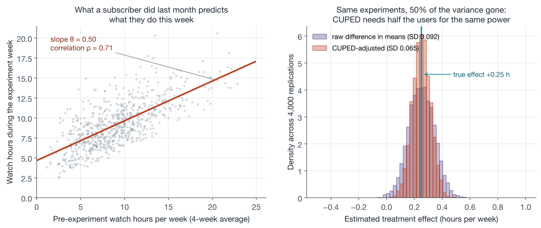
\[\mathrm{var}\big(\bar{Y}^{\mathrm{cv}}\big) = \mathrm{var}\big(\bar{Y}\big)\,(1 - \rho^2)\]where \(\rho\) is the correlation between metric and covariate. All three claims (unbiasedness for any \(\theta\), the optimal \(\theta\), the \(1-\rho^2\) factor) are proved in tool 4, which also shows CUPED is exactly a regression adjustment wearing streaming clothes. The intuition is worth keeping alongside the algebra: heavy watchers stay heavy, light watchers stay light, and all of that predictable between-user spread is noise for the purpose of detecting a treatment effect; CUPED subtracts each user’s own expected level and lets arms be compared on their surprises.
The economics: a correlation of 0.7, entirely realistic for a usage metric against its own four-week pre-period, removes \(1 - 0.7^2 = 51\%\) of the variance, which halves the required sample size. The original paper reports exactly this scale in production: roughly 50% variance reduction on Bing metrics with one to two weeks of pre-period data (their recommendation for the pre-period length), and Netflix’s variance-reduction paper reports up to 40% for existing members using pre-experiment streaming behavior. Simulating our own version, 4,000 replicated experiments on 2,000 subscribers per arm with a true effect of +0.25 watch-hours:
In code, the whole method is five lines on top of the difference in means, shown here on one of those simulated experiments:
pre = np.concatenate([pre_c, pre_t])            # pre-period hours, both arms
y   = np.concatenate([y_c, y_t])                # in-experiment hours

theta = np.cov(y, pre, ddof=1)[0, 1] / pre.var(ddof=1)
adj_c = y_c - theta * (pre_c - pre.mean())      # one theta, pooled, both arms
adj_t = y_t - theta * (pre_t - pre.mean())
raw    +0.269 h  (SE 0.091)  95% CI [+0.089, +0.448]
CUPED  +0.293 h  (SE 0.064)  95% CI [+0.167, +0.419]
Same users, same experiment, a confidence interval 30% narrower (the SE ratio is \(\sqrt{1-\rho^2} \approx 0.70\)), purely from information that existed before the experiment started.
Reproduce the CUPED experiment (numpy only)
Generates the subscriber-watch-hours experiment behind the snippet and figure (pre-period and in-experiment hours are gamma-built and non-negative; the true effect is +0.25 hours), then prints the raw and CUPED reads. Same seed and draw order as the figure script's first replication.
import numpy as np

rng = np.random.default_rng(11)
n = 2000
shape, scale = (9.0 / 4.0) ** 2, 4.0 ** 2 / 9.0          # pre-period: mean 9, sd 4
eps_shape, eps_scale = 4.5 ** 2 / 4.16, 4.16 / 4.5       # week noise, corr = 0.7

pre_c = rng.gamma(shape, scale, n)
pre_t = rng.gamma(shape, scale, n)
y_c = 0.5 * pre_c + rng.gamma(eps_shape, eps_scale, n)
y_t = 0.5 * pre_t + rng.gamma(eps_shape, eps_scale, n) + 0.25

def report(label, a, b):
    d = b.mean() - a.mean()
    se = np.sqrt(a.var(ddof=1) / n + b.var(ddof=1) / n)
    print(f"{label}  {d:+.3f} h  (SE {se:.3f})  "
          f"95% CI [{d - 1.96 * se:+.3f}, {d + 1.96 * se:+.3f}]")

report("raw  ", y_c, y_t)
pre = np.concatenate([pre_c, pre_t])
y = np.concatenate([y_c, y_t])
theta = np.cov(y, pre, ddof=1)[0, 1] / pre.var(ddof=1)
report("CUPED", y_c - theta * (pre_c - pre.mean()),
                y_t - theta * (pre_t - pre.mean()))

# raw    +0.269 h  (SE 0.091)  95% CI [+0.089, +0.448]
# CUPED  +0.293 h  (SE 0.064)  95% CI [+0.167, +0.419]
The paper’s most striking demonstration of what that buys: a deliberate 250ms server-slowdown experiment at Bing whose effect became statistically significant from day one with CUPED, versus barely clearing significance after two weeks without it. CUPED is now table stakes in commercial platforms,9 and one operational detail matters: estimate a single pooled \(\theta\) and apply it to both arms. Separate per-arm slopes are only safe when the covariate is centered on the pooled mean, which turns them into Lin’s interacted regression from the next paragraph; applied to raw covariates they bias the difference.
Two extensions cover the gaps. New users have no pre-period, which is precisely the case for our trial-conversion experiments; the generalization is to adjust by any pre-assignment covariates (country, device, acquisition channel, day of signup), either via regression or via CUPED with a modeled covariate. DoorDash’s variant, CUPAC (“control using predictions as covariates”), trains a machine-learning model on pre-experiment data to predict the outcome and uses the prediction as the covariate, which is just a way to compress many weak covariates into one strong one and inherits CUPED’s math (the correlation between prediction and outcome plays the role of \(\rho\)); they report it shortened their switchback tests by more than 25%. Eppo’s CUPED++ does essentially the same. On the classical side, regression adjustment with treatment-by-covariate interactions is the textbook-correct general form: Lin’s 2013 analysis settled a long-running argument by showing that with the interactions included, adjustment cannot hurt asymptotic precision even when the linear model is wrong.10
Capping: heavy tails are variance you can negotiate with
Not all variance is between-user predictability; some is a handful of extreme values. Our service sells add-on rentals alongside the subscription, and 28-day add-on revenue per subscriber looks like most revenue-per-user metrics: mostly zeros, a modest lognormal body, and a tail of enthusiasts, one of whom spends \$878. Metrics like that are both slow to reach normality (Kohavi’s rule of thumb needs roughly \(355 \times \text{skewness}^2\) users per arm just for the confidence intervals to be trustworthy, which at Bing’s revenue skewness of ~18 meant 114,000 users per arm) and inefficient, because a single whale in one arm can swamp a real effect. The standard mitigation is winsorizing: cap the metric at a chosen quantile.
cap = np.quantile(spend, 0.999)
capped = np.minimum(spend, cap)
mean 0.941  max 878  skew 41.2
cap at p99 =  22.1: skew ->  5.7   SE 0.0341 -> 0.0135 (61% smaller)   mean shrinks 31.57%
cap at p99.9 =  96.7: skew -> 11.1   SE 0.0341 -> 0.0246 (28% smaller)   mean shrinks 6.40%
Reproduce the capping comparison (numpy + scipy)
Simulates 28-day add-on revenue for 50,000 subscribers (92% spend nothing; buyers are lognormal) and prints the skewness, standard error, and mean bias at two caps.
import numpy as np
from scipy.stats import skew

rng = np.random.default_rng(23)
n = 50_000
buys = rng.random(n) < 0.08
spend = np.where(buys, rng.lognormal(1.7, 1.3, n), 0.0)

se = lambda x: x.std(ddof=1) / np.sqrt(len(x))
print(f"mean {spend.mean():.3f}  max {spend.max():.0f}  skew {skew(spend):.1f}")
for q in [0.99, 0.999]:
    cap = np.quantile(spend, q)
    capped = np.minimum(spend, cap)
    print(f"cap at p{q * 100:g} = {cap:5.1f}: skew -> {skew(capped):4.1f}   "
          f"SE {se(spend):.4f} -> {se(capped):.4f} "
          f"({1 - se(capped) / se(spend):.0%} smaller)   "
          f"mean shrinks {(spend.mean() - capped.mean()) / spend.mean():.2%}")

# mean 0.941  max 878  skew 41.2
# cap at p99 =  22.1: skew ->  5.7   SE 0.0341 -> 0.0135 (61% smaller)   mean shrinks 31.57%
# cap at p99.9 =  96.7: skew -> 11.1   SE 0.0341 -> 0.0246 (28% smaller)   mean shrinks 6.40%
The simulation above (50,000 subscribers, 8% of whom buy anything) shows both the appeal and the fine print. Capping at the 99th percentile cuts the standard error by 61%, a sample-size discount CUPED can rarely match; it also deletes 32% of the mean, because in heavy-tailed revenue the top 1% is a third of the money. You are no longer estimating the effect on revenue; you are estimating the effect on capped revenue, a different estimand that is blind to changes among your biggest spenders. Sometimes that trade is right (Bing found capping revenue at \$10 per user per week let the same sample detect roughly 30% smaller changes), sometimes it is exactly wrong (an experiment aimed at upsell behavior lives in the tail you just amputated). The honest pattern is to pre-register the cap, report capped and uncapped results side by side, and treat disagreement between them as information about where in the distribution the effect lives.
There is one more variance lever the power section already hinted at: choose sensitive metrics in the first place. Netflix’s threshold-style engagement metrics, and binary “did the user do X at least once” indicators generally, have bounded variance and often dominate raw averages for decision-making; the stratified sampling post covers the related at-assignment idea of balancing known segments, though Netflix’s comparison paper found post-assignment adjustment (post-stratification or CUPED) more practical than stratifying the assignment itself at scale, and the theory backs the shortcut: Miratrix, Sekhon and Yu proved post-stratification is nearly as efficient as stratifying up front, with the gap shrinking at rate \(1/n^2\).
Ratio metrics: when the unit you randomize is not the unit you count
Every metric so far was per-user, one number per randomized account, and the i.i.d. assumption behind the standard error was inherited straight from randomization. Now consider a metric our product team genuinely wants: session completion rate, completed sessions over started sessions. Sessions belong to accounts; accounts were randomized; sessions from the same account share tastes, devices, and bandwidth. Treat the sessions as independent Bernoulli draws and you are claiming more effective sample than you own, because sessions arrive in correlated bundles, the same clustering trap the mixed-effects post diagnosed at length.
The estimator is a ratio of sums, equivalently of per-user means: \(R = \bar{Y} / \bar{X}\) with \(Y_i\) user \(i\)’s completions and \(X_i\) their sessions. Ratios of random quantities do not have textbook variances, but a first-order Taylor expansion (the delta method again, this time in two variables; the CLV post proved the one-variable version in its toolbox and tool 7 extends it) gives the workhorse formula, the same one derived in Deng, Knoblich and Lu’s practical guide to the delta method in metric analytics:
\[\mathrm{var}\!\left(\frac{\bar{Y}}{\bar{X}}\right) \;\approx\; \frac{1}{n}\left( \frac{\sigma_Y^2}{\mu_X^2} \;-\; \frac{2\,\mu_Y\,\sigma_{XY}}{\mu_X^3} \;+\; \frac{\mu_Y^2\,\sigma_X^2}{\mu_X^4} \right)\]Everything in it is a per-user moment, so the correlation between a user’s numerator and denominator is priced in. Watching it against the naive session-level calculation, on a simulated arm of 5,000 accounts with heavy-tailed session counts:
rate = completions.sum() / sessions.sum()

# naive: pretend sessions are independent coin flips
se_naive = np.sqrt(rate * (1 - rate) / sessions.sum())

# delta method on the ratio of per-user means
xbar, ybar = sessions.mean(), completions.mean()
cov_xy = np.cov(completions, sessions, ddof=1)[0, 1]
se_delta = np.sqrt((completions.var(ddof=1) / xbar**2
                    - 2 * ybar * cov_xy / xbar**3
                    + ybar**2 * sessions.var(ddof=1) / xbar**4) / len(sessions))
session completion rate  0.6999
naive SE      0.00303
delta SE      0.00390
empirical SD  0.00385   (over 4,000 replications)
The empirical truth (replicating the whole arm 4,000 times) is 0.00385; the delta method nails it; the naive session-level formula claims standard errors 21% too small, which means confidence intervals 21% too narrow and a false-positive rate silently above its label, on every ratio metric, in every experiment, forever. This is one of the two standard ways experimentation platforms quietly produce too many “significant” results (the other is peeking), and it is the concrete mechanism behind the advice to run A/A tests: an A/A suite on ratio metrics with naive variances rejects far more than 5% and hands you the bug report. An equivalent fix with different tradeoffs is the bootstrap over users (never over sessions), which the Spotify team uses at quantile scale.
Reproduce the ratio-metric comparison (numpy only)
Simulates one arm of 5,000 accounts with heavy-tailed session counts and per-user completion propensities, computes the three standard errors, and checks the delta method against 4,000 full replications.
import numpy as np

rng = np.random.default_rng(21)

def one_arm(n_users):
    sessions = 1 + rng.negative_binomial(1.2, 0.25, n_users)   # heavy-tailed
    q = rng.beta(7, 3, n_users)               # per-user completion propensity
    completions = rng.binomial(sessions, q)
    return sessions, completions

n = 5000
sessions, completions = one_arm(n)
rate = completions.sum() / sessions.sum()
se_naive = np.sqrt(rate * (1 - rate) / sessions.sum())

xbar, ybar = sessions.mean(), completions.mean()
cov_xy = np.cov(completions, sessions, ddof=1)[0, 1]
se_delta = np.sqrt((completions.var(ddof=1) / xbar**2
                    - 2 * ybar * cov_xy / xbar**3
                    + ybar**2 * sessions.var(ddof=1) / xbar**4) / n)

reps = np.array([(lambda s, c: c.sum() / s.sum())(*one_arm(n))
                 for _ in range(4000)])
print(f"session completion rate  {rate:.4f}")
print(f"naive SE      {se_naive:.5f}")
print(f"delta SE      {se_delta:.5f}")
print(f"empirical SD  {reps.std():.5f}   (over 4,000 replications)")

# session completion rate  0.6999
# naive SE      0.00303
# delta SE      0.00390
# empirical SD  0.00385   (over 4,000 replications)
Tip: the rule that generalizes is analyze at the level you randomized. Per-user metrics satisfy it automatically; ratio metrics need the delta method or a user-level bootstrap; and if you ever randomize at a coarser level still (whole regions in a geo experiment, region-time blocks in a switchback), the effective sample size is the number of those units, however many millions of events they contain.
Reading results without fooling yourself
The experiment ran its pre-registered course, the SRM check passed, and the dashboard shows results. The remaining failure modes live between the numbers and the decision.
A significant result is not “95% likely real”
The 5% in \(\alpha = 0.05\) is the rate of false alarms among true nulls, not the chance your particular win is false. To get the number you actually want, apply Bayes’ rule with the one prior you have excellent evidence about: your own historical win rate. If a fraction \(\pi\) of tested ideas genuinely work, your tests run at power \(1-\beta\), and positives are declared two-sided at \(\alpha\), then among positive significant results the share that are real is
\[P(\text{real} \mid \text{significant}^{+}) = \frac{(1-\beta)\,\pi}{(1-\beta)\,\pi + \tfrac{\alpha}{2}\,(1 - \pi)}\]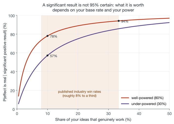
The industry’s own numbers, from the “Intuition Busters” paper: at a one-third success rate (Microsoft’s historical average) the false-positive share among wins is about 6%; at Bing’s roughly 15% success rate it is 15%; at the ~8% rate reported for Airbnb’s search team it is 26%. Our curve reproduces the same arithmetic: a healthy team with a 10% hit rate and well-powered tests should expect 78% of its significant wins to be real, and only 57% if it runs underpowered at 30%. Two operational conclusions follow directly. Surprising results, especially breakthrough ones, should be replicated before anyone reorganizes a roadmap around them (Kohavi’s Rule #2 arithmetic: if genuine breakthroughs are one in five hundred, a significant breakthrough result is 97% likely to be false). And the more extreme a reported effect, the more Twyman’s law applies: “any figure that looks interesting or different is usually wrong.”11
Many metrics, many segments, many chances to be fooled
The metric sheet has six rows; the platform reports sixty; someone will also slice by country, device, plan and tenure. Every extra look is another draw from the false-positive urn: with twenty independent truly-null metrics, the chance at least one clears \(p < 0.05\) is \(1 - 0.95^{20} = 64\%\). The context determines the right correction. For the decision, the OEC discipline already solved it: one pre-declared success metric (or a couple with a pre-declared rule), guardrails tested for non-inferiority with their false-negative rates controlled, everything else explicitly labeled exploratory. For exploration, control the false discovery rate with Benjamini-Hochberg, which bounds the expected share of false positives among your discoveries rather than the chance of any single false positive, the right currency when the output is a list of leads for future experiments rather than a launch decision.12
Segments deserve their own paranoia, because two published pathologies live there. First, a significant effect in some segment is nearly guaranteed by search: twenty segments at 5% each is the same urn as twenty metrics. The uplift-modeling section of the causal post covers the principled version of heterogeneity hunting; the unprincipled version is called HARKing (hypothesizing after results are known) and the cure is to treat any post-hoc segment finding as a hypothesis for the next experiment, not a result of this one. Second, segment results can genuinely reverse the aggregate through Simpson’s paradox whenever assignment shares varied, and experiments manufacture that condition routinely: Kohavi and Longbotham describe a five-week experiment that ramped from 1% to 5% and then to 50% of users mid-flight and measured 4% worse overall while being better on almost every single day, because the days were weighted differently in each arm. LinkedIn’s -9.4% local versus +0.5% site-wide email experiment is the same paradox through the triggering door. The mechanical rule that prevents most of it: analyze only windows where the assignment ratio was constant, which usually means the measurement clock starts after the ramp completes.
Novelty, primacy, and metrics that haven’t finished happening
Two time-related illusions round out the set. The first is behavioral: users poke at anything new (a novelty effect that fades), or take time to learn a changed interface (a primacy effect that grows), so the first week’s effect can be a bad forecast of the steady state. The Microsoft “puzzling outcomes” paper both defines these effects and warns against over-diagnosing them: many apparently trending treatment effects in short experiments are statistical artifacts of cumulative plots, and genuine novelty effects are rarer than dashboards suggest. The practical checks are to compare new users (who have no baseline to be novel against) with existing users, and to distrust any launch case that depends on the first days of data.
The second illusion is mechanical, and for subscription products it is the important one: your metrics take time to finish happening. Trial conversion is undefined until the trial ends; a day-10 read of a 14-day trial is a biased sample of early deciders. Worse, treatments that change when users act masquerade as treatments that change whether they act. Our day-3 reminder email, simulated with 20,000 trialists per arm:
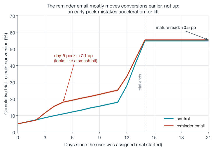
At the day-5 peek the treatment leads by 7.1 percentage points, an effect so large it passes any test you like; the genuine effect, baked into the simulation, is +0.5 points, and the mature read at day 21 recovers exactly that. Nothing here is subtle statistics; it is the definition of the metric. The discipline that fixes it is cohort maturity: compare users only at equal time-since-assignment, and only at horizons every included user has fully reached, which for renewal metrics means whole billing cycles (a “30-day retention” read taken 20 days into the experiment silently contains only the earliest joiners, who are not a random sample of joiners). This is the same censoring logic the CLV post built survival curves around, showing up one layer earlier in the pipeline. The foldable block reproduces the figure.
Reproduce the delayed-conversion simulation (numpy only)
Daily conversion probabilities for a 14-day trial; the reminder arm moves probability mass from the end-of-trial decision days to days 3-5 and adds 0.5 points of genuinely new conversion. Same seed and draw order as the figure.
import numpy as np

def conversion_day_probs(reminder):
    base = np.zeros(15)                     # P(convert on day d), d = 0..14
    base[0] = 0.05                          # instant upgraders
    base[1:12] = 0.012                      # slow trickle
    base[12:15] = [0.10, 0.14, 0.128]       # end-of-trial decision
    if reminder:
        s = base.copy()
        s[12:15] -= np.array([0.020, 0.028, 0.022])   # decided earlier instead...
        s[3:6]   += np.array([0.032, 0.024, 0.014])   # ...at the day-3 nudge
        s[4]     += 0.005                             # the genuinely new conversions
        return s
    return base

rng = np.random.default_rng(31)
n = 20_000

def draw(probs):
    cdf = np.concatenate([[0.0], np.cumsum(probs)])
    u = rng.uniform(size=n)
    day = np.searchsorted(cdf, u) - 1
    return np.where(u < cdf[-1], np.clip(day, 0, 14), -1)   # -1 = never converts

day_c, day_t = draw(conversion_day_probs(False)), draw(conversion_day_probs(True))
for h in [5, 21]:
    lift = ((day_t >= 0) & (day_t <= h)).mean() - ((day_c >= 0) & (day_c <= h)).mean()
    print(f"day-{h} read: {lift * 100:+.1f} pp")

# day-5 read: +7.1 pp
# day-21 read: +0.5 pp
The long game: retention, proxies, and holdouts
Everything above gets you trustworthy two-to-six-week experiments. A subscription business ultimately cares about horizons those experiments cannot reach: does the paywall change affect month-six retention? Does a louder upsell program slowly teach users to ignore you? Three published strategies address the gap, in increasing order of patience.
Validated proxy metrics. The Netflix approach from the OEC section, made rigorous: choose short-term metrics because they predict the long-term outcome, and keep re-validating that link on the growing archive of past experiments. The statistics community has formalized this as the surrogate index:13 combine several short-term outcomes into an index trained to predict the long-term outcome, and, under the assumption that treatment affects the long-term outcome only through the surrogates, an experiment’s effect on the index estimates its effect on the long-term outcome, with months of calendar time removed from the decision loop. In their application to a California job-training experiment, employment over the first six quarters was enough to recover the program’s effect on nine-year employment, with 35% smaller standard errors than waiting for the long-term data. Netflix’s experimentation team published exactly this kind of program in 2024, learning proxy metrics from thousands of historical experiments so that sensitive short-term movement stands in for insensitive long-term revenue and retention. The assumption is strong and worth saying out loud in reviews: a treatment that reaches the long-term outcome around the surrogates (say, by annoying users in a way current engagement misses) will fool the index.
Long-running holdouts. Keep a small slice of users on the old experience for a quarter while everything ships to everyone else, then read the cumulative effect of the quarter’s launches at once. Spotify runs precisely this: a fresh holdback group each quarter, exempted from that quarter’s experiments and features, against which “the combined experience of all (successful) experiments” is measured when the quarter ends. Meta’s version uses asymmetric allocations (holding back, say, 6% rather than a full mirror arm) because withholding good features from users has a real cost you want to minimize. Holdouts answer two questions nothing else can: do our shipped wins add up to their promised sum (they usually add up to less; individually-significant effects are selected upward, the same winner’s-curse arithmetic as the false-positive section), and do effects persist once novelty fades?
Learning the long-term effect’s shape. The deepest published example is Google’s ads-blindness work: long-duration experiments showed that users exposed to heavier or lower-quality ads learn to click less over months, a lagged effect invisible in a two-week read, and modeling that learning let Google trade short-term revenue for long-term health, including a sequence of launches that cut the mobile search ad load by 50% on the strength of the predicted long-term gains. The subscription translation is direct: aggressive monetization experiments (more upsells, more interruptions, stingier trials) are exactly the category where the two-week read and the six-month truth are most likely to disagree, so they are exactly the category that earns a holdout.
Two subscription-specific footnotes to the long game. First, interference: the causal post’s SUTVA discussion applies, but gently, because a personal subscription mostly lacks the marketplace coupling that forces DoorDash into switchback designs and LinkedIn into cluster randomization; the exceptions are social surfaces (shared accounts, referral programs, watch parties), and the honest response is usually to note the bias direction rather than deploy heavy machinery. Second, pricing: randomizing price per user is legally fraught in some jurisdictions and reputationally fraught in all of them, which is why real price tests tend to randomize at market or cohort granularity (Netflix, per press reports, tested higher prices on new Australian signups in 2017: new cohorts only, one geography), accept the coarser unit’s power cost, and lean on the acceptance-curve modeling of the pricing post between tests.
Culture: the part that doesn’t fit in a formula
The statistical machinery is necessary and insufficient; what separates organizations that learn from ones that generate colorful dashboards is process, and the published record is unusually consistent about which processes matter.
- Make experiments cheap and safe enough to be default. Booking.com’s paper on democratizing experimentation describes the operating point: over a thousand concurrent experiments daily, with anyone in the company able to test their own ideas end to end, because the platform provides the safety (automatic quality checks, kill switches) that gatekeeping used to. Experimentation doubles as their feature-release mechanism, so every launch is reversible and measured by construction.
- Keep institutional memory. The same paper’s first pillar is a central repository of past experiments, successes and failures. The archive is what turns win rates from folklore into the measured priors the false-positive arithmetic needs, feeds meta-analyses like Netflix’s proxy-metric program, and stops teams from re-running last year’s failed idea with a new coat of paint.
- Review designs, not just results. The pre-experiment artifact (hypothesis, OEC, guardrails, power calculation, duration, ship criteria) is short, and forcing it through review catches most of this post’s failure modes while they are still free. Spotify’s decision rule is a good template for the ship criterion: significantly superior on at least one success metric, non-inferior on all guardrails, no deterioration or quality alarms.
- Let the platform enforce the statistics. Humans should not be trusted to not peek, to remember SRM checks, or to apply delta-method variances by hand at 5pm before a launch review. The pattern across Microsoft, Netflix, Spotify and the commercial platforms is the same: correctness lives in the platform (sequential boundaries, automatic SRM gating, CUPED by default), and the humans spend their judgment on hypotheses and interpretation.
- Protect the dignity of negative results. If only a third of ideas work even at Microsoft, then most well-run experiments end in “no, and now we know,” and the program’s value includes every feature that didn’t ship (Duolingo’s public write-ups pointedly celebrate the subscription promotion they killed). An organization that punishes negative results will get fewer of them reported, which is not the same as having fewer of them.
When an A/B test is the wrong tool
Honest boundaries, briefly. When you cannot randomize at all (the launch already happened, the unit is one country, the horizon is years), you are in quasi-experiment territory, and the causal inference post maps that toolkit (difference-in-differences, synthetic control, and friends; Netflix and Uber both describe using them alongside their experiment platforms). When the cost of showing users an inferior arm dominates and the goal is optimizing rather than measuring (rotating promotional artwork, ordering a carousel), multi-armed bandits reallocate traffic toward winners while exploring, at the price of messier inference about why; that post builds the standard algorithms in full. And when the question is narrowly “which ranker is better,” Netflix’s interleaving work shows a design that mixes both rankers’ results for every user and reads preference from clicks, needing over 100 times fewer subscribers than their most sensitive A/B metric to pick a winner, with the explicit caveat that it measures relative preference only, so their pipeline prunes candidates by interleaving and still confirms the survivors with a traditional A/B test on engagement and retention.
Conclusion
The seductive summary of A/B testing (“split the traffic, compare the means, ship if significant”) is true the way “hit the ball into the hole” is true of golf. What the companies that industrialized experimentation actually learned, and were generous enough to publish, is a longer sentence: pick a randomization unit that matches how the product is bought, declare the deciding metric and its guardrails before the data can lobby you, price your sensitivity honestly and buy more with pre-experiment covariates rather than wishful thinking, let the platform spend your error budget (against peeking, against sixty metrics, against broken denominators), read only mature cohorts, disbelieve your own most exciting results at a rate calibrated to your win rate, and keep a slice of users on yesterday’s product so the long game stays measurable. None of the individual pieces is deep, most are a page of algebra (the appendix has the pages), and every one exists because a company with millions of users shipped the corresponding mistake. The compounding return comes from the loop: an organization that can run a trustworthy experiment cheaply will run many, most will fail, the failures are tuition, and every so often one of them is the ad-title experiment paying for the decade.
Appendix: the derivation toolbox
The facts the body leans on, each proved, so the post stands alone. As in the CLV and causal inference posts, the classical imports are the central limit theorem and the law of large numbers; everything else is derived.
1. The variance of a difference in means
Claim. If \(\bar{Y}_t\) and \(\bar{Y}_c\) are means of independent samples of size \(n\) from distributions with variances \(\sigma_t^2, \sigma_c^2\), then \(\mathrm{var}(\bar{Y}_t - \bar{Y}_c) = (\sigma_t^2 + \sigma_c^2)/n\).
Proof.
\[\begin{aligned} \mathrm{var}\big(\bar{Y}\big) &= \mathrm{var}\!\Big( \tfrac{1}{n} \sum_{i=1}^n Y_i \Big) = \frac{1}{n^2} \sum_{i=1}^n \mathrm{var}(Y_i) = \frac{\sigma^2}{n} && \textcolor{#7b8794}{\small\text{independent draws: variances add; scaling by } c \text{ scales variance by } c^2} \\[4pt] \mathrm{var}\big(\bar{Y}_t - \bar{Y}_c\big) &= \mathrm{var}(\bar{Y}_t) + \mathrm{var}(\bar{Y}_c) = \frac{\sigma_t^2 + \sigma_c^2}{n} && \textcolor{#7b8794}{\small\text{the arms are independent, and } \mathrm{var}(-X) = \mathrm{var}(X)} \end{aligned}\]Replacing the \(\sigma^2\) with sample variances gives the standard error used in the body; the central limit theorem supplies approximate normality of each mean, hence of their difference. \(\blacksquare\)
2. The two-proportion z-test
Claim. For conversion metrics, \(Y_i \in \{0, 1\}\) with \(P(Y_i = 1) = p\), the general machinery of tool 1 specializes to \(\mathrm{se}(\hat{p}_t - \hat{p}_c) = \sqrt{ \hat{p}_t(1-\hat{p}_t)/n + \hat{p}_c(1-\hat{p}_c)/n }\).
Proof. A 0/1 variable satisfies \(Y_i^2 = Y_i\), so
\[\mathrm{var}(Y_i) = \mathbb{E}[Y_i^2] - \mathbb{E}[Y_i]^2 = p - p^2 = p(1-p) \qquad \textcolor{#7b8794}{\small\text{a Bernoulli variance is } p(1-p) \text{, maximized at } p = \tfrac12}\]and substituting into tool 1 with \(\hat{p}\) estimating each arm’s \(p\) gives the claim. Under the null hypothesis \(p_t = p_c\) the pooled version substitutes the combined \(\hat{p}\) in both slots; at experiment sample sizes the numerical difference is negligible. \(\blacksquare\)
3. Where the sample-size formula comes from
Claim. To detect a true effect of size \(\delta\) with power \(1-\beta\) using a two-sided level-\(\alpha\) z-test, when the metric has variance \(\sigma^2\) in each arm, requires approximately
\[n \;\text{per arm} = \frac{2\sigma^2 (z_{1-\alpha/2} + z_{1-\beta})^2}{\delta^2}\]Proof. Write \(\mathrm{se} = \sqrt{2\sigma^2/n}\) for the standard error of \(\hat{\Delta}\) (tool 1 with equal variances). The test rejects when \(\lvert \hat{\Delta} \rvert > z_{1-\alpha/2}\, \mathrm{se}\). Now suppose the truth is \(\Delta = \delta > 0\), so \(\hat{\Delta} \sim \mathcal{N}(\delta, \mathrm{se}^2)\). Power is the probability of rejecting; ignoring the far tail (the probability of rejecting in the wrong direction, negligible for any effect worth detecting),
\[\begin{aligned} 1 - \beta &= P\big( \hat{\Delta} > z_{1-\alpha/2}\, \mathrm{se} \big) = P\!\left( \frac{\hat{\Delta} - \delta}{\mathrm{se}} > z_{1-\alpha/2} - \frac{\delta}{\mathrm{se}} \right) && \textcolor{#7b8794}{\small\text{standardize: subtract the true mean, divide by the SE}} \\[4pt] &= \Phi\!\left( \frac{\delta}{\mathrm{se}} - z_{1-\alpha/2} \right) && \textcolor{#7b8794}{\small\text{for a standard normal } Z,\ P(Z > -x) = \Phi(x)} \end{aligned}\]Applying \(\Phi^{-1}\) to both sides: \(z_{1-\beta} = \delta/\mathrm{se} - z_{1-\alpha/2}\), so the requirement is \(\delta = (z_{1-\alpha/2} + z_{1-\beta})\, \mathrm{se}\). In words: the true effect must equal the sum of the two quantiles, in standard-error units (at \(\alpha = 0.05\), 80% power, that sum is \(1.960 + 0.842 = 2.80\), the “detectable effect is 2.8 standard errors” rule). Substituting \(\mathrm{se} = \sqrt{2\sigma^2/n}\) and solving for \(n\):
\[\delta^2 = (z_{1-\alpha/2} + z_{1-\beta})^2\, \frac{2\sigma^2}{n} \quad\Longrightarrow\quad n = \frac{2\sigma^2 (z_{1-\alpha/2} + z_{1-\beta})^2}{\delta^2}\]With the conventional constants, \((1.960 + 0.842)^2 = 7.85\), giving \(n \approx 15.7\,\sigma^2/\delta^2 \approx 16\sigma^2/\delta^2\) per arm. \(\blacksquare\)
4. CUPED: unbiasedness, the optimal theta, and the variance discount
Claim. Let \(Y\) be the metric, \(X\) a covariate unaffected by treatment with the same distribution in both arms, and define per-arm adjusted means \(\bar{Y}^{\mathrm{cv}} = \bar{Y} - \theta \bar{X}\). Then (a) the difference of adjusted means is unbiased for the treatment effect for any fixed \(\theta\); (b) the variance of an arm’s adjusted mean is minimized at \(\theta^\star = \mathrm{cov}(Y, X)/\mathrm{var}(X)\); (c) at \(\theta^\star\), \(\mathrm{var}(\bar{Y}^{\mathrm{cv}}) = \mathrm{var}(\bar{Y})(1 - \rho^2)\) with \(\rho = \mathrm{corr}(Y, X)\).
Proof. (a) Randomization gives both arms the same distribution of \(X\) (it is pre-treatment), so \(\mathbb{E}[\bar{X}_t] = \mathbb{E}[\bar{X}_c] = \mu_X\) and
\[\mathbb{E}\big[ \bar{Y}^{\mathrm{cv}}_t - \bar{Y}^{\mathrm{cv}}_c \big] = \mathbb{E}[\bar{Y}_t] - \mathbb{E}[\bar{Y}_c] - \theta\,\big( \mu_X - \mu_X \big) = \Delta \qquad \textcolor{#7b8794}{\small\text{the covariate terms cancel because their means match across arms}}\](b) Within an arm, using the variance rules from tool 1 plus the covariance cross-term,
\[\begin{aligned} v(\theta) \;=\; \mathrm{var}\big( \bar{Y} - \theta \bar{X} \big) &= \frac{1}{n} \Big( \mathrm{var}(Y) - 2\theta\, \mathrm{cov}(Y, X) + \theta^2\, \mathrm{var}(X) \Big) && \textcolor{#7b8794}{\small \mathrm{var}(A - B) = \mathrm{var}(A) - 2\,\mathrm{cov}(A,B) + \mathrm{var}(B)} \\[4pt] v'(\theta) &= \frac{1}{n} \Big( -2\, \mathrm{cov}(Y, X) + 2\theta\, \mathrm{var}(X) \Big) = 0 && \textcolor{#7b8794}{\small\text{differentiate in } \theta \text{ and set to zero}} \\[4pt] \theta^\star &= \frac{\mathrm{cov}(Y, X)}{\mathrm{var}(X)} && \textcolor{#7b8794}{\small\text{a minimum: } v''(\theta) = 2\,\mathrm{var}(X)/n > 0} \end{aligned}\]This \(\theta^\star\) is exactly the slope of the least-squares regression of \(Y\) on \(X\), which is the precise sense in which CUPED is regression adjustment.
(c) Substitute \(\theta^\star\) into \(v(\theta)\):
\[\begin{aligned} v(\theta^\star) &= \frac{1}{n} \left( \mathrm{var}(Y) - 2\,\frac{\mathrm{cov}(Y,X)^2}{\mathrm{var}(X)} + \frac{\mathrm{cov}(Y,X)^2}{\mathrm{var}(X)} \right) = \frac{1}{n} \left( \mathrm{var}(Y) - \frac{\mathrm{cov}(Y,X)^2}{\mathrm{var}(X)} \right) && \textcolor{#7b8794}{\small\text{plug in and collect the two covariance terms}} \\[4pt] &= \frac{\mathrm{var}(Y)}{n} \left( 1 - \frac{\mathrm{cov}(Y,X)^2}{\mathrm{var}(Y)\,\mathrm{var}(X)} \right) = \mathrm{var}\big(\bar{Y}\big)\,\big(1 - \rho^2\big) && \textcolor{#7b8794}{\small\text{factor out } \mathrm{var}(Y)/n \text{ and recognize the squared correlation}} \end{aligned}\]The same factor applies to the difference of two adjusted means, since both arms shrink by it. In practice \(\theta^\star\) is estimated from the pooled data; using one pooled estimate in both arms preserves the cancellation in (a) up to negligible terms. Per-arm estimates preserve it too, but only when each arm’s covariate is centered on the pooled mean \(\bar{X}\) rather than left raw, since \(\mathbb{E}[\bar{X}_t - \bar{X}] = 0\) whereas \(\theta_t \mu_X - \theta_c \mu_X\) does not vanish. \(\blacksquare\)
5. Why peeking inflates the false-positive rate
Claim. Under the null, the z-statistics at two looks, after \(n_1\) and \(n_2 > n_1\) users per arm, are jointly normal with correlation \(\sqrt{n_1/n_2}\); consequently the probability that either exceeds \(\pm 1.96\) is strictly above 5% (numerically 8.31% for a halfway peek), and with unlimited looks the escape probability tends to 1.
Proof of the correlation. Let \(D_i\) be user \(i\)’s treatment-minus-control contribution, i.i.d. mean zero, variance \(\tau^2\) under the null, and \(S_n = \sum_{i \le n} D_i\). The look-\(k\) statistic is \(Z_k = S_{n_k} / (\tau\sqrt{n_k})\). Then
\[\begin{aligned} \mathrm{cov}(Z_1, Z_2) &= \frac{ \mathbb{E}[ S_{n_1} S_{n_2} ] }{ \tau^2 \sqrt{n_1 n_2} } = \frac{ \mathbb{E}\big[ S_{n_1} \big( S_{n_1} + (S_{n_2} - S_{n_1}) \big) \big] }{ \tau^2 \sqrt{n_1 n_2} } && \textcolor{#7b8794}{\small\text{split the later sum into the earlier sum plus new users}} \\[4pt] &= \frac{ \mathbb{E}[ S_{n_1}^2 ] + 0 }{ \tau^2 \sqrt{n_1 n_2} } = \frac{ n_1 \tau^2 }{ \tau^2 \sqrt{n_1 n_2} } = \sqrt{ \frac{n_1}{n_2} } && \textcolor{#7b8794}{\small\text{new users are independent of old ones, so the cross-term dies}} \end{aligned}\]For a peek at the halfway point, \(n_2 = 2 n_1\), so \(\rho = 1/\sqrt{2} \approx 0.707\). The pair \((Z_1, Z_2)\) is bivariate normal (each is a normalized sum over overlapping user sets), and the escape probability \(1 - P(\lvert Z_1 \rvert \le 1.96,\, \lvert Z_2 \rvert \le 1.96)\) evaluates numerically to 0.0831, matching the 0.082 the 20,000-path simulation measured at two looks. The correlation being below 1 is the whole story: each additional look is a partially fresh draw, so each adds a real, if shrinking, slice of escape probability. For the limit, the law of the iterated logarithm gives \(\limsup_n Z_n / \sqrt{2 \log\log n} = 1\) almost surely, so \(Z_n\) exceeds any fixed threshold infinitely often with probability one: an experimenter with unlimited patience and no correction will reach significance under the null, which is Anscombe’s “sampling to a foregone conclusion.” Sequential designs escape the theorem by demanding more than a fixed threshold at early looks (the O’Brien-Fleming boundary in the body scales like \(\sqrt{K/k}\)), spending a finite error budget across all looks. \(\blacksquare\)
6. The SRM check is a one-proportion z-test in disguise
Claim. For a configured 50/50 split with observed counts \((a, b)\) and \(N = a + b\), Pearson’s chi-squared statistic with expected counts \((N/2, N/2)\) equals the squared z-statistic for testing whether a binomial proportion is \(\tfrac12\).
Proof. With expected count \(E = N/2\) in each cell and deviations \(a - E = (a-b)/2 = -(b - E)\),
\[\chi^2 = \frac{(a - E)^2}{E} + \frac{(b - E)^2}{E} = \frac{2\,\big( \tfrac{a-b}{2} \big)^2}{N/2} = \frac{(a - b)^2}{N} \qquad \textcolor{#7b8794}{\small\text{both cells contribute the same squared deviation}}\]Meanwhile the z-test for the proportion \(\hat{\pi} = a/N\) against \(\pi_0 = \tfrac12\), whose null standard error is \(\sqrt{ \pi_0 (1 - \pi_0) / N } = 1/(2\sqrt{N})\) (tool 2’s Bernoulli variance):
\[z = \frac{ \hat{\pi} - \tfrac12 }{ 1 / (2\sqrt{N}) } = 2\sqrt{N} \left( \frac{a}{N} - \frac12 \right) = \frac{a - b}{\sqrt{N}} \quad\Longrightarrow\quad z^2 = \frac{(a-b)^2}{N} = \chi^2\]so the chi-squared test on the split is the familiar normal test on the assignment proportion, and its null distribution (\(\chi^2_1\), the square of a standard normal) follows from the central limit theorem. The general-\(k\)-arm and unequal-split versions follow the same pattern with the appropriate expected counts. \(\blacksquare\)
7. The delta method for a ratio of means
Claim. Let \((X_i, Y_i)\) be i.i.d. per-user pairs (sessions and completions) with means \(\mu_X \ne 0, \mu_Y\), variances \(\sigma_X^2, \sigma_Y^2\), covariance \(\sigma_{XY}\). Then
\[\mathrm{var}\!\left( \frac{\bar{Y}}{\bar{X}} \right) \approx \frac{1}{n} \left( \frac{\sigma_Y^2}{\mu_X^2} - \frac{2 \mu_Y \sigma_{XY}}{\mu_X^3} + \frac{\mu_Y^2 \sigma_X^2}{\mu_X^4} \right)\]Proof. This is the two-variable version of the delta method the CLV post proved in one variable: expand the smooth function around the means and keep the linear terms, which is accurate because \((\bar{X}, \bar{Y})\) concentrates around \((\mu_X, \mu_Y)\) at rate \(1/\sqrt{n}\). For \(g(x, y) = y/x\), the partial derivatives at the means are
\[\frac{\partial g}{\partial x} = -\frac{\mu_Y}{\mu_X^2}, \qquad \frac{\partial g}{\partial y} = \frac{1}{\mu_X} \qquad \textcolor{#7b8794}{\small\text{gradient of } y/x \text{ evaluated at } (\mu_X, \mu_Y)}\]so the linearization is
\[\frac{\bar{Y}}{\bar{X}} \;\approx\; \frac{\mu_Y}{\mu_X} \;+\; \frac{1}{\mu_X}\,\big( \bar{Y} - \mu_Y \big) \;-\; \frac{\mu_Y}{\mu_X^2}\,\big( \bar{X} - \mu_X \big) \qquad \textcolor{#7b8794}{\small\text{first-order Taylor expansion in both arguments}}\]Taking the variance of the right side, a linear combination \(aU + bV\) with \(a = 1/\mu_X\), \(b = -\mu_Y/\mu_X^2\):
\[\begin{aligned} \mathrm{var}\!\left( \frac{\bar{Y}}{\bar{X}} \right) &\approx a^2\, \mathrm{var}(\bar{Y}) + b^2\, \mathrm{var}(\bar{X}) + 2ab\, \mathrm{cov}(\bar{X}, \bar{Y}) && \textcolor{#7b8794}{\small \mathrm{var}(aU + bV) = a^2 \mathrm{var}(U) + b^2 \mathrm{var}(V) + 2ab\, \mathrm{cov}(U, V)} \\[4pt] &= \frac{1}{n} \left( \frac{\sigma_Y^2}{\mu_X^2} + \frac{\mu_Y^2 \sigma_X^2}{\mu_X^4} - \frac{2 \mu_Y \sigma_{XY}}{\mu_X^3} \right) && \textcolor{#7b8794}{\small\text{means of } n \text{ i.i.d. pairs: every moment picks up a } 1/n} \end{aligned}\]which is the formula, with sample moments substituted in practice. The middle (covariance) term is the one the naive session-level calculation cannot see: when users who generate many sessions also generate many completions, numerator and denominator co-move, and ignoring that changes the variance by exactly the amount our simulation measured (naive 0.00303 versus true 0.00385). \(\blacksquare\)
Sources & further reading
The post draws on the published experimentation literature from the large platforms; these are the primary sources for every named claim.
- Kohavi, Tang & Xu, Trustworthy Online Controlled Experiments: A Practical Guide to A/B Testing (Cambridge, 2020) — the field’s reference book; the companion site hosts a free first chapter containing the Bing ad-title story and the win-rate numbers. Most of the corpus below is collected at exp-platform.com.
- Kohavi, Crook & Longbotham, “Online Experimentation at Microsoft” (2009) — source of the “about one-third of ideas succeed” statistic.
- Kohavi, Longbotham, Sommerfield & Henne, “Controlled Experiments on the Web: Survey and Practical Guide” (2009) — A/A tests, weekly multiples, the 25x cost of a 99/1 ramp.
- Kohavi & Longbotham, “Unexpected Results in Online Controlled Experiments” (SIGKDD Explorations, 2010) — the ramped experiment that was worse overall while better on almost every day, the Simpson’s paradox example in the segments section.
- Kohavi, Deng, Frasca, Longbotham, Walker & Xu, “Trustworthy Online Controlled Experiments: Five Puzzling Outcomes Explained” (KDD 2012) — the degraded-search-results example, primacy and novelty effects, and why many apparent trends are artifacts.
- Kohavi, Deng, Longbotham & Xu, “Seven Rules of Thumb for Web Site Experimenters” (KDD 2014) — the 0.1-1.0% typical win sizes, the speed-matters numbers, the 355·s² normality rule, revenue capping, and the Bayesian win-rate arithmetic.
- Kohavi, Deng & Vermeer, “A/B Testing Intuition Busters” (KDD 2022) — false-positive risk by company win rate, the Optimizely peeking account, and the 2.8-standard-errors detectability rule.
- Deng, Xu, Kohavi & Walker, “Improving the Sensitivity of Online Controlled Experiments by Utilizing Pre-Experiment Data” (WSDM 2013) — the CUPED paper: the θ formula, the 1−ρ² factor, the ~50% production numbers, the 1-2 week pre-period advice.
- Fabijan et al., “Diagnosing Sample Ratio Mismatch in Online Controlled Experiments” (KDD 2019) — the SRM taxonomy, the ~6% prevalence at Microsoft, and the worked 821,588-vs-815,482 example this post recomputes.
- Deng, Knoblich & Lu, “Applying the Delta Method in Metric Analytics” (KDD 2018) — the ratio-metric variance formula and the randomization-unit versus analysis-unit problem.
- Xie & Aurisset, “Improving the Sensitivity of Online Controlled Experiments: Case Studies at Netflix” (KDD 2016) — retention as the primary business metric, streaming hours as its sensitive proxy, and the stratification/post-stratification/CUPED comparison.
- Netflix Tech Blog, the “Decision Making at Netflix” series (Tingley et al., 2021-22) — a lucid public course on the conventions: false positives and significance, power, and building confidence in decisions, all around the Top 10 row example.
- Netflix Tech Blog, “Improve Your Next Experiment by Learning Better Proxy Metrics From Past Experiments” (2024) — learning proxies for long-term retention and revenue from historical experiments.
- Netflix Tech Blog, “Innovating Faster on Personalization Algorithms at Netflix Using Interleaving” (2017) — the >100x sensitivity claim for ranker preference, with its relative-measurement caveat.
- Schultzberg & Ankargren, “Choosing a Sequential Testing Framework: Comparisons and Discussions” (Spotify Engineering, 2023) — group sequential versus always-valid, with the power comparisons quoted in the peeking section.
- Schultzberg, Ankargren & Frånberg, “Risk-Aware Product Decisions in A/B Tests with Multiple Metrics” (Spotify Engineering, 2024) — the success/guardrail/deterioration/quality taxonomy and the asymmetric multiple-testing treatment.
- Mercer & Meakin, “The Power of Asymmetric Experiments @ Meta” (Analytics at Meta, 2025) — asymmetric holdouts, and the worked 6%/30% allocation the long-game section alludes to.
- Rydberg, “Spotify’s New Experimentation Platform, Part 2” (2020) — quarterly holdbacks for cumulative long-term measurement.
- Johari, Koomen, Pekelis & Walsh, “Peeking at A/B Tests: Why It Matters, and What to Do About It” (KDD 2017) — always-valid p-values and the mSPRT, the machinery behind Optimizely’s stats engine.
- Evan Miller, “How Not To Run an A/B Test” (2010) — the classic peeking essay; source of the 26.1% figure. His sample size calculator implements the power formula from the appendix.
- Pekelis, “The Story Behind Optimizely’s New Stats Engine” (2015) — Optimizely’s own accounting of the peeking problem, including the up-to-57% realized false-positive rate under per-visitor monitoring.
- Overgoor, “Experiments at Airbnb” (2014) — the real p-value-crossing example and seasonality cautions.
- Xu, Chen, Fernandez, Sinno & Bhasin, “From Infrastructure to Culture: A/B Testing Challenges in Large Scale Social Networks” (KDD 2015) — triggering, site-wide impact dilution, the -9.4%/+0.5% Simpson’s example, and network-interference cluster randomization at LinkedIn.
- Kaufman, Pitchforth & Vermeer, “Democratizing Online Controlled Experiments at Booking.com” (2017) — the >1,000 concurrent experiments figure and the cultural pillars.
- Hohnhold, O’Brien & Tang, “Focusing on the Long-term: It’s Good for Users and Business” (KDD 2015) — ads blindness, learned long-term effects, and the 50% mobile ad-load reduction.
- Athey, Chetty, Imbens & Kang, “The Surrogate Index” (NBER working paper 26463, 2019) — combining short-term proxies to estimate long-term treatment effects.
- Deng & Shi, “Data-Driven Metric Development for Online Controlled Experiments: Seven Lessons Learned” (KDD 2016) — metric design as its own discipline.
- Kastelman & Ramesh, “Switchback Tests and Randomized Experimentation Under Network Effects at DoorDash” (2018) — region-time randomization when marketplace units interfere.
- Duolingo blog, “Improving Duolingo, one experiment at a time” (2020) — a few hundred concurrent experiments, and the subscription-promotion test killed by its retention guardrail.
- Li, Tang & Bauman, “Improving Experimental Power through Control Using Predictions as Covariate (CUPAC)” (DoorDash Engineering, 2020) — CUPED with a machine-learned covariate for settings without a clean pre-period metric.
- Lin, “Agnostic Notes on Regression Adjustments to Experimental Data” (Annals of Applied Statistics, 2013) — why covariate adjustment with interactions cannot hurt asymptotic precision.
- Miratrix, Sekhon & Yu, “Adjusting Treatment Effect Estimates by Post-Stratification in Randomized Experiments” (JRSS-B, 2013) — post-stratification is nearly as efficient as stratifying the assignment up front.
- Benjamini & Hochberg, “Controlling the False Discovery Rate” (JRSS-B, 1995) — the FDR procedure recommended for exploratory metric sweeps.
- van Belle, Statistical Rules of Thumb, chapter 2 (Wiley) — the 16/Δ² sample-size rule and its derivation, free from the author’s site.
Footnotes
-
The one-third figure is from Kohavi, Crook and Longbotham’s “Online Experimentation at Microsoft” (2009); the 10-20% figure for well-optimized domains like Bing and Google is from the book Trustworthy Online Controlled Experiments, citing Jim Manzi’s Uncontrolled. Slack’s product leadership has put its monetization win rate around 30%. ↩
-
The simple \(w \cdot \Delta\) rule is exact for additive per-user metrics under the assumption that untriggered users are unaffected. Percentage and ratio metrics need more care; chapter 20 of Kohavi, Tang and Xu’s book works the general formulas. ↩
-
The term predates the web: Kohavi et al.’s 2007 KDD paper borrowed “overall evaluation criterion” from Ranjit Roy’s design-of-experiments textbook on Taguchi methods. Their definition: a quantitative measure of the experiment’s objective, chosen so that short-term movement predicts long-term goals. ↩
-
The retention-as-primary framing, the sensitivity argument, and the nonlinearity observation that follows are from Xie and Aurisset’s KDD 2016 paper on Netflix experiments; the Tingley-era blog series (2021) describes the primary decision metric as member engagement, chosen because it correlates with long-term retention. Same hierarchy, described from both ends. ↩
-
The \(16\sigma^2/\delta^2\) form is van Belle’s rule of thumb, and the same formula anchors both Evan Miller’s sample-size calculator and the worked examples in Kohavi, Deng and Vermeer’s “A/B Testing Intuition Busters” (KDD 2022). ↩
-
The episode is recounted both by Optimizely’s own statisticians in their stats-engine launch post and in Kohavi, Deng and Vermeer’s “A/B Testing Intuition Busters” (KDD 2022); at the time, stopping at significance was the company’s recommended practice. ↩
-
The reference is Johari, Koomen, Pekelis and Walsh’s “Peeking at A/B Tests: Why It Matters, and What to Do About It” (KDD 2017), with the full theory in their 2022 Operations Research paper on always-valid inference. ↩
-
Introduced by Deng, Xu, Kohavi and Walker at WSDM 2013, out of Microsoft’s experimentation platform team; the paper’s production numbers appear later in this section. ↩
-
Eppo’s implementation defaults to a 30-day pre-assignment lookback; Statsig’s uses the 7 days before each user’s exposure. Both platforms document CUPED as a standard analysis option. ↩
-
Winston Lin, “Agnostic notes on regression adjustments to experimental data” (Annals of Applied Statistics, 2013), responding to Freedman’s critique that careless adjustment could backfire in randomized experiments. ↩
-
The quote as used throughout Kohavi, Tang and Xu’s book, which names its trustworthiness chapter after the law. William Twyman, a UK audience-measurement researcher, appears never to have written it down himself; several variants circulate. ↩
-
The 1995 proof assumes independent test statistics; Benjamini and Yekutieli’s 2001 extension covers the positive dependence typical of correlated metrics, at the cost of a more conservative threshold. ↩
-
Athey, Chetty, Imbens and Kang’s NBER working paper “The Surrogate Index” (2019), building on the surrogacy condition from the clinical-trials literature. ↩