
Table of Contents
- TL;DR
- The two-part problem
- The data you actually have
- The survival toolkit: two functions, one identity
- The Kaplan-Meier estimator
- How wrong could the curve be? Greenwood’s formula
- Building the dataset from a real customer base
- Fitting it in Python
- From survival curve to customer lifetime value
- What CLV is for
- Beyond Kaplan-Meier
- Conclusion
- Appendix: the derivation toolbox
- Resources
How much is a customer worth? Every acquisition budget, retention campaign, and audience targeting decision quietly depends on an answer, and the honest answer has two parts: how long the customer will stay, and how much they generate while they do. The second part is usually arithmetic on your pricing model. The first part is a genuine statistical problem, because at any moment most of your customers have not churned yet, so most of the lifetimes you want to average are unfinished. This post works through the classical tool for exactly that situation, the Kaplan-Meier survival curve: why the obvious shortcuts fail, where the estimator comes from (with every result derived, not asserted), how uncertain the fitted curve really is, how to build the input data and fit it with a few lines of Python, and how to turn the curve into a customer lifetime value you can defend in front of a finance team.
TL;DR
- A live customer base is a censored dataset. For every active customer you know only that their lifetime exceeds their current tenure. Dropping them, or counting them as churned, biases lifetime estimates badly; on our simulated base the two shortcuts land 40 and 32 points too low at month 24.
- The Kaplan-Meier estimator solves censoring with one idea: survival factorizes into conditional survivals. Surviving 24 months means surviving month 1, then month 2 given month 1, and so on. Each factor \(1 - d_i/n_i\) is estimated from exactly the customers observable at that point, so a censored customer contributes evidence for as long as we saw them and then exits without distorting anything.
- Each factor is a maximum likelihood estimate, and the product inherits a computable variance: Greenwood’s formula gives the confidence band, and the band widening where the risk set thins is the curve telling you where to stop trusting it.
- The most dangerous data bug is survivorship bias: include customers acquired before your history begins and you only see the ones who lived long enough to be visible, so the curve comes out flattering. The fix is one filter (or lifelines’
entryargument). - CLV is a discounted sum of survival probabilities. The expected lifetime of a discrete lifetime variable is just the area under the survival curve (derived below), so \(\mathrm{CLV} = \sum_t m\,\hat{S}(t)\,\delta^t\): margin, damped by the probability the customer is still there, damped by the time value of money. Our simulated base prices a new customer at \$557 over 36 months against a no-churn ceiling of \$1,008.
- Everything here runs in a few lines of
lifelines, and the post ends with the honest limitations: no covariates, no extrapolation past your observation window, and pointers to Cox, parametric, and discrete-time models when you outgrow it.
The two-part problem
Customer lifetime value factors cleanly:
\[\mathrm{CLV} \;=\; \mathbb{E}\big[\, \text{lifetime revenue} \,\big] \;=\; \sum_{t} \underbrace{\mathbb{E}\big[\, \text{revenue in period } t \,\big]}_{\text{pricing model}} \times \underbrace{P\big(\, \text{still a customer at } t \,\big)}_{\text{survival model}}\]For a subscription business the first factor is close to a constant (the monthly contribution margin), which is why this post spends nearly all its effort on the second: estimating the probability that a customer is still around after \(t\) months. That probability, as a function of \(t\), is called the survival curve, and the whole art is estimating it from data where most customers are still alive.
We will carry one running example throughout: a telco-style subscription base of 2,500 customers across two products, broadband on 24-month contracts and SIM-only mobile on 12-month contracts, observed at a single snapshot date. The base is simulated with a known churn process (the full recipe is in a collapsible block later, so every number in this post is reproducible), which buys us something a real dataset never offers: we know the true survival curve, so we can see exactly how good or bad each estimate is.
The data you actually have
Pull a customer base from the warehouse and each customer contributes one interval: they joined on some date, and either churned on a known date or were still active when you looked. The second kind of record is called right-censored: the observation ends before the event does, so the true lifetime is known only to exceed the observed tenure. The word “right” refers to the timeline, with the unknown remainder of the lifetime lying to the right of where our view stops.
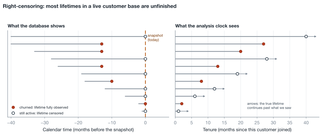
Censoring is the entire difficulty, and it is worth seeing concretely why the two tempting shortcuts fail before building the estimator that does not.
Shortcut 1: analyze only churned customers. Compute lifetimes for customers who actually churned and average those. The problem: at any snapshot, the customers who have already churned are disproportionately the short-lived ones, while the long-lived are mostly still active and therefore excluded. You are averaging over a sample selected for dying early.
Shortcut 2: treat every record’s end as a churn. Use each customer’s observed tenure and pretend all of them ended in churn. Now a loyal customer who joined four months ago is recorded as a four-month lifetime, and the estimate drowns in fictional early exits.
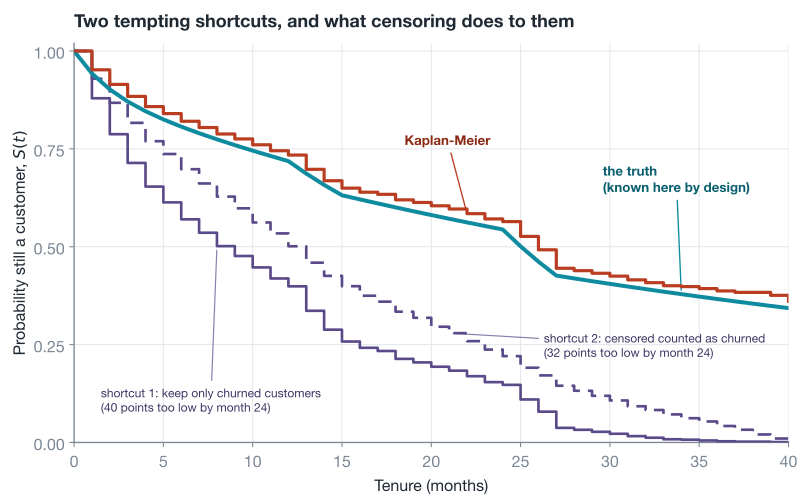
Both shortcuts are biased in the same direction, toward pessimism about survival, and the size of the bias grows with the fraction of the base that is censored, which for a healthy business is most of it (60% of our simulated base is still active). Any downstream CLV built on them undervalues customers dramatically. The fix is not a correction factor; it is a different way of composing the estimate.
The survival toolkit: two functions, one identity
Let \(T\) be a customer’s lifetime in whole months, a random variable. Two functions describe it, and the whole method rests on the relationship between them.
The survival function is the headline object, the probability of lasting beyond \(t\) months:
\[S(t) = P(T > t)\]It starts at \(S(0) = 1\), never increases, and its value at each tenure is exactly the “probability still a customer” your CLV needs.
The hazard is the local risk: the probability of churning in month \(t\) given survival up to its start,
\[h(t) = P(T = t \mid T \ge t)\]This conditional framing looks like a technicality and is actually the entire trick. Hazards are what businesses intuitively track (“what fraction of month-13 customers cancel during month 13?”), they are where the mechanism lives (onboarding friction shows up as high early hazard, contract expiries as spikes at months 13 and 25), and, crucially, each one can be estimated from whichever customers happen to be observable at that age.
The identity connecting them: surviving past month \(t\) means surviving month 1, then surviving month 2 given that, and so on. Formally, the event \(\{T > t\}\) is contained in \(\{T > t-1\}\), which is contained in \(\{T > t-2\}\), so the chain rule of conditional probability unrolls telescopically:
\[\begin{aligned} S(t) &= P(T > 1)\; P(T > 2 \mid T > 1) \cdots P(T > t \mid T > t-1) && \textcolor{#7b8794}{\small\text{chain rule over nested events}} \\[4pt] &= \prod_{u=1}^{t} P(T > u \mid T \ge u) && \textcolor{#7b8794}{\small\text{for integer lifetimes, } T > u-1 \text{ and } T \ge u \text{ are the same event}} \\[4pt] &= \prod_{u=1}^{t} \big(1 - h(u)\big) && \textcolor{#7b8794}{\small\text{each factor is one month's conditional survival}} \end{aligned}\]Survival is a product of one-month conditional survivals. Estimate the hazards and the curve follows.
The Kaplan-Meier estimator
Estimating one hazard
Fix a month \(u\) and ask: of the customers we could actually watch during their \(u\)-th month, what fraction churned? Two counts define the answer. The risk set size \(n_u\) is the number of customers still under observation and still active as month \(u\) begins, meaning neither churned nor censored earlier. The event count \(d_u\) is how many of those \(n_u\) churned during month \(u\). The natural estimate is
\[\hat{h}(u) = \frac{d_u}{n_u}\]and this is not just natural but the maximum likelihood estimate. Conditional on being at risk, each of the \(n_u\) customers either churns that month (probability \(h_u\)) or does not, independently, so the month’s evidence about \(h_u\) is a binomial experiment with likelihood \(L(h_u) = h_u^{\,d_u} (1 - h_u)^{\,n_u - d_u}\), and maximizing it gives the sample fraction (tool 1 in the appendix does the two-line calculus). The full likelihood of the whole censored dataset factorizes into one such term per month, with each customer appearing in exactly the months they were observed, which is the formal sense in which the estimator wastes nothing: a customer censored at month 9 contributed their presence to \(n_1, \dots, n_9\) and then stopped making claims about months they were not seen in.
Plugging the estimated hazards into the product identity gives the Kaplan-Meier estimator, also called the product-limit estimator:
\[\hat{S}(t) = \prod_{i:\; t_i \le t} \left( 1 - \frac{d_i}{n_i} \right)\]where the product runs over the observed event times \(t_i\) up to \(t\) (months with no churn contribute a factor of exactly 1, so only event times matter). Between events the curve is flat; at each event it steps down by the factor above. Censored customers never trigger a step. Their only effect is to quietly leave the risk set, shrinking the \(n_i\) of every later factor.
The estimator by hand
Formulas earn trust by being executed once at small scale. Take twelve customers: six churned, at months 3, 5, 5, 9, 13, and 17; six censored, at months 2, 7, 11, 15, 19, and 20. Walking the event times:
| event time \(t_i\) | at risk \(n_i\) | churned \(d_i\) | factor \(1 - d_i/n_i\) | \(\hat{S}(t_i)\) |
|---|---|---|---|---|
| 3 | 11 | 1 | 10/11 | 0.909 |
| 5 | 10 | 2 | 8/10 | 0.727 |
| 9 | 7 | 1 | 6/7 | 0.623 |
| 13 | 5 | 1 | 4/5 | 0.499 |
| 17 | 3 | 1 | 2/3 | 0.332 |
Read one row closely to see censoring at work. At month 3, only 11 customers are at risk, not 12, because the customer censored at month 2 has already left our view; one of the 11 churns, so the curve drops to 10/11. By month 9 the risk set is down to 7: the two censored at 2 and 7 have exited silently, the three churners at 3, 5, 5 loudly. Every factor is an honest fraction over exactly the customers we could see at that age. One bookkeeping convention to know when reproducing tables like this: a customer censored in the same month as an event still counts in that month’s risk set, censoring being treated as happening just after the month’s events, which is the convention lifelines and every standard implementation follow.
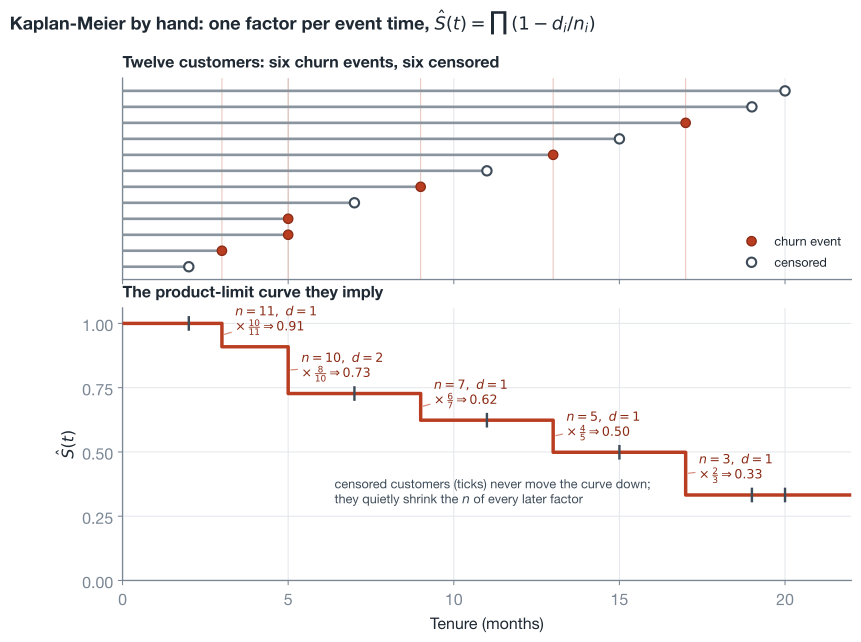
This is the same calculation the original 1958 Kaplan and Meier paper proposed, and it remains one of the most cited statistics papers ever written, because the idea generalizes far beyond customers: patients in clinical trials, machine components, loan defaults, anywhere lifetimes meet an observation boundary.
What the estimator assumes
Four assumptions do the load-bearing work, and each one fails in a specific, checkable way.
- The event and its timing are unambiguous. “Churn” needs a clean definition and date. Contractual businesses mostly have one; usage-based businesses have to draw a line (say, 60 days inactive) and should check the conclusions are not sensitive to where the line sits.
- Censoring is non-informative. Customers censored at tenure \(t\) must face the same future risk as uncensored customers at tenure \(t\). Administrative censoring at a snapshot date is usually harmless. What is not: censoring that correlates with risk, for instance excluding customers mid-way through a save-desk intervention, or losing a risky segment in a data migration. If being censored predicts what would have happened next, every factor after that point is estimated on a distorted risk set.
- No calendar drift within the sample. The estimator pools everyone by tenure regardless of join date, implicitly assuming a customer’s survival prospects do not depend on when they joined. Price rises, competitor launches, and product changes violate this. The practical check is to fit the curve per acquisition-year cohort and look for divergence; the practical fix is stratification, which we get to shortly.
- The output is a step function over the observed window. The curve is defined up to the largest observed tenure and says nothing beyond it, and it has no covariates: it describes a population, not an individual. Both limits have proper escape routes, covered at the end of the post.
How wrong could the curve be? Greenwood’s formula
A curve fitted from finite data needs an error bar, and this one has a classical closed form. The derivation is a nice showcase of two workhorse moves, turning a product into a sum, and pushing variance through a function with the delta method, so it is worth the half page. (As in previous posts, every probability fact these derivations lean on is stated and proved in the appendix toolbox; nothing rests on an unproven “it can be shown”.)
Products are awkward to analyze; logarithms turn them into sums:
\[\log \hat{S}(t) = \sum_{i:\; t_i \le t} \log\big(1 - \hat{h}_i\big)\]The estimated hazards at different event times are uncorrelated, because each is a fresh conditional experiment on its own risk set (rigorously an appeal to martingale theory, but the intuition is exactly that), so the variance of the sum is the sum of the variances, and each term yields to the delta method (tool 2: for a function of a noisy quantity, \(\mathrm{Var}\,g(X) \approx g'(\mu)^2\, \mathrm{Var}(X)\)):
\[\begin{aligned} \mathrm{Var}\big[\log(1 - \hat{h}_i)\big] &\approx \frac{\mathrm{Var}(\hat{h}_i)}{(1 - h_i)^2} && \textcolor{#7b8794}{\small\text{delta method with } g(x) = \log(1-x),\ g'(x)^2 = (1-x)^{-2}} \\[4pt] &= \frac{h_i (1 - h_i) / n_i}{(1 - h_i)^2} = \frac{h_i}{n_i (1 - h_i)} && \textcolor{#7b8794}{\small\text{variance of a binomial proportion is } p(1-p)/n} \\[4pt] \widehat{\mathrm{Var}}\big[\log \hat{S}(t)\big] &= \sum_{i:\; t_i \le t} \frac{d_i}{n_i (n_i - d_i)} && \textcolor{#7b8794}{\small\text{sum the terms and plug in } \hat{h}_i = d_i / n_i} \end{aligned}\]One more delta-method step (this time through \(g(x) = e^x\)) carries the variance back to the survival scale, giving Greenwood’s formula:
\[\widehat{\mathrm{Var}}\big[\hat{S}(t)\big] \;\approx\; \hat{S}(t)^2 \sum_{i:\; t_i \le t} \frac{d_i}{n_i (n_i - d_i)}\]Read the summand as a running record of how much each event time taught us: months where the risk set \(n_i\) was large contribute almost nothing to the uncertainty, months where it was thin contribute a lot. A naive interval of \(\hat{S} \pm 1.96\,\widehat{\mathrm{se}}\) can escape \([0, 1]\), so software (lifelines included) builds the interval on the doubly-logged scale, where the quantity \(\log(-\log \hat{S})\) is unconstrained, and maps back, producing the asymmetric band \(\hat{S}(t)^{\exp(\pm 1.96\, \widehat{\mathrm{se}}_{\theta})}\) with \(\widehat{\mathrm{se}}_{\theta}\) the Greenwood sum’s square root divided by \(\lvert \log \hat{S}(t) \rvert\).
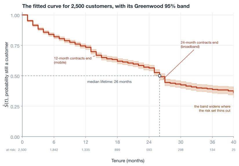
Two reading habits are worth building. First, always plot the band; a survival curve without one invites overconfident decisions in exactly the tail region where the data is thinnest. Second, report the median lifetime (first \(t\) with \(\hat{S}(t) \le 0.5\), here 26 months) rather than the mean when summarizing, because the mean is undefined until the curve reaches zero, and ours, like most customer curves, does not.
Building the dataset from a real customer base
Everything the estimator needs is two columns, plus any features you want to stratify by:
| snapshot_date | id | product | acquisition_date | churn_date | tenure | churned |
|---|---|---|---|---|---|---|
| 2024-05-28 | 1234 | broadband | 2017-01-12 | NULL | 88 | 0 |
| 2024-05-28 | 2345 | broadband | 2021-12-09 | NULL | 29 | 0 |
| 2024-05-28 | 3456 | mobile | 2021-12-12 | NULL | 29 | 0 |
| 2024-05-28 | 5678 | mobile | 2021-12-13 | 2023-12-13 | 24 | 1 |
tenure is months from acquisition to churn (if churned) or to the snapshot (if not); churned is the event flag, with 0 marking a censored record. In pandas:
import pandas as pd

snapshot = pd.Timestamp("2024-05-28")
base = pd.read_parquet("customer_base.parquet")  # one row per customer

end = base["churn_date"].fillna(snapshot)
base["tenure"] = (
    (end.dt.year - base["acquisition_date"].dt.year) * 12
    + (end.dt.month - base["acquisition_date"].dt.month)
).clip(lower=1)
base["churned"] = base["churn_date"].notna().astype(int)
Warning, survivorship bias: the one data bug that silently ruins survival curves. Suppose your reliable churn history starts in January 2021, but the base contains customers acquired in 2017. The 2017 joiners you can see today are, by construction, the ones who survived at least four years; their cohort-mates who churned in 2018 never enter your extract. Include them and the left side of your curve is estimated partly from a sample of certified survivors, so the whole curve comes out flattering. The clean fix is one filter, keep only customers acquired after your history begins:
base = base[base["acquisition_date"] >= pd.Timestamp("2021-01-01")]The statistical name for the situation is left truncation, and if discarding the old cohorts hurts too much, lifelines supports the proper correction via the
entryargument tofit, which tells the estimator each customer’s delayed entry into observation so they join the risk sets late instead of poisoning the early ones.
Fitting it in Python
The lifelines library is the standard Python home for this. Fitting is three lines; the objects it returns are the survival function, the Greenwood band, and the summaries we have been deriving:
from lifelines import KaplanMeierFitter

kmf = KaplanMeierFitter()
kmf.fit(df["tenure"], event_observed=df["churned"], label="all customers")

kmf.median_survival_time_                 # 26.0 months
kmf.survival_function_at_times([12, 24, 36])
# 12    0.734
# 24    0.564
# 36    0.387

ax = kmf.plot_survival_function()         # step curve + Greenwood band
Those are the exact numbers in the figures above: a new customer has a 73% chance of reaching one year, 56% of reaching two, and a median lifetime of 26 months. If you want to reproduce everything locally, the block below generates the simulated base used throughout this post; on real data, the shaping snippet from the previous section replaces it.
The simulated customer base (click to expand)
Each product has a monthly hazard with fading onboarding churn plus a spike when its contract term ends. Lifetimes are drawn by inverting the survival function; staggered acquisition over 40 months provides the censoring.
import numpy as np
import pandas as pd

def monthly_hazard(product: str, horizon: int = 120) -> np.ndarray:
    """Monthly churn hazard h(t) = P(churn in month t | still active at its start)."""
    t = np.arange(1, horizon + 1)
    if product == "broadband":
        h = 0.012 + 0.035 * np.exp(-(t - 1) / 2.5)   # onboarding churn fades
        h[(t >= 25) & (t <= 27)] += 0.085            # 24-month contracts end
    else:  # mobile
        h = 0.028 + 0.045 * np.exp(-(t - 1) / 2.0)
        h[(t >= 13) & (t <= 15)] += 0.075            # 12-month contracts end
    return h

def simulate_customers(n: int = 2500, seed: int = 42) -> pd.DataFrame:
    """A subscription base observed at one snapshot: staggered acquisition
    over the last 40 months, so most true lifetimes are right-censored."""
    rng = np.random.default_rng(seed)
    product = rng.choice(["broadband", "mobile"], size=n, p=[0.6, 0.4])
    observed_for = rng.integers(1, 41, size=n)       # months on book at the snapshot
    lifetime = np.zeros(n, dtype=int)
    for prod in ["broadband", "mobile"]:
        mask = product == prod
        surv = np.concatenate([[1.0], np.cumprod(1 - monthly_hazard(prod))])
        u = rng.uniform(size=mask.sum())
        t = (surv[None, :] < u[:, None]).argmax(axis=1)   # first t with S(t) < u
        lifetime[mask] = np.where(u < surv[-1], len(surv), t)
    return pd.DataFrame({
        "product": product,
        "tenure": np.minimum(lifetime, observed_for),     # what we can see
        "churned": (lifetime <= observed_for).astype(int),
        "observed_for": observed_for,
    })

df = simulate_customers()
Stratify before you average
The pooled curve above is an average over two genuinely different populations, and averages of survival curves can mislead: our pooled curve shows two mysterious accelerations that belong to different products’ contract expiries. Fitting per segment is the same three lines inside a loop, and comparing segments has its own classical significance test, the log-rank test, which asks whether the observed churn events split between two groups the way chance would split them if both shared one survival curve. It compares each group’s observed events against its expected share at every event time, then aggregates; tool 4 in the appendix builds the statistic from scratch.
from lifelines import KaplanMeierFitter
from lifelines.statistics import logrank_test

for product, sub in df.groupby("product"):
    KaplanMeierFitter().fit(
        sub["tenure"], event_observed=sub["churned"], label=product,
    ).plot_survival_function()

bb, mob = (df[df["product"] == p] for p in ["broadband", "mobile"])
result = logrank_test(bb["tenure"], mob["tenure"],
                      bb["churned"], mob["churned"])
result.test_statistic, result.p_value    # (174.7, 7.0e-40)
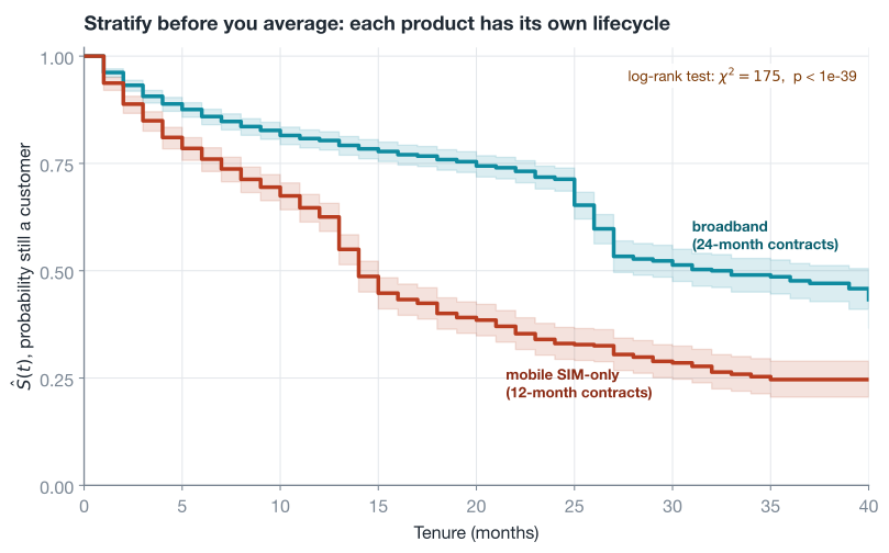
The medians are 32 months for broadband against 14 for mobile, a gap the pooled median of 26 conceals entirely, and any CLV, audience valuation, or payback calculation that uses the pooled curve will overvalue mobile customers and undervalue broadband ones. In practice you stratify on the few features that plausibly shift the lifecycle (product, plan tier, acquisition channel), fit one curve per combination, and at scoring time look up each customer’s curve by matching those same features.
Tip: stratification spends data fast; ten binary features would mean 1,024 cells, most with risk sets too thin for a trustworthy curve (Greenwood will tell you, via bands wide enough to be useless). Keep strata few and coarse. When you genuinely need many segments, the right tools are models that share strength across groups instead of fitting each alone, in the same spirit as the partial pooling of the mixed effects post, with survival-specific options in the final section.
From survival curve to customer lifetime value
The curve is fitted; now the payoff. The bridge between survival probabilities and expected lifetimes is a small identity worth knowing on its own: for a non-negative integer lifetime, the expected value is the sum of the survival curve,
\[\mathbb{E}[T] \;=\; \sum_{t=0}^{\infty} S(t)\]that is, the area under the curve (tool 3 derives it in three lines by swapping a double sum). The intuition is lovely: a customer’s lifetime is a sum of month-indicators, one per month they survive into, and each indicator’s expected value is exactly a point on the survival curve, so summing the curve sums the expected months.
CLV upgrades this identity twice. First, weight each month by the margin \(m\) it generates. Second, discount: a dollar of margin twelve months out is worth less than one today, by the monthly factor \(\delta = (1 + r)^{-1/12}\) for an annual discount rate \(r\). Together, over a planning horizon of \(H\) months:
\[\mathrm{CLV}_H \;=\; \sum_{t=1}^{H} m \cdot \hat{S}(t) \cdot \delta^{\,t}\]margin, damped by the probability the customer is still there to pay it, damped by the time value of money. The horizon matters for honesty: the fitted curve only exists out to the largest observed tenure (40 months here), so we compute a 36-month CLV rather than pretend to know the far tail. What this truncated sum estimates is, in survival-analysis terms, a discounted restricted mean lifetime, and treating it as a floor rather than the whole story is the defensible move.
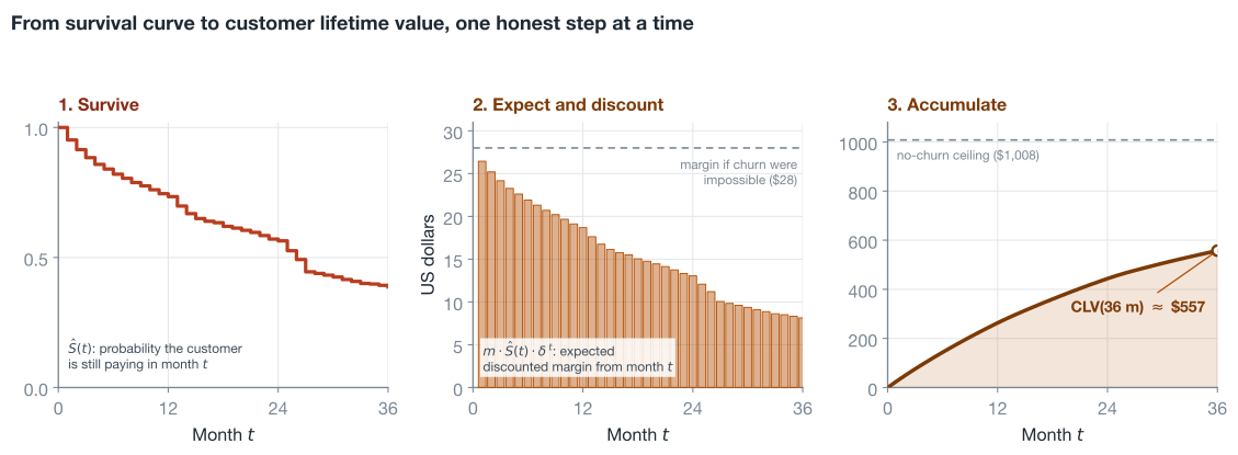
In code, working directly from the fitted lifelines object:
import numpy as np

def clv_from_km(kmf, margin=28.0, annual_discount=0.10, horizon=36):
    """Expected discounted margin over the next `horizon` months, new customer."""
    delta = (1 + annual_discount) ** (-1 / 12)
    t = np.arange(1, horizon + 1)
    s = kmf.survival_function_at_times(t).to_numpy()
    return float((margin * s * delta ** t).sum())

clv_from_km(kmf)    # 557.30
A new customer is worth about \$557 over three years, 55% of the \$1,008 a churn-free customer would deliver. Run per stratum instead of pooled and the gap from the previous section becomes money: the broadband curve prices its customers far above the mobile curve, which is exactly the input acquisition budgeting needs.
One refinement makes this serviceable for the base you already own, not just for new acquisitions. An existing customer at tenure 12 is not a fresh draw from \(\hat{S}\); they have already survived a year, so their future is governed by the conditional survival \(P(T > 12 + k \mid T > 12) = S(12+k)/S(12)\). No new machinery hides in that equality: surviving past month \(12+k\) already implies surviving past month 12, so the intersection in the definition of conditional probability collapses and what remains is a ratio of two points on the curve you already have:
def conditional_clv(kmf, tenure_now, margin=28.0, annual_discount=0.10, horizon=24):
    """Expected discounted margin over the next `horizon` months, given
    the customer has already survived to `tenure_now`."""
    delta = (1 + annual_discount) ** (-1 / 12)
    k = np.arange(1, horizon + 1)
    s_now = float(kmf.survival_function_at_times([tenure_now]).iloc[0])
    s_future = kmf.survival_function_at_times(tenure_now + k).to_numpy()
    return float((margin * (s_future / s_now) * delta ** k).sum())

conditional_clv(kmf, tenure_now=12)    # 440.57
A customer twelve months in is worth about \$441 over their next two years.
The last step from analysis to something a team can actually use is scoring the whole base: every active customer gets a forward value from their own stratum’s curve, conditioned on their own tenure. Two production details need care, and both are handled in the function below. Vectorize the arithmetic instead of calling conditional_clv in a loop (a tenure-by-horizon matrix does every customer of a stratum at once), and never let \(t + k\) walk past the observed window, because indexing a step function beyond its last point silently extrapolates a flat curve; here those months contribute zero, keeping the score an honest floor.
def score_base(df, margin=28.0, annual_discount=0.10, horizon=24):
    """Attach a forward CLV to every active customer: expected discounted
    margin over the next `horizon` months, conditional on current tenure,
    from the customer's own stratum's curve."""
    delta = (1 + annual_discount) ** (-1 / 12)
    k = np.arange(1, horizon + 1)
    scored = df.copy()
    scored["future_clv"] = np.nan
    for _, sub in df.groupby("product"):
        kmf = KaplanMeierFitter().fit(sub["tenure"], event_observed=sub["churned"])
        t_max = int(sub["tenure"].max())
        s = kmf.survival_function_at_times(np.arange(t_max + 1)).to_numpy()
        active = sub.index[sub["churned"] == 0]
        tenure = sub.loc[active, "tenure"].to_numpy()
        future = np.minimum(tenure[:, None] + k, t_max)   # clamp to the window
        value = margin * (s[future] / s[tenure][:, None]) * delta ** k
        value[tenure[:, None] + k > t_max] = 0.0          # never extrapolate
        scored.loc[active, "future_clv"] = value.sum(axis=1)
    return scored

scored = score_base(df)
scored.loc[scored["churned"] == 0, "future_clv"].describe()
# count 1,507   mean 366.50   50% 374.66   max 518.41
That column is the deliverable: 1,507 active customers priced over their next two years (averaging \$383 for broadband against \$330 for mobile), ready to join a campaign table or a finance forecast, refreshed as easily as the curves are refitted. One honesty note carries over from the horizon discussion: for customers already near the edge of the observed window the zeroed months make the floor very loose (the longest-tenured customers here score near zero), which is the no-extrapolation limitation surfacing in production, and exactly the point at which the parametric models of the next section earn their keep.
What CLV is for
The classic consumer of these numbers is acquisition economics. Every channel has a cost of acquisition (CAC); putting each channel’s CAC against the CLV of the customers it delivers turns marketing allocation from a reach argument into an expected-value calculation.
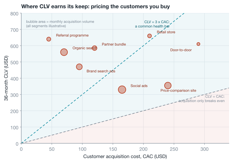
Beyond acquisition, the same per-customer forward value drives retention prioritization (a save offer worth \$50 is trivially justified against a \$441 conditional CLV, and unjustifiable for a customer whose stratum’s curve prices the next two years at \$60) and plain financial planning, since summing conditional CLV across the base is a revenue forecast with churn already priced in. Deciding which at-risk customers to intervene on, and with what, is its own discipline beyond the scope of a survival curve; the engineering retention post covers a production system built around exactly that question.
Beyond Kaplan-Meier
Kaplan-Meier is the right first tool, and knowing its edges tells you when to reach for the next one.
No covariates. The estimator describes populations, so individual-level features enter only through stratification, which runs out of data quickly. The Cox proportional hazards model is the classical continuous answer: it models each customer’s hazard as a shared baseline scaled by \(\exp(\beta^\top x)\), giving interpretable multiplicative risk factors (“each support ticket in the first month multiplies churn hazard by 1.3”) while leaving the baseline as flexible as KM itself; lifelines.CoxPHFitter has the same API shape as everything above. Alternatively, for monthly data there is a trick that reuses tools you may already have: expand each customer into one row per month survived (person-period format) and fit a logistic regression predicting the churn indicator from tenure dummies plus features; that is a discrete-time hazard model, estimating exactly the \(h(t)\) this post started from, with features.
No extrapolation. The step function ends at your largest observed tenure, and CLV beyond it requires a shape assumption. Parametric survival models (Weibull, log-normal, log-logistic; lifelines.WeibullFitter and friends) buy extrapolation by assuming a functional form, and should always be sanity-checked against the KM curve on the observed window before being trusted beyond it.
Contractual assumptions. Everything here treats churn as an observable event, which fits subscriptions. In non-contractual settings (retail, e-commerce) customers never announce their death, they just stop buying, and the right tools are latent-lifetime models like BG/NBD and Gamma-Gamma from the Fader-Hardie line of work, which infer aliveness from purchase timing.
None of this displaces the KM curve as the first artifact to produce: it is assumption-light, it is the benchmark every fancier model must reproduce on the observed window, and nine times out of ten its stratified version already answers the business question.
Conclusion
The Kaplan-Meier estimator earns its place in the customer-analytics toolkit by solving the one problem every lifetime dataset has: the customers you most want to learn from are the ones whose stories have not ended. The whole construction is three ideas snapped together, survival factorizes into conditional survivals, each conditional survival is a fraction over the customers actually observable at that age, and uncertainty propagates through the product in closed form. From the fitted curve, lifetime value is a discounted sum, conditioning on current tenure is a ratio, and segment comparisons come with a proper significance test. The derivations fit in a blog post, the implementation fits in twenty lines of lifelines, and the output is a defensible dollar value on every customer you have or might buy.
Appendix: the derivation toolbox
The four facts the derivations above lean on, each with its proof, so the post stands alone.
1. The MLE of a proportion
Claim. If \(d\) events occur among \(n\) independent trials each with probability \(h\), the likelihood \(L(h) = h^d (1-h)^{n-d}\) is maximized at \(\hat{h} = d/n\).
Proof. Work with the log-likelihood (same maximizer, easier calculus) and follow the standard recipe: differentiate, set to zero, solve.
\[\begin{aligned} \ell(h) &= d \log h + (n - d) \log(1 - h) && \textcolor{#7b8794}{\small\text{take logs: the product becomes a sum}} \\[4pt] \ell'(h) &= \frac{d}{h} - \frac{n - d}{1 - h} \;=\; 0 && \textcolor{#7b8794}{\small\text{differentiate and set to zero}} \\[4pt] d\,(1 - h) &= (n - d)\, h && \textcolor{#7b8794}{\small\text{multiply through by } h(1-h)} \\[4pt] \hat{h} &= \frac{d}{n} && \textcolor{#7b8794}{\small\text{the } dh \text{ terms cancel: events over trials}} \end{aligned}\]This critical point is a maximum because \(\ell''(h) = -d/h^2 - (n-d)/(1-h)^2\) is negative everywhere. For the variance used by Greenwood’s formula: \(\hat{h}\) is a binomial count divided by \(n\), so \(\mathrm{Var}(\hat{h}) = n h(1-h) / n^2 = h(1-h)/n\). \(\blacksquare\)
2. The delta method
Claim. If a random quantity \(X\) has mean \(\mu\) and small variance \(\sigma^2\), and \(g\) is smooth near \(\mu\), then \(g(X)\) has variance approximately \(g'(\mu)^2 \sigma^2\).
Proof (sketch). The idea: a smooth curve looks like its tangent line up close, and \(X\) stays close to \(\mu\) when \(\sigma\) is small, so replace the curve with the tangent line and read off the variance.
\[\begin{aligned} g(X) &\approx g(\mu) + g'(\mu)\,(X - \mu) && \textcolor{#7b8794}{\small\text{first-order Taylor expansion; the error is order } (X-\mu)^2 \text{, negligible when } \sigma \text{ is small}} \\[4pt] \mathrm{Var}\big[g(X)\big] &\approx \mathrm{Var}\big[\,g(\mu) + g'(\mu)\,(X - \mu)\,\big] && \textcolor{#7b8794}{\small\text{take the variance of both sides}} \\[4pt] &= g'(\mu)^2\; \mathrm{Var}(X) && \textcolor{#7b8794}{\small\text{added constants do not move variance; scaling by } c \text{ scales it by } c^2} \end{aligned}\]Greenwood’s formula uses this twice. First with \(g(x) = \log(1-x)\), whose derivative gives the factor \(g'(x)^2 = (1-x)^{-2}\). Then with \(g(x) = e^x\) to come back from the log scale: evaluated at \(x = \log S\), the factor is \(g'(\log S)^2 = (e^{\log S})^2 = S^2\), which is where the leading \(\hat{S}(t)^2\) comes from. \(\blacksquare\)
3. The tail-sum formula for expectations
Claim. For a random lifetime \(T\) taking values in the non-negative integers, \(\mathbb{E}[T] = \sum_{s=1}^{\infty} P(T \ge s) = \sum_{t=0}^{\infty} S(t)\).
Proof. The trick is to stop counting how long the lifetime is and instead count which months it reaches: a lifetime of 3 reaches months 1, 2, and 3, so it is a sum of three indicator variables. In general,
\[\begin{aligned} T &= \sum_{s=1}^{\infty} \mathbf{1}\{T \ge s\} && \textcolor{#7b8794}{\small\text{one indicator per month reached; exactly } T \text{ of them equal } 1} \\[4pt] \mathbb{E}[T] &= \sum_{s=1}^{\infty} \mathbb{E}\big[\mathbf{1}\{T \ge s\}\big] && \textcolor{#7b8794}{\small\text{expectation and sum swap safely: every term is non-negative}} \\[4pt] &= \sum_{s=1}^{\infty} P(T \ge s) && \textcolor{#7b8794}{\small\text{the expected value of an indicator is the probability of its event}} \\[4pt] &= \sum_{s=1}^{\infty} S(s - 1) \;=\; \sum_{t=0}^{\infty} S(t) && \textcolor{#7b8794}{\small\text{for integer } T,\ \{T \ge s\} = \{T > s-1\} \text{; re-index with } t = s - 1} \end{aligned}\]Truncating the sum at a horizon \(H\) gives the expected value of the capped lifetime \(\min(T, H)\), the restricted mean the CLV section computes. \(\blacksquare\)
4. The log-rank statistic
Claim. Suppose two groups truly share one survival curve (the null hypothesis). At each event time \(t_i\) let the risk set hold \(n_i\) customers, \(n_{1i}\) of them from group 1, and let \(d_i\) events occur, \(d_{1i}\) of them in group 1. Then
\[\chi^2 \;=\; \frac{\Big( \sum_i \big( d_{1i} - \mathbb{E}[d_{1i}] \big) \Big)^2}{\sum_i \mathrm{Var}(d_{1i})}\]follows approximately a chi-squared distribution with 1 degree of freedom, and large values are evidence against the shared curve.
Proof (sketch). The whole construction is one observation: under the null, group labels carry no risk information, so which \(d_{1i}\) of the month’s \(d_i\) events land in group 1 is pure chance, a draw of \(d_i\) customers without replacement from an urn holding \(n_{1i}\) group-1 members among \(n_i\). That makes \(d_{1i}\) hypergeometric, with known mean and variance:
\[\begin{aligned} \mathbb{E}[d_{1i}] &= d_i \cdot \frac{n_{1i}}{n_i} && \textcolor{#7b8794}{\small\text{group 1's fair share: its fraction of the risk set, times the events}} \\[4pt] \mathrm{Var}(d_{1i}) &= d_i \cdot \frac{n_{1i}}{n_i} \Big( 1 - \frac{n_{1i}}{n_i} \Big) \cdot \frac{n_i - d_i}{n_i - 1} && \textcolor{#7b8794}{\small\text{binomial-style spread, shrunk by a without-replacement correction}} \end{aligned}\]Now aggregate the surprise. Each month’s discrepancy \(d_{1i} - \mathbb{E}[d_{1i}]\) has mean zero under the null, and discrepancies at different event times are uncorrelated for the same reason the Greenwood terms were: each is a fresh conditional experiment on its own risk set. So the summed discrepancy has mean zero and variance \(\sum_i \mathrm{Var}(d_{1i})\), the central limit theorem makes the standardized sum approximately standard normal, and squaring a standard normal gives a chi-squared with 1 degree of freedom. On our simulated base the observed value of 174.7 sits absurdly far into the tail of that distribution, hence the \(p\)-value of \(10^{-40}\). \(\blacksquare\)
Resources
- Kaplan & Meier (1958), “Nonparametric Estimation from Incomplete Observations”
- The original paper, and still readable: the product-limit construction arrives on the second page.
- lifelines documentation, “Introduction to survival analysis”
- The library used throughout this post; the docs double as a well-written course, covering Kaplan-Meier, Cox, and the parametric fitters.
- Rich et al. (2010), “A practical guide to understanding Kaplan-Meier curves”
- A short clinician-oriented walkthrough of reading the curves, censoring ticks, and risk tables; the conventions transfer to customer data unchanged.
- Fader & Hardie, “Probability Models for Customer-Base Analysis”
- The canonical line of work for the non-contractual setting (BG/NBD and friends) mentioned in the final section.