
Two models forecast daily demand for a bakery. Model A has the better RMSE. Model B makes the bakery more money, every single week. If that sentence sounds impossible, this post is for you: the evaluation metric you pick is not a scorecard bolted on after training, it is the specification your whole modelling effort ends up satisfying. Kaggle grandmasters internalise this to the point that studying the competition metric is their first act in any competition, and the habit transfers directly to real projects, where the difference between a metric that encodes what the business actually loses and one that merely sounds standard can make or break the use case.
Table of Contents
- TL;DR
- Every metric is an opinion
- The common metrics, and where each one lies
- Worked example: a metric with a croissant-shaped hole in it
- When you can’t train on the metric
- Designing your own metric: a field checklist
- Sources & further reading
TL;DR
Every metric is an opinion: about which errors hurt most, and about which virtues, like ranking well or stating honest probabilities, deserve credit. The common metrics (RMSE, MAE, accuracy, F1, log loss, AUC) each encode a different opinion, and each has known situations where it quietly rewards the wrong model. When no standard metric matches your problem, derive one from the costs of the decisions the model powers; a worked bakery example below turns a 4:1 stockout-to-waste cost ratio into a quantile metric, and a model trained on it beats the RMSE-trained model by about 19% on cost while losing on RMSE. Finally, since models train on a loss rather than the metric, you need alignment tricks from the Kaggle playbook: matching or custom objectives, target transforms, tuning on the metric, threshold optimisation, and probability calibration.
Every metric is an opinion
A model does not know what you want. It knows what you measure. The training loss tells the optimiser which errors to shrink, and the evaluation metric tells you which model to ship, which experiment to keep, and which idea to abandon. Choose a metric that shrugs at the errors your business bleeds from, and you will iterate for months in a direction that feels like progress and isn’t.
The Kaggle world makes this brutally concrete because the metric is the entire game: submissions are ranked by one number, so top competitors treat the metric as the first object of study, not an afterthought. The pattern shows up across the strongest public writeups: implement the metric from scratch, probe it with constant baselines, simulate how it reacts to different error types, and only then start modelling.1 By one Meta Kaggle analysis, two out of three recent competitions used a metric that appears in no other competition,2 so this “interrogate the metric” skill is rehearsed constantly, and it is exactly the skill you need at work, where the metric is always one nobody has met before.
The common metrics, and where each one lies
You should be able to sketch this table from memory, because the last two columns are the whole point: no metric is neutral.
| Metric | Rewards | Where it lies to you |
|---|---|---|
| RMSE | predicting the conditional mean | outliers dominate; a few weird days steer the whole model |
| MAE | predicting the conditional median | ignores how big the rare disasters are |
| RMSLE | getting the scale/ratio right | systematically under-predicts large values (often intended!) |
| Accuracy | matching labels | useless under imbalance: 95% negatives makes “always no” 95% accurate |
| Precision / Recall | avoiding false alarms / avoiding misses | each is trivially maxed by sacrificing the other |
| F1 | balancing the two | silently assumes false positives and false negatives cost the same |
| Log loss | honest probabilities | punishes overconfidence savagely; one confident wrong answer wrecks the score |
| ROC AUC | ranking positives above negatives | looks healthy under heavy imbalance even when precision is terrible |
| PR AUC | ranking, judged on the rare class | noisier; harder to compare across datasets with different base rates |
| Quadratic weighted kappa | ordinal agreement beyond chance | depends on your prediction distribution, so it invites distribution-matching games |
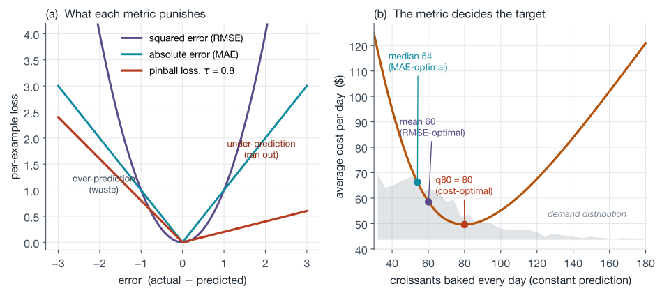
Three of these lies are worth internalising as reflexes. First, accuracy under imbalance: it is the most-quoted number in ML and the least informative one on rare-event problems. Second, ROC AUC under imbalance: because the false-positive rate divides by the huge negative class, a model can score an impressive-looking AUC while flooding you with false alarms, which is why the precision-recall view is the more honest lens when positives are rare.3 Third, the mean-versus-median split between RMSE and MAE: they are not two flavours of the same thing, they aim your model at genuinely different targets, as the figure in the next section shows. For ranking and recommendation metrics (NDCG, MAP@K, MRR), which have their own subtleties, see the evaluation section of the learning-to-rank post.
Notice, too, that the table mixes two species. RMSE and log loss are error functions, where lower is better; ROC AUC, F1, and kappa are scores, where higher is better, rewarding a property of the prediction set as a whole (ranking quality, agreement beyond chance) rather than the size of any single miss. Some scores reward things pointwise error cannot express at all: the OSIC competition’s Laplace log likelihood paid models for being honest about their own uncertainty, not just for being close.
Two more distinctions before the worked example, both about what happens when a metric meets an optimiser. The objective (loss) function is what the training algorithm minimises, and it must be smooth enough to optimise; the evaluation metric is what you score the trained model with, and it can be anything, including lumpy, discontinuous things like F1 or kappa. When the two coincide (squared loss and RMSE), life is easy. When they cannot coincide (no gradient descent on F1), you need the alignment levers covered later. And because optimisers minimise, a metric’s direction has to travel with it wherever it meets one: a higher-is-better score enters as its negative or via an explicit flag, which is exactly why scikit-learn’s make_scorer forces you to declare greater_is_better rather than guessing.
Worked example: a metric with a croissant-shaped hole in it
A bakery bakes croissants every morning and needs a daily demand forecast. Unsold croissants are written off at a cost of \$1 each. But when the bakery runs out, each croissant of unmet demand costs \$4 in lost margin and annoyed regulars. That 4:1 asymmetry is the problem statement, and no symmetric metric can represent it.
So we design the metric from the decision. The model’s prediction is “how many to bake”, and the cost of a day is:
\[\text{cost}(p, d) = 4 \cdot \max(d - p, 0) + 1 \cdot \max(p - d, 0)\]where \(p\) is the prediction and \(d\) the realised demand. Our evaluation metric is simply the average of this over days: average dollars lost per day. It is interpretable to the owner, it has the right asymmetry, and a classic result makes it tractable: the prediction minimising this expected cost is not the mean or the median of the demand distribution but its quantile at
\[\tau = \frac{c_{\text{under}}}{c_{\text{under}} + c_{\text{over}}} = \frac{4}{4+1} = 0.8\]so the optimal policy deliberately over-bakes, holding stock at the 80th percentile of demand. The intuition: keep adding a croissant to the plan as long as the chance it sells, times the \$4 saved, beats the \$1 risk of it going stale, and that break-even lands exactly where the chance of selling drops to 20%.4 The per-example loss whose minimiser is exactly that quantile is the pinball loss (also called quantile loss), which charges \(\tau \cdot \lvert e \rvert\) for under-prediction and \((1-\tau)\cdot \lvert e \rvert\) for over-prediction. This is the same machinery the M5 Uncertainty forecasting competition built its metric from, scaled and dollar-weighted across thousands of Walmart series.5
To see how much this matters, simulate 2,000 days of right-skewed demand (lognormal, as retail demand tends to be) and ask: if you had to commit to one constant bake quantity, what does each metric tell you to do? The RMSE-optimal constant is the mean, 60 croissants, costing \$58.52 per day. The MAE-optimal constant is the median, 54, costing \$66.28 per day. The cost-optimal constant found by brute-force grid search is 80, exactly the 0.8 quantile, costing \$49.60 per day: 15.2% cheaper than the mean and the metric said so before any model was trained.
The punchline arrives when you train real models. Give a gradient boosting model two features the bakery actually has (day of week and a weather index) and train it twice: once with the default squared-error objective, once with the quantile objective at \(\tau = 0.8\), which LightGBM ships out of the box:
import numpy as np
import lightgbm as lgb

rng = np.random.default_rng(0)
n = 3000

# two features the bakery actually has: day of week and a weather index
dow = rng.integers(0, 7, n)                    # 0=Mon ... 6=Sun
weather = rng.normal(0, 1, n)                  # sunny > 0, rainy < 0
log_mu = 3.7 + 0.35 * (dow >= 5) + 0.12 * weather
demand = np.round(np.exp(rng.normal(log_mu, 0.45)))

X = np.column_stack([dow, weather])
train, test = np.arange(n) < 2400, np.arange(n) >= 2400

def daily_cost(pred, actual, c_under=4.0, c_over=1.0):
    short = np.maximum(actual - pred, 0)
    waste = np.maximum(pred - actual, 0)
    return np.mean(c_under * short + c_over * waste)

params = dict(n_estimators=300, learning_rate=0.05, num_leaves=15, verbose=-1)
m_l2 = lgb.LGBMRegressor(objective="regression", **params)
m_q  = lgb.LGBMRegressor(objective="quantile", alpha=0.8, **params)
m_l2.fit(X[train], demand[train])
m_q.fit(X[train], demand[train])

p_l2 = m_l2.predict(X[test])
p_q = m_q.predict(X[test])
print(f"RMSE   model: RMSE {np.sqrt(np.mean((p_l2 - demand[test])**2)):5.1f}, cost ${daily_cost(p_l2, demand[test]):.2f}/day")
print(f"tau=.8 model: RMSE {np.sqrt(np.mean((p_q - demand[test])**2)):5.1f}, cost ${daily_cost(p_q, demand[test]):.2f}/day")

# RMSE   model: RMSE  25.4, cost $48.18/day
# tau=.8 model: RMSE  29.6, cost $39.05/day
The quantile model is worse on RMSE by a wide margin and about 19% better on the metric that pays the rent. If the team had standardised on RMSE dashboards, the better business model would have looked like a step backwards and been reverted. That is the whole thesis of this post in two printed lines.
Reproduce the bakery cost curve (numpy only)
Generates the 2,000 simulated days behind panel (b) of the figure and prints the cost of each candidate constant prediction. Same seed and draw order as the figure, so the numbers match exactly.
import numpy as np

C_UNDER = 4.0   # margin lost per croissant short (stockout)
C_OVER = 1.0    # cost per croissant wasted (baked but unsold)
TAU = C_UNDER / (C_UNDER + C_OVER)  # 0.8


def simulate_demand(n_days=2000, seed=42):
    """Right-skewed daily demand: lognormal, rounded to whole croissants."""
    rng = np.random.default_rng(seed)
    demand = rng.lognormal(mean=4.0, sigma=0.5, size=n_days)
    return np.round(demand)


def avg_daily_cost(pred, demand):
    """Average daily cost of always baking `pred` croissants."""
    short = np.maximum(demand - pred, 0.0)   # unmet demand
    waste = np.maximum(pred - demand, 0.0)   # unsold stock
    return np.mean(C_UNDER * short + C_OVER * waste)


demand = simulate_demand()
grid = np.arange(30, 181)
costs = np.array([avg_daily_cost(p, demand) for p in grid])

for name, pred in [("mean", demand.mean()),
                   ("median", np.median(demand)),
                   ("0.8 quantile", np.quantile(demand, TAU))]:
    print(f"{name:>13}: bake {pred:5.1f} -> ${avg_daily_cost(pred, demand):.2f}/day")
print(f"  grid optimum: bake {grid[np.argmin(costs)]:5.0f} -> ${costs.min():.2f}/day")

#          mean: bake  60.1 -> $58.52/day
#        median: bake  54.0 -> $66.28/day
#  0.8 quantile: bake  80.0 -> $49.60/day
#  grid optimum: bake    80 -> $49.60/day
When you can’t train on the metric
The bakery got lucky: its designed metric mapped onto an objective the library already ships. Often it doesn’t, and the metric you’re judged on (F1, kappa, a business KPI) has no usable gradient. The Kaggle playbook for this gap has five levers, ordered by where they attack the pipeline: before training, during it, and after it.
1. Transform the target so a standard loss becomes your metric. The classic is RMSLE: since it is just RMSE computed on \(\log(1+y)\), training an ordinary squared-error model on np.log1p(y) and inverting with np.expm1 optimises RMSLE exactly. No custom code, one line of preprocessing.
2. Write a custom objective. Gradient boosting libraries and every deep learning framework accept custom losses; for LightGBM/XGBoost you supply a function returning the gradient and Hessian of your loss with respect to the raw prediction. Max Halford’s focal loss for LightGBM walkthrough is the best recipe I know, including the detail almost every tutorial skips: you must also set the boosting initialisation (init_score) to your loss’s optimal constant, or the model quietly converges worse. Beware losses with degenerate curvature: MAE’s second derivative is zero everywhere, which starves Newton-style split gains, and is why XGBoost only gained a native reg:absoluteerror in v1.7 via line search.
3. Tune and select on the metric even while training on a proxy. Early stopping rounds, hyperparameter search, model selection, and ensembling weights can all be driven by your true metric through a custom eval function (which is also where you tell the library whether your metric is an error or a score, e.g. the is_higher_better flag LightGBM’s custom eval functions return), even when the per-tree fitting uses log loss or squared error. This is the workhorse lever: cheap, safe, and it captures most of the gap in practice.
4. Post-process the predictions. When the metric involves a hard decision (a threshold, a rounding), fit the decision rule on validation data as its own little optimisation. Two Kaggle classics: for ordinal problems scored by quadratic weighted kappa, Abhishek Thakur’s PetFinder approach treated the problem as regression, then searched the four rounding thresholds (starting from 0.5, 1.5, 2.5, 3.5) with Nelder-Mead to maximise kappa directly, which beat classification approaches.6 And for per-order F1 in the Instacart basket competition, Faron’s expected-F1 maximiser computed the optimal number of items to predict for each order from the predicted probabilities via dynamic programming, an idea from Ye et al. (2012) that the 2nd, 4th, and 6th place teams all leaned on.7
5. Calibrate the probabilities. If the metric consumes probabilities (log loss, expected-cost decisions), remember that many models output scores that rank well but are not honest probabilities; random forests are notorious. Probability calibration, as easy as wrapping the model in CalibratedClassifierCV, was famously worth a large log-loss jump in the Otto competition, as Christophe Bourguignat’s Why Calibration Works notebook showed.
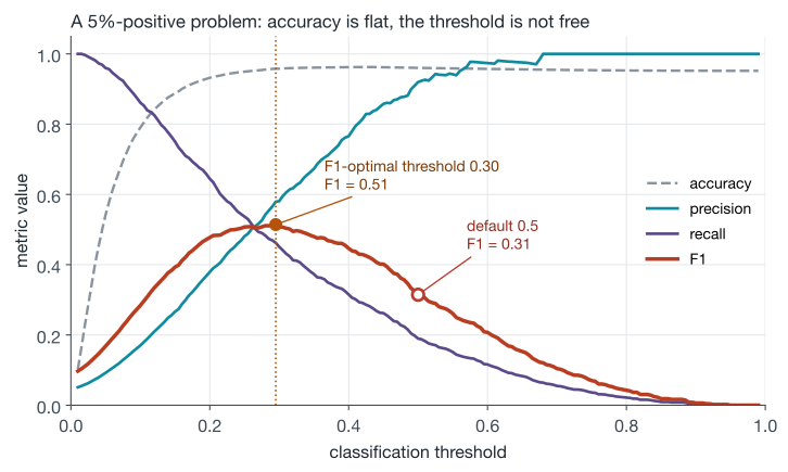
Lever 4 deserves its own picture, because the single most common version of it is also the most commonly skipped: choosing a classification threshold. Libraries default to 0.5, but on an imbalanced problem 0.5 is just a number nobody chose. Below, a simulated fraud problem with 5% positives: predicting “nobody is fraud” already scores 95.2% accuracy (the flat gray line), while sweeping the threshold shows F1 peaking at 0.51 at a threshold of 0.30, against 0.31 at the default 0.5. A three-line validation sweep bought a 20-point F1 improvement without touching the model.
Reproduce the threshold sweep (numpy only)
Generates the 20,000 simulated scores behind the figure and prints the headline numbers. Same seed and draw order as the figure.
import numpy as np

def simulate_fraud_scores(n=20000, pos_rate=0.05, seed=7):
    """Scores for a 5%-positive problem: two Gaussians on the logit scale."""
    rng = np.random.default_rng(seed)
    y = (rng.random(n) < pos_rate).astype(int)
    logit = np.where(y == 1, rng.normal(-1.0, 1.2, n), rng.normal(-3.0, 1.0, n))
    scores = 1.0 / (1.0 + np.exp(-logit))
    return y, scores

def sweep(y, scores, thresholds):
    prec, rec, f1, acc = [], [], [], []
    for t in thresholds:
        pred = (scores >= t).astype(int)
        tp = np.sum((pred == 1) & (y == 1))
        fp = np.sum((pred == 1) & (y == 0))
        fn = np.sum((pred == 0) & (y == 1))
        tn = np.sum((pred == 0) & (y == 0))
        p = tp / (tp + fp) if tp + fp else 1.0
        r = tp / (tp + fn) if tp + fn else 0.0
        prec.append(p)
        rec.append(r)
        f1.append(2 * p * r / (p + r) if p + r else 0.0)
        acc.append((tp + tn) / len(y))
    return map(np.array, (prec, rec, f1, acc))

y, scores = simulate_fraud_scores()
thresholds = np.linspace(0.01, 0.99, 197)
prec, rec, f1, acc = sweep(y, scores, thresholds)

i = int(np.argmax(f1))
print(f"accuracy of predicting nobody is positive: {np.mean(y == 0):.3f}")
print(f"F1 at default threshold 0.5: {f1[np.argmin(np.abs(thresholds - 0.5))]:.2f}")
print(f"F1 at optimal threshold {thresholds[i]:.2f}: {f1[i]:.2f}")

# accuracy of predicting nobody is positive: 0.952
# F1 at default threshold 0.5: 0.31
# F1 at optimal threshold 0.30: 0.51
Designing your own metric: a field checklist
Pulling the threads together, here is the process I’d actually follow when the standard menu doesn’t fit, whether the “competition” is on Kaggle or in a sprint review.
- Start from the decision, not the prediction. What action does the model trigger, and what does each outcome cost or earn? Sometimes what falls out is a cost to minimise, like the bakery’s dollars lost per day; sometimes it is a value to maximise, like margin captured per approved loan or agreement with expert graders. Both are legitimate metrics, so declare the direction as part of the definition, and write it in the units the business already argues about (dollars, hours, complaints). The bakery metric fell out of two sentences about croissants.
- Interrogate it like a Kaggler meeting a new metric. Implement it from scratch in a few lines of numpy, direction included, since a sign error here silently inverts every comparison downstream. Compute the best constant prediction and its score; that is your floor, and its identity (mean? median? a quantile? the base rate?) tells you what the metric secretly targets, which is exactly the exercise the bakery foldable above runs for the cost metric. Simulate error patterns (all errors small, a few errors huge, errors only on one class) and check the metric ranks those worlds the way you’d want, with better worlds on the better side of the direction you declared.
- Decide the aggregation deliberately. Micro vs macro averaging decides whether frequent classes dominate. Scaling per-series errors (as M5’s WRMSSE does) makes segments of different sizes comparable, and explicit weights encode which segments matter; M5 weighted by dollar sales precisely so the metric cared more about what earned more.
- Keep one optimising number; make the rest constraints. Andrew Ng’s framing in Machine Learning Yearning: a single-number metric lets you iterate fast, and secondary concerns like latency become satisficing thresholds (“under 100ms”) rather than terms mushed into a weighted blend nobody can interpret.
- Red-team it for gaming. Goodhart’s law, in Marilyn Strathern’s phrasing, warns that when a measure becomes a target it ceases to be a good measure.8 Ask: what degenerate model scores well here? If quadratic weighted kappa is the metric, distribution-matching tricks move the score without improving the model; if it’s precision, refusing to predict does. Every gap you find is either fixed in the metric or documented as a guardrail.
- Then, and only then, align training to it using the five levers above, remembering that optimisers minimise: a higher-is-better metric enters a custom objective as its negative, and enters tuning tools through the direction flags mentioned earlier.
- Validate the metric against reality, and expect drift. Booking.com, across roughly 150 models tested with live experiments, found essentially no correlation between offline metric gains and business value gains (Pearson correlation about −0.1), except when the offline metric almost exactly equalled the business metric.9 Netflix never productionised the Prize-winning ensemble partly because RMSE gains stopped translating into user value. Your offline metric is a proxy; the online experimentation post covers how the pre-declared OEC and its guardrail metrics take over from there.
Google’s Rules of Machine Learning compresses much of this into three rules worth pinning above your desk: design and implement your metrics before building the system (Rule #2), choose a simple, observable, attributable metric for your first objective (Rule #13), and don’t overthink which objective to directly optimise, because you’ll iterate anyway (Rule #12). The tension between #13 and #12 is intentional: measure everything, but optimise one simple thing at a time.
The bakery example is small, but the shape of the argument is universal. The metric is the spec. Write it down before you train anything, make sure it would rank a genuinely better world above a genuinely worse one, and treat “our model improved on the metric but the business didn’t move” not as bad luck but as a bug report against the metric itself.
Sources & further reading
- Rules of Machine Learning (Martin Zinkevich, Google) — Rules #2, #12, #13, and #39 are the metric-design core.
- Machine Learning Yearning (Andrew Ng) — chapters on single-number metrics and satisficing vs optimising metrics.
- Banachewicz & Massaron, The Kaggle Book (Packt) — the competition-metrics chapter surveys metric families and the Meta Kaggle dataset trick of finding past competitions that used your metric.
- Understanding the Metric: Quadratic Weighted Kappa and Spearman’s Rho (Carlo Lepelaars) — the template for interrogating an unfamiliar metric.
- OSIC: Understanding Laplace Log Likelihood (Rohan Rao) — constant baselines and simulation for a never-before-seen metric.
- How to use regression here? (Abhishek Thakur) — ordinal targets as regression plus Nelder-Mead-optimised rounding thresholds.
- F1-Score Expectation Maximization in O(n²) (Faron) — decision-theoretic F1 optimisation from Ye et al. (2012).
- Focal loss implementation for LightGBM (Max Halford) — the complete custom-objective recipe, including the init-score trap.
- Why Calibration Works (Christophe Bourguignat) — probability calibration as metric optimisation in the Otto competition.
- The Precision-Recall Plot Is More Informative than the ROC Plot (Saito & Rehmsmeier, 2015) — why ROC flatters under imbalance.
- The M5 uncertainty competition: results, findings and conclusions (Makridakis et al.) — a masterclass in bespoke metric design: scaled, weighted pinball loss.
- 150 Successful Machine Learning Models (Bernardi et al., KDD 2019) and Netflix Recommendations: Beyond the 5 stars — the offline-online gap, measured at scale.
Footnotes
-
Good exemplars: Carlo Lepelaars’ Understanding the Metric: Quadratic Weighted Kappa and Spearman’s Rho, and Rohan Rao’s OSIC: Understanding Laplace Log Likelihood, which even builds an interactive simulation of the metric’s error-versus-uncertainty tradeoff. ↩
-
Banachewicz & Massaron, The Kaggle Book, computed from the public Meta Kaggle dataset: among Featured and Research competitions, the share whose evaluation algorithm was used exactly once reached roughly two thirds by 2023. ↩
-
Saito & Rehmsmeier (2015), The Precision-Recall Plot Is More Informative than the ROC Plot When Evaluating Binary Classifiers on Imbalanced Datasets, PLOS ONE. The ROC plot’s optimistic look on imbalanced data comes from an intuitive but wrong reading of specificity. ↩
-
This is the newsvendor model from inventory theory; the critical-fractile formula \(\tau = c_u/(c_u+c_o)\) dates back to Arrow, Harris & Marschak (1951). ↩
-
The M5 Uncertainty competition scored nine quantiles per series with Weighted Scaled Pinball Loss, weighting each series by its dollar sales, so the metric literally encoded “care more about what earns more”. See Makridakis et al., “The M5 uncertainty competition”. ↩
-
Abhishek Thakur, “How to use regression here?”, PetFinder.my Adoption Prediction discussion, with the companion OptimizedRounder notebook. ↩
-
Faron’s kernel: F1-Score Expectation Maximization in O(n²), implementing Ye, Chai, Lee & Chieu (2012), Optimizing F-measures: A Tale of Two Approaches. ↩
-
The famous sentence is Strathern (1997) generalising Goodhart; Goodhart’s own 1975 version was about statistical regularities collapsing under control pressure. See the Wikipedia entry for the attribution history. ↩
-
Bernardi et al., 150 Successful Machine Learning Models: 6 Lessons Learned at Booking.com, KDD 2019. The reported Pearson correlation between offline gain and business gain was −0.1 with a wide 90% CI of (−0.45, 0.27). ↩