
Table of Contents
- TL;DR
- The question your model can’t answer
- Seeing versus doing
- Potential outcomes: causality as a missing-data problem
- The gold standard: randomize, and the bias terms die
- DAGs: drawing the assumptions you’re making anyway
- The toolkit, part 1: adjust for what you can see
- The toolkit, part 2: let the world randomize for you
- Refute before you believe
- Choosing an identification strategy
- The pitfalls that actually bite
- Where causal inference runs out
- Closing thoughts
- Appendix: the identification toolbox
- Sources and further reading
Every regression post on this blog has ended with the same disclaimer: the coefficients are associations, and reading them as “if we change this, the outcome will respond” requires causal assumptions no fitting procedure can supply. The GLM post said it, the mixed-effects post repeated it, and the retention post built a whole production system around not confusing risk concentration with intervention evidence. This post finally pays that debt. It covers what causal questions actually are and why prediction cannot answer them, the potential-outcomes machinery that makes “the effect of X on Y” a precise mathematical object, the graphs that encode your assumptions, and the working toolkit (randomization, regression adjustment, propensity weighting, double machine learning, uplift models, instrumental variables, difference-in-differences, regression discontinuity, synthetic control) with runnable Python for each, so you know not just what the methods do but when each one is the right tool.
TL;DR
- Prediction and intervention are different questions, and a model can be perfect at one while being catastrophically wrong about the other. Observing that onboarded customers spend more answers \(P(Y \mid T)\); deciding whether to push onboarding needs \(P(Y \mid do(T))\), the distribution after we intervene. No amount of data closes that gap by itself; assumptions do.
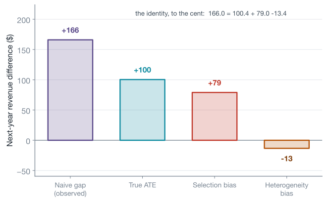
- Causal inference is a missing-data problem. Every customer has two potential outcomes, treated and untreated, and reveals exactly one. The naive treated-vs-untreated gap decomposes, exactly, into the true effect plus selection bias plus a heterogeneity term. In this post’s simulated running example the naive gap is \$166 for a true effect of \$100, and the decomposition is verified to the cent.
- Randomization is the gold standard because it deletes the bias terms, not because it is fancy. When you cannot randomize (ethics, money, spillovers, or the event already happened), you buy identification (the license to read a number causally) with assumptions instead, and the honest name for each method is the assumption it leans on.
- Draw the graph before touching the data. Association flows through forks (confounders: adjust), chains (mediators: leave alone if you want the total effect), and colliders (never adjust: conditioning on one manufactures correlation, flipping r from 0.00 to −0.65 in our simulation). “Control for everything” is not a strategy; it is a way to break your own analysis.
- The toolkit maps data circumstances to estimators. Measured confounders: regression, inverse probability weighting, double machine learning. A randomized nudge with imperfect uptake: instrumental variables. A hard eligibility threshold: regression discontinuity. A rollout that hit some units at a date: difference-in-differences or synthetic control. Each answers a subtly different question (the average effect for everyone, for the people a nudge moved, at a threshold, or on the treated group), and knowing which is most of the skill. And when the question is whom to target rather than whether the program works, uplift models estimate the effect customer by customer.
- Estimates come with refutation obligations. You can never prove unconfoundedness, but you can attack your own estimate with placebo treatments, subset checks, and sensitivity analysis, and believe it only after it survives. DoWhy turns that discipline into an API.
The question your model can’t answer
Here is the situation this post lives in. A subscription company (the same fictional one whose support teams and churn curves have run through the GLM and mixed-effects posts) offers an optional onboarding program: a specialist walks new accounts through setup. A dashboard lands on your desk showing that customers who took the onboarding call generated \$166 more revenue over the following year than customers who did not. The VP asks the natural question: “so if we push everyone into onboarding, we get \$166 a head?”
You can feel that the answer is no, and the reason is worth stating precisely, because it is the founding observation of the whole field: the customers who opted in are not the customers who didn’t. Engaged customers book onboarding calls more often, and engaged customers would have spent more anyway. The \$166 mixes the effect of the call with the pre-existing difference between the kinds of people on each side. The comparison is real, the arithmetic is correct, and the number is still the wrong answer to the VP’s question, because the VP is not asking “how do onboarded customers differ?” but “what happens if we intervene?”
Econometricians call the missing ingredient an identification strategy: the argument for why the number you computed equals the causal quantity you care about. The economist Ben Elsner opens his causal inference course with a framing worth keeping: causality is a theoretical concept that cannot be directly tested with data alone, and the methods in this post are “rhetorical devices” that establish causal claims only under assumptions you must argue for case by case. The central skill, reading or producing this kind of analysis, is to spot the identifying assumptions and ask whether you believe them. Scott Cunningham’s Mixtape sharpens the same point with a story: a sailor on a windy lake works the rudder so skillfully that the boat travels dead straight, so an observer sees zero correlation between rudder and heading and concludes the rudder is broken. Optimal, endogenous behavior erases the correlation without erasing the causation. Data alone cannot tell you the rudder works; a model of wind, rudder, and sailor can.
Seeing versus doing
Judea Pearl organizes causal questions into a three-rung ladder, and the bottom two rungs are where most confusion lives. Rung one is association: \(P(Y \mid T = 1)\), how does observing that a customer onboarded change my belief about their revenue? This is the rung every supervised model, dashboard, and correlation lives on. Rung two is intervention: \(P(Y \mid do(T = 1))\), what revenue should I expect if I make onboarding happen? The \(do\) operator (Pearl’s notation) marks the difference between filtering the data to customers who chose onboarding and reaching into the system to set onboarding, and the two distributions coincide only under conditions this post spends its middle sections earning. Rung three is the counterfactual: given that this specific customer onboarded and spent \$1,200, what would they have spent without it? That question is about an individual’s unrealized alternative, and it is the rung where “what would have happened” lives.
Association is not just a weaker version of the causal answer; it is not even a stable quantity. The classic demonstration is Simpson’s paradox, and it is worth seeing computed rather than asserted:
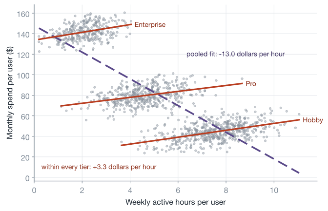
Within every plan tier, active hours and spend move together at about +3.3 dollars per hour; pool the tiers and the relationship inverts to −13 dollars per hour, purely because plan tier drives both variables. If your answer to “does engagement drive revenue?” flips sign depending on how you slice the table, the table was never going to answer the question. What resolves the paradox is not more data but a causal claim about what causes what: if tier causes both hours and spend, the within-tier slopes are the relevant ones; if instead hours determined which tier you bought, pooling would be right. The data is identical in both stories. That asymmetry, statistics indistinguishable, causal conclusions opposite, is why the field needs machinery beyond probability.
Potential outcomes: causality as a missing-data problem
The machinery starts with a definition due to Neyman and Rubin. Give every customer \(i\) two potential outcomes: \(Y_i(1)\), their next-year revenue if they take onboarding, and \(Y_i(0)\), their revenue if they do not. The individual treatment effect is the difference
\[\tau_i = Y_i(1) - Y_i(0)\]and what we actually observe is stitched together by the treatment indicator \(T_i\), via what Cunningham calls the switching equation:
\[Y_i = T_i\, Y_i(1) + (1 - T_i)\, Y_i(0)\]Each customer shows us exactly one of their two numbers and takes the other one to the grave. Holland (1986) named this the fundamental problem of causal inference: individual effects \(\tau_i\) are unobservable, not because our instruments are weak but by construction. Causal inference is therefore a missing-data problem where exactly half the cells are missing, and which half is decided by whatever process assigned treatment.
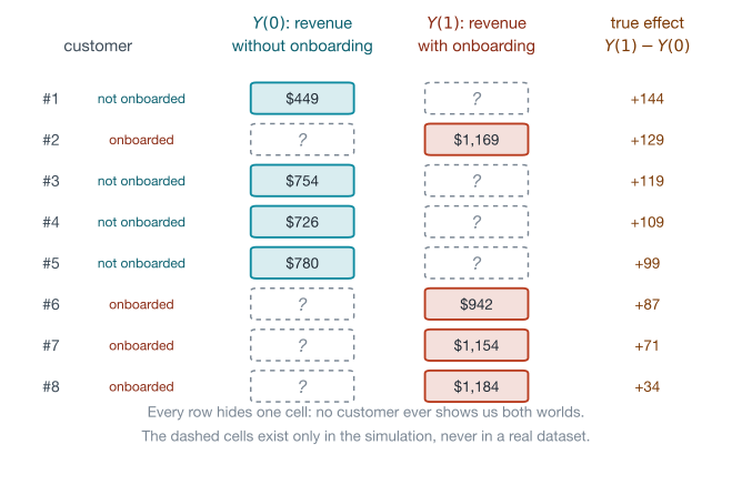
Individual effects being unobservable, the field retreats to averages, and three of them do most of the work. The average treatment effect is the population mean of the individual effects; the average treatment effect on the treated (ATT) and on the untreated (ATU) are the same mean restricted to each group; and the conditional average treatment effect (CATE) is the average among customers who share covariates \(x\):
\[\text{ATE} = \mathbb{E}[Y(1) - Y(0)], \qquad \text{ATT} = \mathbb{E}[Y(1) - Y(0) \mid T = 1], \qquad \tau(x) = \mathbb{E}[Y(1) - Y(0) \mid X = x]\]Averages are estimable in principle because expectation does not care which individuals contribute which term. But the obvious estimator, the difference between the treated group’s mean and the untreated group’s mean, is not the ATE. What it actually equals is one of the most useful identities in the field (derived line by line as tool 2 in the appendix; every derivation in this post rests on a proved tool there, nothing on an unproven “it can be shown”):
\[\underbrace{\mathbb{E}[Y \mid T{=}1] - \mathbb{E}[Y \mid T{=}0]}_{\text{the naive gap}} = \text{ATE} + \underbrace{\mathbb{E}[Y(0) \mid T{=}1] - \mathbb{E}[Y(0) \mid T{=}0]}_{\text{selection bias}} + \underbrace{(1 - \pi)(\text{ATT} - \text{ATU})}_{\text{heterogeneity bias}}\]where \(\pi\) is the treated share. Selection bias asks: would the treated group have looked different even without treatment? Heterogeneity bias asks: does treatment help the people who take it by a different amount than the people who don’t? Both terms involve counterfactual quantities, which is why no amount of staring at the observed table reveals them.
Time to make all of this concrete. The snippet below simulates the onboarding example used by every figure in this post (same seed, same draw order), and the simulation’s superpower is that it generates both potential outcomes before hiding one, so every “true” number later is exact bookkeeping rather than hand-waving. One logistics note: the code blocks in this post form a single Python session, so later snippets reuse these arrays and the imports accumulate as we go:
import numpy as np

rng = np.random.default_rng(42)
n = 4000

engagement = rng.beta(2, 5, n) * 10        # weekly active hours, skewed toward low
tenure = rng.gamma(2.0, 12.0, n)           # months since signup
seats = rng.poisson(3, n) + 1              # licensed seats on the account

# engaged customers opt into the onboarding program far more often
p_enroll = 1 / (1 + np.exp(-(-2.0 + 0.5 * engagement - 0.01 * tenure)))
onboard = rng.binomial(1, p_enroll)

# each customer's two potential outcomes: next-year revenue with and without
tau = 150 - 17.5 * engagement              # the true effect, biggest for low engagement
y0 = 600 + 65 * engagement + 1.2 * tenure + 8 * seats + rng.normal(0, 180, n)
y1 = y0 + tau
revenue = np.where(onboard == 1, y1, y0)   # we only ever see one of the two

print(f"true ATE          {tau.mean():7.2f}")
print(f"naive difference  {revenue[onboard == 1].mean() - revenue[onboard == 0].mean():7.2f}")
true ATE           100.37
naive difference   166.01
The program is genuinely worth about \$100 per customer on average, and the naive dashboard number of \$166 overstates it by two thirds. Computing each piece of the decomposition from the simulated potential outcomes: selection bias contributes \(+79.00\) (engaged customers enroll more and would have spent more regardless), heterogeneity bias contributes \(-13.35\) (the treated are engaged customers, for whom the true effect, \(150 - 17.5 \times \text{engagement}\), is smaller: ATT is \$87.0 against an ATU of \$106.7). Each piece is two lines of numpy on y0, tau, and onboard, and the parts reassemble the naive gap to machine precision, because the decomposition is an identity, not an approximation.1
One assumption has been implicit and should not be: writing \(Y_i(1)\) at all assumes customer \(i\)’s outcome depends only on their own treatment, with no spillovers (my onboarding call does not change your revenue) and no hidden versions of the treatment (every call is the same call). This is SUTVA, the stable unit treatment value assumption, and it fails in exactly the places you would expect: marketplaces, social products, anything with network effects, where one side’s treatment leaks into the other side’s outcome. Hold that thought for the limitations section.
A last calibration on how bad selection can get, from the real world rather than simulation: in the classic National Supported Work data, the experimental benchmark put the effect of a job-training program around +\$1,800 of earnings, while the naive comparison of trainees to a general survey control group gave minus \$8,500, because trainees were drawn from the most disadvantaged applicants. Selection bias does not just inflate effects; it can point them backwards. And Cunningham’s “perfect doctor” example shows the mechanism needs no villain: a doctor who assigns surgery or chemo to whichever gives each patient the longer life, benevolent, optimal sorting, produces a naive comparison of \(-0.4\) years for a true ATE of \(+0.6\).2
Good decision-making creates selection bias, which is precisely why observational data from any functioning business, where people act on their own information, is saturated with it.
The gold standard: randomize, and the bias terms die
Now the decomposition pays rent, because it says exactly what randomization does. Assign onboarding by coin flip and treatment status carries no information about anyone’s potential outcomes:
\[\big(Y(1),\, Y(0)\big) \perp T\]Independence makes \(\mathbb{E}[Y(0) \mid T{=}1] = \mathbb{E}[Y(0) \mid T{=}0]\), killing selection bias, and makes ATT = ATU, killing heterogeneity bias, so the naive gap is the ATE (tool 2 again, corollary at the end). This is the entire intellectual content of A/B testing: not sophistication but deletion, a design that forces two bias terms to zero so that subtraction answers a rung-two question. It is why experiments sit at the top of every evidence hierarchy, and why the first question of the decision guide later in this post is always “can you randomize?”, with variants for awkward settings: switchback experiments that randomize region-time buckets when marketplace interference breaks user-level splits, geo experiments that randomize whole regions for ad measurement, and multi-armed bandits that reallocate traffic toward winners while the test runs.
But this post exists because the answer is so often no. Sometimes randomization is unethical (you cannot withhold a safety feature), sometimes it is impossible (the launch already happened, and the question is retrospective), sometimes the unit is too big (you cannot randomize a pricing change per-customer without fairness and arbitrage problems), sometimes the horizon is too long (five-year retention effects of a brand campaign), and sometimes the org just will not wear it. Netflix’s causal inference team describes its stack exactly this way: A/B tests as the primary tool, with quasi-experimental designs (methods that borrow randomness the world supplies, the second part of this post’s toolkit) for the cases where testing is limited. The rest of this post is that second toolbox.
Where experiments still sneak in: even when you cannot randomize the treatment, you can often randomize encouragement toward it (an email nudging customers to book onboarding). That design comes back in the instrumental-variables section, and it is the most under-used trick in industry causal inference.
DAGs: drawing the assumptions you’re making anyway
Without randomization, every method below leans on assumptions about the causal structure of the world. A directed acyclic graph (DAG) is the notation that makes those assumptions inspectable: nodes are variables, an arrow \(A \to B\) says \(A\) directly causes \(B\), and, just as importantly, a missing arrow asserts the absence of a direct effect. Elsner makes the cultural point crisply: a DAG forces you to take a stand on how the world works, including on variables you cannot observe, and that stand is exactly what the “kitchen sink” habit of dumping every available column into a regression refuses to take. Pearl’s framework then reduces “what should I control for?” to a graph-reading exercise, because association flows along paths, and every path is built from three primitive pieces:
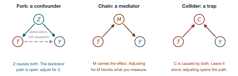
A fork (\(T \leftarrow Z \to Y\)) is a confounder: engagement causes both onboarding uptake and revenue, and the open backdoor path it creates is exactly the selection bias we computed. Conditioning on \(Z\) (stratifying, regressing, matching, weighting) blocks the path. A chain (\(T \to M \to Y\)) is a mediator: if onboarding raises revenue by increasing feature adoption, then feature adoption is part of the effect, and controlling for it subtracts the mechanism from the answer. Leave mediators alone when you want the total effect. A collider (\(T \to C \leftarrow Y\)) is the trap: a variable caused by both ends. A collider blocks its path by default, and conditioning on it opens the path, manufacturing association where none existed. This is the mistake that “control for everything” turns into policy, so it deserves a computed demonstration:
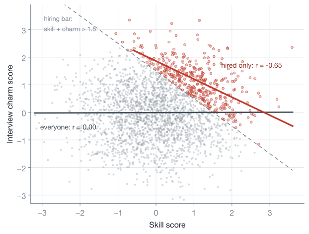
Skill and charm are independent by construction, correlation 0.00. Hire everyone whose skill plus charm clears a bar, and within your company the correlation is −0.65: the charming hires “must have” gotten in on charm. No causal arrow exists between the two; the entire pattern is the selection. Every “among our customers / employees / survivors” analysis is conditioning on a collider candidate, which is also the shape of the famous WWII bomber-armor story: armoring where returning planes show holes conditions on having returned. Cunningham’s chapter 3 works a sharper version, a wage regression where controlling for occupation (a collider between discrimination and unobserved ability) flips the estimated discrimination effect from \(-3.07\) to \(+0.60\), when the truth in his simulation is \(-1.0\); the control introduced the bias.
The general bookkeeping rule is Pearl’s backdoor criterion: a set of variables \(X\) identifies the effect of \(T\) on \(Y\) if \(X\) contains no descendant of \(T\) and blocks every backdoor path (every non-causal path into \(T\)). When it holds, the interventional distribution is computable from purely observational quantities by the adjustment formula:
\[P(Y = y \mid do(T = t)) = \sum_x P(Y = y \mid T = t, X = x)\, P(X = x)\]which in words says: estimate the relationship within each stratum of \(X\), then average the strata by how common they are (not by how often they get treated), and tool 3 derives its potential-outcomes twin. Two practical notes round off the graph toolkit. First, the criterion asks for a sufficient set, not all variables: distinct adjustment sets can be valid simultaneously, which is genuinely useful when one contains a variable you never measured. Second, for the case where confounders are unmeasured but a mediator is clean, Pearl’s front-door criterion identifies effects through a two-step adjustment along the mechanism, a niche but real trick (Molak’s book walks a nice worked example of it, estimating a GPS-use effect through hippocampal volume). Both criteria are special cases of do-calculus, three rewrite rules that are provably complete: if an effect is identifiable from a DAG at all, do-calculus can derive the formula.
Bad controls, the short list: never condition on post-treatment variables when you want the total effect (they are mediators or colliders in waiting), never condition on colliders, and stop treating “more controls” as “more rigorous”. Cinelli, Forney and Pearl’s “A Crash Course in Good and Bad Controls” is the definitive worked catalog.
The toolkit, part 1: adjust for what you can see
Everything in this part leans on one identifying assumption pair. Unconfoundedness (also sold as conditional independence, ignorability, or exchangeability): given the measured covariates \(X\), treatment is as good as random,
\[\big(Y(1),\, Y(0)\big) \perp T \mid X\]and positivity (overlap): every kind of customer has some chance of landing in either group, \(0 < e(x) < 1\) where \(e(x) = P(T = 1 \mid X = x)\). In graph language: \(X\) satisfies the backdoor criterion. In business language: you measured everything that drives both uptake and outcome. That is a strong claim, never fully testable, and the refutation section returns to it; what follows is what you may do once you are willing to defend it.
Regression adjustment
The workhorse. Fit the outcome on treatment plus confounders and read the treatment coefficient:
import pandas as pd
import statsmodels.formula.api as smf

df = pd.DataFrame({"revenue": revenue, "onboard": onboard,
                   "engagement": engagement, "tenure": tenure, "seats": seats})

adj = smf.ols("revenue ~ onboard + engagement + tenure + seats", df).fit()
lo, hi = adj.conf_int().loc["onboard"]
print(f"regression adjustment  {adj.params['onboard']:6.2f}   95% CI [{lo:.1f}, {hi:.1f}]")
regression adjustment 103.97 95% CI [91.3, 116.6]
From \$166 down to \$103.97 against a truth of \$100.37, with the confidence interval covering comfortably. Worth saying out loud: this is the same ols call as any predictive model, and nothing in the software knows we are doing causal inference. The causal content lives entirely in the choice of covariates (a backdoor-sufficient set, no mediators, no colliders) and in the unconfoundedness argument; the regression is just the arithmetic at the end. Two honest caveats. Linear adjustment assumes the confounders enter roughly linearly, and it quietly estimates a variance-weighted blend of stratum effects rather than the ATE when effects are heterogeneous, both of which the later methods relax.
Propensity scores and inverse probability weighting
With many confounders, stratifying on all of them shatters the data: the curse of dimensionality in action, since 18 binary covariates already define \(2^{18} \approx 260{,}000\) distinct customer profiles, far more cells than customers, so exact matches essentially stop existing. Rosenbaum and Rubin’s 1983 theorem collapses the problem: if unconfoundedness holds given \(X\), it also holds given the single number \(e(X)\), the propensity score. Customers with the same propensity are, statistically, the products of the same coin flip, whatever their raw covariates.
The estimator that makes the theorem practical is inverse probability weighting (IPW). Weight every treated customer by \(1/\hat{e}(x)\) and every untreated customer by \(1/(1-\hat{e}(x))\), and each group is reweighted into a copy of the full population; tool 4 proves the population version of this contrast (with the true propensity) equals the ATE, and the sample estimator plugs in an estimate \(\hat{e}\) and inherits consistency:
\[\hat{\tau}_{\text{IPW}} = \frac{1}{n} \sum_{i=1}^{n} \left( \frac{T_i\, Y_i}{\hat{e}(X_i)} - \frac{(1 - T_i)\, Y_i}{1 - \hat{e}(X_i)} \right)\]from sklearn.linear_model import LogisticRegression
X = df[["engagement", "tenure", "seats"]]
e_hat = LogisticRegression(C=1e6).fit(X, onboard).predict_proba(X)[:, 1]
w1 = onboard / e_hat # weight for the onboarded
w0 = (1 - onboard) / (1 - e_hat) # weight for everyone else
ipw = (w1 @ revenue) / w1.sum() - (w0 @ revenue) / w0.sum()
print(f"propensity range {e_hat.min():.2f} to {e_hat.max():.2f}")
print(f"IPW estimate {ipw:6.2f}")
propensity range   0.05 to 0.91
IPW estimate       106.95
For uncertainty, bootstrap the whole pipeline with the propensity fit inside the loop, or step up to a doubly robust estimator, which pairs the propensity model with an outcome model so the estimate survives either one being misspecified and comes with analytic standard errors. The estimate lands at \$106.95,3 and the mechanism is worth seeing, because IPW’s whole job is to fake the covariate balance an experiment would have produced:
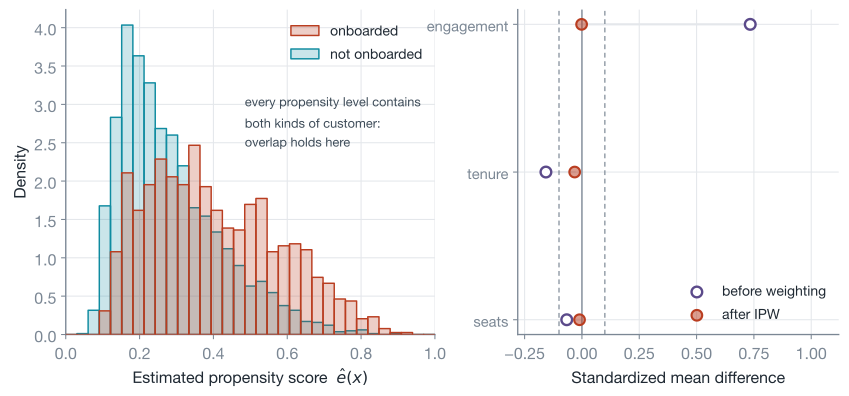
The left panel is the overlap check: both colors present at every propensity level. The right panel is the balance audit: standardized mean differences before weighting (engagement at +0.73, badly imbalanced) and after (every covariate within a hair of zero). Run this plot every time; weighting you cannot audit is weighting you should not trust.
The audit matters because IPW has a sharp failure mode: propensities near 0 or 1 produce enormous weights, and a handful of customers end up carrying the whole estimate with their noise amplified accordingly. Practical defenses: use a calibrated propensity model (plain logistic regression is the industry default for exactly this reason), inspect the weight distribution and get suspicious around weights of 20 or more (a propensity of 0.05), clip or trim extreme propensities, and treat genuine positivity failures (a customer segment that never enrolls) as a redefine-the-question problem rather than a weighting problem, because no reweighting can conjure counterfactuals for people who are never treated. One deliberate omission: propensity score matching, the once-standard cousin, is skipped here on purpose; King and Nielsen’s “Why Propensity Scores Should Not Be Used for Matching” documents how score-matching discards information and can increase imbalance, and weighting or the estimators below dominate it in practice.
Double machine learning
Regression adjustment assumed linear confounding. Replacing the linear pieces with gradient boosting sounds like the obvious upgrade, but plugging ML predictions straight into a causal contrast smuggles in regularization bias: a regularized learner shrinks its fit toward smoothness, some of the confounding signal survives in the residuals, and it leaks into the treatment coefficient. The fix, from Chernozhukov and coauthors’ double/debiased machine learning (DML), is a design in three moves built on the partially linear model
\[Y = \theta\, T + g(X) + \varepsilon, \qquad T = m(X) + \eta\]- Predict the outcome from the confounders with any ML model you like, and keep the residual \(\tilde{Y} = Y - \hat{m}_Y(X)\): revenue with everything the covariates explain stripped out.
- Predict the treatment from the confounders, and keep that residual too: \(\tilde{T} = T - \hat{m}_T(X)\). This is the propensity idea wearing a regression hat: \(\tilde{T}\) is the part of treatment the covariates cannot explain, the closest thing to a coin flip the data contains.
- Regress \(\tilde{Y}\) on \(\tilde{T}\); the slope estimates \(\theta\).
This residual-on-residual move is the Frisch-Waugh-Lovell theorem from econometrics (Robinson’s 1988 semiparametric version), and its magic is orthogonality: small errors in either nuisance model (the two auxiliary predictors, “nuisance” because their fits are a means to the estimate rather than the answer) only perturb the final estimate at second order, because the errors multiply each other rather than add. The remaining trap, the models overfitting their own noise into the residuals, is closed by cross-fitting: fit the nuisance models on one fold, form residuals on the held-out fold, rotate, so every residual comes from a model that never saw that row.
EconML (Microsoft Research’s CATE library, v0.16 here) packages the whole recipe, generalizing the constant \(\theta\) into a function \(\theta(x)\) that is linear in whatever features you hand it, and its API makes one more distinction the beginner should internalize: W are confounders to adjust away, X are the variables you want the effect to vary by:
from econml.dml import LinearDML
from sklearn.ensemble import GradientBoostingRegressor, GradientBoostingClassifier

dml = LinearDML(model_y=GradientBoostingRegressor(random_state=0),
                model_t=GradientBoostingClassifier(random_state=0),
                discrete_treatment=True, cv=5, random_state=0)
dml.fit(Y=revenue, T=onboard, X=engagement.reshape(-1, 1),
        W=df[["tenure", "seats"]])

print(f"ATE  {dml.ate(X=engagement.reshape(-1, 1)):6.2f}")
personas = np.array([[1.0], [5.0], [8.0]])
effects = dml.const_marginal_effect(personas)
lb, ub = dml.const_marginal_effect_interval(personas, alpha=0.05)
for p, eff, l, u in zip(personas.ravel(), effects.ravel(), lb.ravel(), ub.ravel()):
    print(f"engagement={p:.0f}h  effect {eff:7.2f}   95% CI [{l:6.1f}, {u:6.1f}]")
ATE  106.10
engagement=1h  effect  143.17   95% CI [ 121.5,  164.9]
engagement=5h  effect   62.42   95% CI [  42.5,   82.4]
engagement=8h  effect    1.87   95% CI [ -40.5,   44.3]
The ATE lands at \$106, and because we handed engagement to X, the model also returns the effect as a function of engagement: \$143 for a barely-engaged customer, \$62 at five hours, statistically indistinguishable from zero at eight. The simulation’s true values at those three points are \(150 - 17.5x = 132.5\), \(62.5\), and \(10.0\), each covered by its interval. Which is the perfect segue, because that per-customer view has its own name and its own industry.
From averages to individuals: CATE and uplift
The ATE answers “should this program exist?”. The operational question is usually “who should get it?”, and that is a question about the CATE function \(\tau(x)\). In our simulation the truth is \(\tau(x) = 150 - 17.5 \times \text{engagement}\), and a single average washes out everything a targeting policy needs:
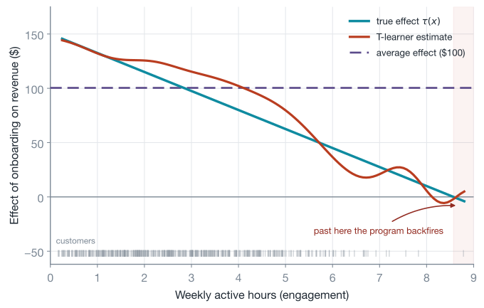
The estimation recipes are called meta-learners because they turn any supervised learner into a CATE estimator. The S-learner fits one model with treatment as a feature and differences its predictions (simple, but regularized learners can shrink a modest treatment feature to nothing). The T-learner fits separate models per arm and differences them (the ember curve above; each model sees less data). The X-learner builds on the T-learner: use each arm’s model to impute the other arm’s counterfactuals, fit second-stage models to those imputed individual effects, and blend the two by propensity, which shines when one arm is much smaller than the other. Causal forests (and EconML’s CausalForestDML) grow trees whose splits maximize effect heterogeneity rather than predictive fit, giving nonparametric CATE with honest confidence intervals.
This whole family is what industry calls uplift modeling: Uber open-sourced CausalML for it, Wayfair built pylift for remarketing, and the canonical segmentation sorts customers into persuadables (positive effect: target them), sure things and lost causes (zero effect: spending on them is waste), and do-not-disturbs (negative effect: the contact itself repels, our simulation’s over-engaged power users).
Two warnings before you productionize the pretty curve. First, a CATE model inherits the identification of its data: fit an uplift model on confounded observational data and you get confidently wrong targeting, which is why the cleanest uplift stacks train on experimental data, using the model for heterogeneity while the randomization carries identification. Second, this is the payoff of the retention post’s “cohorts are levers, not proof” caveat: a high-risk cohort tells you where the problem concentrates, a CATE model tells you where the intervention pays, and the two lists can be almost disjoint (the highest-risk customers are often lost causes, not persuadables).
The toolkit, part 2: let the world randomize for you
Everything so far demanded “we measured every confounder”, which is a hard sentence to say with a straight face. The second family, the quasi-experimental designs, replaces it with a different kind of claim: that somewhere in the world’s plumbing, an accident, a threshold, a rollout schedule, did some randomizing for you. These designs are the workhorses of applied economics and, increasingly, of tech (Uber’s list of observational methods reads: matching, IPW, doubly robust, RDD, interrupted time series, DiD, IV).
Instrumental variables: leaning on a nudge
Suppose the company once ran an innocuous experiment: a randomized email inviting customers to book onboarding. You cannot force attendance (uptake was a choice, hence confounded), but the invitation was a coin flip. A variable like that, randomly assigned, moving treatment, touching the outcome only through treatment, is an instrument \(Z\), and it supports a beautiful trick: compare outcomes by invitation, compare uptake by invitation, and divide.
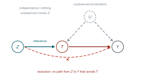
The division is the Wald estimator, derived as tool 5:
\[\hat{\tau}_{\text{Wald}} = \frac{\mathbb{E}[Y \mid Z{=}1] - \mathbb{E}[Y \mid Z{=}0]}{\mathbb{E}[T \mid Z{=}1] - \mathbb{E}[T \mid Z{=}0]}\]The numerator is the effect of the invitation on revenue (clean, because the invitation was randomized: this is called the intent-to-treat effect). But the invitation only moved some people’s attendance, so the intent-to-treat effect is the treatment effect diluted by partial compliance, and the denominator, the share of behavior the nudge actually shifted, is exactly the dilution factor. Simulated on a fresh population (numbers deliberately unrelated to part 1’s onboarding world), with heavy confounding by an unobserved motivation variable:
r = np.random.default_rng(11)
m = 20000

motivation = r.normal(0, 1, m)             # drives uptake AND spend; we never see it
nudged = r.binomial(1, 0.5, m)             # the randomized email invitation

# who would attend with and without the nudge (the simulation can see both)
u = 0.8 * motivation + r.normal(0, 0.5, m)
t0, t1 = (u > 0.55).astype(int), (0.9 + u > 0.55).astype(int)
attended = np.where(nudged == 1, t1, t0)

tau_i = 60 + 40 * motivation               # heterogeneous true effect
spend = 900 + 130 * motivation + tau_i * attended + r.normal(0, 150, m)

compliers = (t1 == 1) & (t0 == 0)
print(f"true ATE {tau_i.mean():6.2f}   "
      f"true LATE {tau_i[compliers].mean():6.2f} ({compliers.mean():.0%} compliers)")

iv_df = pd.DataFrame({"spend": spend, "attended": attended, "nudged": nudged})
naive = smf.ols("spend ~ attended", iv_df).fit().params["attended"]

wald = ((spend[nudged == 1].mean() - spend[nudged == 0].mean())
        / (attended[nudged == 1].mean() - attended[nudged == 0].mean()))

from linearmodels.iv import IV2SLS
tsls = IV2SLS.from_formula("spend ~ 1 + [attended ~ nudged]", iv_df).fit(cov_type="robust")
print(f"naive OLS {naive:6.2f}   Wald {wald:6.2f}   "
      f"2SLS {tsls.params['attended']:6.2f} (SE {tsls.std_errors['attended']:.2f})")
true ATE  60.09   true LATE  64.04 (36% compliers)
naive OLS 240.70   Wald  59.91   2SLS  59.91 (SE 8.08)
The email lifted attendance from 27% to 64%, and dividing the two randomized differences does its job: the naive comparison says \$241, the truth is around \$60, and the IV lands at \$59.91. But look closely at what “the truth” means here, because IV’s honest fine print is the estimand, the precise quantity a procedure actually estimates. When effects vary across customers, the ratio does not recover the ATE; it recovers the local average treatment effect (LATE), the average effect among compliers, the customers whose attendance the nudge actually flipped (36% of this population, true complier-average \$64.04, and the \$59.91 sits within one standard error of it; that it also landed near the population ATE is luck of this draw). Never-takers and always-takers contribute nothing to either difference, so the estimator cannot speak for them. The Imbens-Angrist result behind this needs one more assumption, monotonicity: the nudge pushes nobody away from attending (no defiers), which encouragement designs usually satisfy by construction. The IV2SLS call generalizes the ratio to continuous instruments and covariates via two-stage least squares: regress treatment on instrument (the first stage), then regress the outcome on the first stage’s fitted values.
Practical rules, hard-won by a literature full of scar tissue:
- Relevance is testable, so test it. The first-stage F statistic here (printed by
tsls.first_stage) is 3,212. The classic rule of thumb flags anything under 10 as a weak instrument, whose 2SLS estimate drifts back toward the confounded OLS answer while its standard errors lie; a 2022 study by Lee and coauthors sharpened the bad news, showing the conventional 5% t-test needs F above roughly 105 to be honest, and re-examining 1,311 specifications from 61 published AER papers with the corrected inference, about a quarter of the results that had been significant at 5% no longer were. - Exclusion is not testable, so argue it. The email must not move spend except through attendance, which is precisely why Cunningham quips that good instruments should feel weird: an instrument with an obvious story usually has an obvious second path to the outcome.
- Raid your experiment archive. An old A/B test of anything that moved uptake of the thing you now care about is a free encouragement design; TripAdvisor famously repurposed an easier-signup experiment as an instrument for the effect of membership.
Difference-in-differences: subtracting history
New scenario, new data shape. The company launches an in-app onboarding banner in 12 pilot markets in month 7; 12 comparison markets never get it. Pilot markets were not chosen at random (they are the stronger markets, levels differ from the start), and month 7 also brought seasonality and a product release that hit everyone. Two subtractions clean up both problems at once. Each group’s own pre-period subtracts away its stable level; the comparison group’s change subtracts away the shared shocks; what survives is the treatment effect:
\[\hat{\delta}_{\text{DiD}} = \big( \bar{y}_{\text{pilot}}^{\text{post}} - \bar{y}_{\text{pilot}}^{\text{pre}} \big) - \big( \bar{y}_{\text{comp}}^{\text{post}} - \bar{y}_{\text{comp}}^{\text{pre}} \big)\]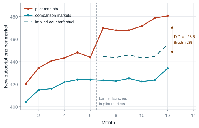
r = np.random.default_rng(3)
n_mkt, n_month = 24, 12
pilot = np.repeat([1, 0], n_mkt // 2)            # 12 pilot, 12 comparison markets
mkt_fe = r.normal(0, 30, n_mkt) + 25 * pilot     # pilots start stronger: levels differ
months = np.arange(1, n_month + 1)
month_fe = 3.0 * months + 10 * np.sin(2 * np.pi * (months - 1) / 12)  # shared shocks
subs = (400 + mkt_fe[:, None] + month_fe[None, :]
        + 28.0 * (pilot[:, None] * (months[None, :] >= 7))   # the true effect: +28
        + r.normal(0, 12, (n_mkt, n_month)))

panel = pd.DataFrame({"subs": subs.ravel(),
                      "market": np.repeat(np.arange(n_mkt), n_month),
                      "pilot": np.repeat(pilot, n_month),
                      "post": np.tile((months >= 7).astype(int), n_mkt)})

did = smf.ols("subs ~ pilot * post", panel).fit(
    cov_type="cluster", cov_kwds={"groups": panel["market"]})
print(f"DiD estimate  {did.params['pilot:post']:6.2f}  (SE {did.bse['pilot:post']:.2f})")
DiD estimate 26.55 (SE 2.36)
The regression form is the same arithmetic with standard errors attached: the interaction coefficient in pilot * post is the double difference, landing at +26.55 against the simulated truth of +28. Note the clustered standard errors by market: panel outcomes within a market are correlated over time, and this is exactly the mixed-effects post’s clustering lesson wearing its econometrics uniform.
The identifying assumption has a name you already saw drawn as the dashed line: parallel trends. Had the banner never launched, pilot markets would have moved like comparison markets moved. Not “the groups are similar” (they visibly are not; levels differ by roughly 20 subscriptions throughout) but “their changes would have matched”, and tool 6 shows this identifies the ATT, the effect on the pilot markets specifically. Parallel trends is untestable (it is a claim about a counterfactual), but it is probe-able: plot the pre-period and check the trends were parallel before treatment (they are, above), or run the event-study version with a coefficient per period and check the pre-treatment coefficients hug zero. Flat pre-trends do not prove the counterfactual, as Cunningham stresses, but crooked ones kill it. The design’s pedigree is hard to beat: John Snow used it in the 1850s to show cholera traveled by water (two water companies, one moved its intake upstream, deaths per 10,000 diverged), and Card and Krueger’s 1994 minimum-wage study is the modern template.4
One modern caution: everything above is the clean two-group case. When treatment staggers in over time and you throw one two-way fixed-effects regression at it (a dummy per unit and per period, the multi-period generalization of pilot * post), the estimator quietly averages many little 2x2 comparisons, some of which use already-treated units as controls, and can even flip sign when effects grow over time (the Goodman-Bacon decomposition literature). Staggered rollouts want the modern heterogeneity-robust DiD estimators (Callaway-Sant’Anna and kin); know the trap exists before your first multi-wave launch analysis.
Regression discontinuity: exploiting arbitrary thresholds
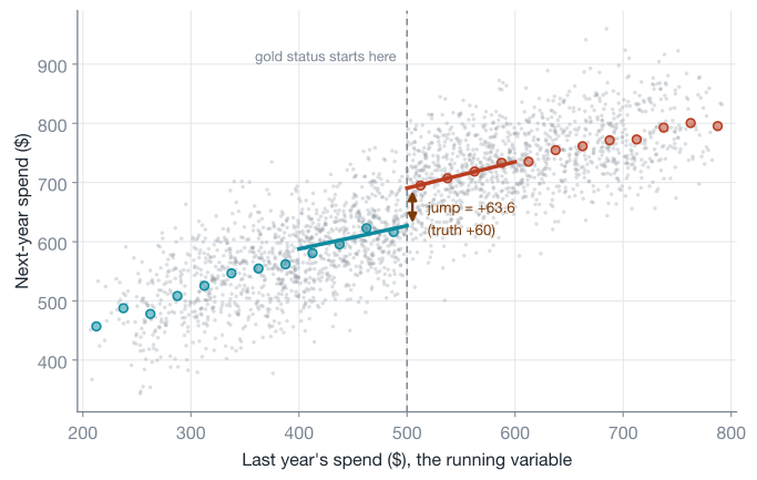
Businesses are full of hard thresholds: spend \$500 last year and you get gold status, score above the bar and the loan approves, rank in the top 10 and you appear on page one. Thresholds feel like a nuisance until you notice what they are: a locally randomized experiment. A customer at \$499 and a customer at \$501 are, in every way that matters, the same customer, except that a rule flipped treatment for exactly one of them. Regression discontinuity (RDD) turns that into identification: the thresholded score is called the running variable, and comparing units just left and right of its cutoff reads the jump as the causal effect at the threshold,
\[\tau_{\text{SRD}} = \mathbb{E}\big[ Y(1) - Y(0) \mid X = c \big] = \lim_{x \downarrow c} \mathbb{E}[Y \mid X = x] \;-\; \lim_{x \uparrow c} \mathbb{E}[Y \mid X = x]\]identified by a continuity assumption: both potential-outcome curves run smoothly through the cutoff, so the only thing that jumps at \(c\) is treatment itself, and therefore any jump in the outcome is the effect. (The SRD subscript reads “sharp RDD”: crossing the line always flips treatment; the leaky version comes at the end of this section.) Estimation is two local regressions:
r = np.random.default_rng(5)
k = 2400
run = 200 + 600 * r.beta(2, 2, k)                # last year's spend
gold = (run >= 500).astype(int)
y_rdd = (380 + 0.5 * run - 0.00035 * (run - 500) ** 2   # smooth baseline curve
         + 60.0 * gold + r.normal(0, 55, k))            # the true jump: +60

h = 100                                          # bandwidth around the cutoff
rdf = pd.DataFrame({"y": y_rdd, "gold": gold, "center": run - 500})
win = rdf[np.abs(rdf.center) < h].copy()
kernel_w = 1 - np.abs(win.center) / h            # triangular kernel

rdd = smf.wls("y ~ gold * center", win, weights=kernel_w).fit()
print(f"RDD estimate  {rdd.params['gold']:6.2f}  (SE {rdd.bse['gold']:.2f})")
RDD estimate 63.60 (SE 5.88)
The gold * center formula fits a separate line on each side of the (centered) cutoff and reports their disagreement at zero; the triangular kernel weights observations by closeness to the threshold. Three field rules keep RDD honest. Bandwidth is the bias-variance dial: wider windows borrow strength from customers who are less comparable; production analyses use data-driven bandwidths with robust bias-corrected inference (the rdrobust package, from the Calonico-Cattaneo-Titiunik school, is the standard), and fitting high-order global polynomials over all the data is a known way to manufacture artifacts (Gelman and Imbens wrote the warning paper). Check for manipulation: if customers can see the threshold and game their spend to clear it, the just-above group is self-selected hustlers rather than accidental treatments; the McCrary density test checks for the tell-tale bunching of the running variable at the cutoff. Respect the locality: this is the effect for customers near \$500, full stop. If treatment also requires crossing the line but only probabilistically (some eligible customers never activate gold), the design goes “fuzzy” and the fix is the previous section: eligibility becomes an instrument for treatment, and the estimand becomes a LATE for cutoff compliers. The design’s origin study is charming, Thistlethwaite and Campbell in 1960 on merit-award certificates, and the modern classic is Hoekstra’s flagship-university study: earnings ten to fifteen years later jump 9.5% at the admissions cutoff, which scales to roughly 20% for actually attending once the fuzzy-RDD division by the enrollment jump is applied.
Synthetic control: manufacturing a comparison group
Last shape: one treated unit. The company overhauls pricing in its largest market, and there is nothing to average, no twelve pilots, just Germany versus the world. This design gets a section rather than a chapter, because in practice you should run it through a library, but the shape is essential to recognize: one treated unit, many untreated “donor” units, a long pre-treatment history. Synthetic control builds the missing comparison as an explicit weighted blend of donor markets, with weights chosen (non-negative, summing to one) so the blend tracks the treated unit’s pre-treatment history as closely as possible; the post-treatment gap between reality and the blend is the effect estimate, \(\hat{\tau}_t = Y_{1t} - \sum_j w_j Y_{jt}\).
The transparency is the selling point: the weights are inspectable (“synthetic Germany is 40% France, 35% Netherlands, 25% Austria”), and inference runs by placebo, re-fitting the method on every donor as if it were treated and asking whether the real unit’s post-period divergence stands out.5
Abadie’s method has become a tech staple: Google’s CausalImpact does the Bayesian time-series version of the same idea, Meta’s GeoLift wraps it for geo-level ad measurement, and Netflix used it to simulate how titles would have been watched had pandemic shutdowns not delayed their dubs.
Refute before you believe
A cross-validated predictive model earns trust by predicting a holdout. A causal estimate has no holdout: the counterfactual never arrives, and unconfoundedness is not testable from the data it conditions on. Molak’s book frames the escape well, borrowing from Popper: you cannot verify a causal model, but you can try hard to falsify it and believe it in proportion to what it survives. DoWhy (the PyWhy library, v0.14 here) builds that discipline into a four-step API: model the problem as a graph, identify the estimand (it mechanically applies the backdoor/frontdoor/IV criteria and tells you which assumption set licenses estimation), estimate with your method of choice, and then refute. Back on part 1’s onboarding frame df:
from dowhy import CausalModel

model = CausalModel(data=df, treatment="onboard", outcome="revenue",
                    common_causes=["engagement", "tenure", "seats"])

estimand = model.identify_effect()
estimate = model.estimate_effect(estimand,
    method_name="backdoor.linear_regression")
print(f"estimate: {estimate.value:.2f}")

placebo = model.refute_estimate(estimand, estimate,
    method_name="placebo_treatment_refuter", placebo_type="permute",
    random_seed=0)
print(placebo)

subset = model.refute_estimate(estimand, estimate,
    method_name="data_subset_refuter", random_seed=0)
print(subset)
Which prints (values rounded here for readability):
estimate: 103.97

Refute: Use a Placebo Treatment
Estimated effect: 103.97
New effect: 0.88
p value: 0.90

Refute: Use a subset of data
Estimated effect: 103.97
New effect: 104.30
p value: 0.84
The two refuters shown are of the two archetypes worth memorizing. Nullifying tests rewire the problem so the true answer must be zero and check that your pipeline says so: the placebo refuter permutes the treatment column and the estimated “effect” collapses from \$104 to \$0.88, exactly as it should. Invariance tests perturb things that should not matter and check the estimate stays put: the subset refuter re-estimates on random halves and finds the estimate stable. A random_common_cause refuter (add a synthetic confounder, estimate should not move) rounds out the standard battery. Passing refuters is necessary, not sufficient; they validate the pipeline’s structure, not the unconfoundedness assumption itself. The heavier artillery for the latter is sensitivity analysis, which answers “how strong would an unmeasured confounder have to be to erase this effect?” (Cinelli and Hazlett’s sensemakr is the modern tool), turning an untestable assumption into a quantified robustness claim you can argue about. That, plus benchmarking observational estimates against past experiments where both exist (with the caveat, which Spotify’s researchers have made formal, that such a comparison can show an observational model is wrong but never that it is right), is what mature causal practice looks like: not certainty, but estimates that have survived serious attempts on their life.
Choosing an identification strategy
The whole post compresses into one decision walk, and it is a walk through your data’s circumstances, not through your modeling preferences:
The same walk as a reference card, with each method’s load-bearing assumption and, crucially, what it actually estimates:
| Design | Reach for it when | Load-bearing assumption | What you get |
|---|---|---|---|
| A/B test | you can randomize | no interference (SUTVA) | ATE |
| Adjustment / IPW / DML | rich pre-treatment covariates | unconfoundedness + overlap | ATE (or CATE) |
| Instrumental variables | a randomized-ish nudge moved uptake | exclusion + monotonicity | LATE (compliers) |
| Difference-in-differences | a rollout hit some units at a date | parallel trends | ATT |
| Regression discontinuity | a threshold rule assigns treatment | continuity at the cutoff | effect at the cutoff |
| Synthetic control | one treated unit, many donors | pre-period fit transfers | ATT for that unit |
| Uplift / CATE models | deciding whom to target | inherits the data’s identification | \(\tau(x)\) |
The last column deserves a slow read, because “the effect” is not one number. An IV study of onboarding speaks for compliers; an RDD speaks for customers near \$500; a DiD speaks for the pilot markets. When two careful analyses disagree, the first hypothesis should not be that one is wrong but that they measured different estimands on different subpopulations. Decide what you need (the estimand) before how to compute it (the estimator); Molak’s “estimand first” is the right slogan.
The pitfalls that actually bite
Collected from the sections above plus the ones that only show up in production, this is the checklist to run before believing any causal number, yours or anyone else’s:
- Conditioning on post-treatment variables. The single most common error in applied work. Any variable measured after treatment is a mediator or collider candidate, and “controlling” for it either subtracts the mechanism or manufactures bias (the wage example above flipped sign). Adjustment sets are pre-treatment only, chosen from the graph.
- Convenience-sample colliders. Every analysis restricted to “our users”, “completed transactions”, “survey responders”, or “survivors” has conditioned on a selection node. Ask what causes membership in your table; if both treatment and outcome plausibly do, the r = 0.00 to −0.65 demo above is your risk profile.
- Positivity failures dressed as small weights. If some segment essentially never gets treated, IPW responds with enormous weights and silently rests the whole estimate on a handful of rows. Audit the weight distribution, trim transparently, and accept that segments with no overlap support no inference.
- Weak instruments. An F of 9 does not mean “slightly noisy”; it means 2SLS is drifting back toward the confounded OLS answer with dishonestly tight intervals. Report the first stage, remember the modern F thresholds are far above 10, and prefer no instrument to a weak one.
- Pre-trends theater. Flat pre-trends support parallel trends; they do not prove it, and a policy that was triggered by a diverging trend (the classic “Ashenfelter dip” in training programs, enrolled precisely when earnings dipped) violates it in exactly the way pre-testing misses. Ask why treatment happened when it did.
- Threshold gaming. RDD dies quietly when units can manipulate the running variable; run the density test, and think like a customer who knows the \$500 rule exists.
- Uplift on confounded data. Meta-learners fit anything, selection bias included; heterogeneity modeling is a layer on top of identification, never a substitute.
- Estimand drift. The analysis computed a LATE, the deck says “the effect”, and the rollout applies it to never-takers. Label every estimate with who it is about.
Where causal inference runs out
- Unconfoundedness is an argument, not a checkbox. No test on your data can confirm you measured every confounder, because the violation lives in what you did not measure. Sensitivity analysis bounds the damage; only design (experiments, instruments, thresholds) removes it.
- External validity is the second exam. Every quasi-experimental estimate is local: compliers, cutoff neighbors, pilot markets, this quarter. Scaling a local effect to the whole base and the next fiscal year imports assumptions the identification never covered, and SUTVA bites at scale too: onboarding every customer may change what onboarding is (saturated specialists, shifted norms), a feedback the unit-level definition quietly assumed away.
- Interference breaks the bookkeeping. In marketplaces and networks, treating one unit moves others’ outcomes, so \(Y_i(T_i)\) is not even well-defined; the honest fixes change the experimental unit (switchbacks, geo splits, cluster randomization) rather than the estimator.
- Some effects are not identifiable, and pretending otherwise is malpractice. When the graph says no adjustment set exists and no instrument or design applies, the analysis’s deliverable is that fact plus a sensitivity bound. Molak’s Icarus rule fits: fly neither too low (ignoring causal tools that would work) nor too high (claiming identification you do not have).
- The graph itself is an assumption. Every guarantee above is conditional on the DAG being right, and the data alone cannot hand you the DAG (observationally equivalent graphs exist by construction). Causal discovery algorithms can propose structure, but domain knowledge remains the load-bearing input, which is why Cunningham insists that all empirical work requires theory.
Closing thoughts
Three ideas to carry out of this post. First, the question determines the difficulty: association, intervention, and counterfactual are different rungs, every model you have ever shipped lives on the first, and the gap between rungs is closed by assumptions and design, never by data volume alone. Second, the naive gap has an exact anatomy: effect plus selection plus heterogeneity, and every method here is a strategy for zeroing the two bias terms, whether by coin flip (randomization), by measurement (adjustment, weighting, DML), or by borrowing an accident of the world’s plumbing (nudges, thresholds, rollouts). Third, identification is a claim you defend, not a property you compute: draw the graph, name the assumption, state whose effect you estimated, and attack your own number with placebos and sensitivity analysis before anyone else gets the chance. The regression posts on this blog ended by warning that their coefficients were not causal; this one ends with the constructive version. Causal claims are available to the same tabular data you already have, at the price of assumptions you must be willing to say out loud.
Appendix: the identification toolbox
Six facts power every derivation above. Each is stated, proved, and linked back to where it earns its keep; nothing in the post rests on an unproven step. Throughout, \(T\) is a binary treatment, \(Y(1), Y(0)\) are potential outcomes, \(Y = T\,Y(1) + (1-T)\,Y(0)\) is the switching equation, and \(\pi = P(T=1)\).
| Tool | In one line | Powers |
|---|---|---|
| 1. Iterated expectations | an average is the average of conditional averages | every other tool |
| 2. The naive gap, decomposed | naive gap = ATE + selection + heterogeneity | potential outcomes, randomization |
| 3. Adjustment from unconfoundedness | condition on enough, average back out, and \(do\) becomes \(see\) | regression adjustment, the backdoor formula |
| 4. Inverse propensity weights | reweighting by \(1/e(X)\) rebuilds the missing population | IPW |
| 5. The IV ratio | intent-to-treat divided by compliance = the compliers’ effect | instrumental variables |
| 6. DiD under parallel trends | two subtractions cancel levels and shared shocks, leaving the ATT | difference-in-differences |
1. Iterated expectations
The fact. For any random variables \(Y\) and \(X\),
\[\mathbb{E}[Y] = \mathbb{E}\big[\, \mathbb{E}[Y \mid X] \,\big]\]the overall average is the population-weighted average of the group averages. Two corollaries the proofs below lean on: conditioning can be partial, \(\mathbb{E}[Y \mid A] = \mathbb{E}\big[ \mathbb{E}[Y \mid A, B] \mid A \big]\) (the tower property), and if \(Y \perp T\) then \(\mathbb{E}[Y \mid T] = \mathbb{E}[Y]\): independence means conditioning changes nothing, which is the entire algebraic content of “randomization works”.
Proof (discrete case)
\[\begin{aligned} \mathbb{E}\big[ \mathbb{E}[Y \mid X] \big] &= \sum_x \mathbb{E}[Y \mid X = x]\, P(X = x) && \textcolor{#7b8794}{\small\text{the outer expectation averages the inner one over } X} \\[4pt] &= \sum_x \sum_y y\, P(Y = y \mid X = x)\, P(X = x) && \textcolor{#7b8794}{\small\text{write the inner conditional expectation out}} \\[4pt] &= \sum_y y \sum_x P(Y = y, X = x) && \textcolor{#7b8794}{\small\text{conditional times marginal is the joint; swap the sums}} \\[4pt] &= \sum_y y\, P(Y = y) = \mathbb{E}[Y] && \textcolor{#7b8794}{\small\text{summing the joint over } x \text{ marginalizes } X \text{ away}} \end{aligned}\]For the independence corollary: \(Y \perp T\) means \(P(Y = y \mid T) = P(Y = y)\), so the conditional expectation is computed from the same distribution as the unconditional one.
Powers: every tool below; used silently whenever a proof splits an average by group and reassembles it.
2. The naive gap, decomposed
The fact. With ATT and ATU as defined in the body,
\[\mathbb{E}[Y \mid T{=}1] - \mathbb{E}[Y \mid T{=}0] = \text{ATE} + \big( \mathbb{E}[Y(0) \mid T{=}1] - \mathbb{E}[Y(0) \mid T{=}0] \big) + (1 - \pi)\,(\text{ATT} - \text{ATU})\]Proof, one added zero and one split average
\[\begin{aligned} \mathbb{E}[Y \mid T{=}1] - \mathbb{E}[Y \mid T{=}0] &= \mathbb{E}[Y(1) \mid T{=}1] - \mathbb{E}[Y(0) \mid T{=}0] && \textcolor{#7b8794}{\small\text{the switching equation: each group reveals its own arm}} \\[4pt] &= \underbrace{\mathbb{E}[Y(1) \mid T{=}1] - \mathbb{E}[Y(0) \mid T{=}1]}_{\text{ATT}} + \underbrace{\mathbb{E}[Y(0) \mid T{=}1] - \mathbb{E}[Y(0) \mid T{=}0]}_{\text{selection bias}} && \textcolor{#7b8794}{\small\text{add and subtract } \mathbb{E}[Y(0) \mid T{=}1] \text{, the treated group's missing counterfactual}} \end{aligned}\]That is already the two-term version: naive gap = ATT + selection bias. To surface the ATE, split it by treatment group using tool 1:
\[\begin{aligned} \text{ATE} &= \pi\, \text{ATT} + (1 - \pi)\, \text{ATU} && \textcolor{#7b8794}{\small\text{the population effect is the group effects, population-weighted}} \\[4pt] \Rightarrow\; \text{ATT} - \text{ATE} &= (1 - \pi)\,(\text{ATT} - \text{ATU}) && \textcolor{#7b8794}{\small\text{subtract ATE from ATT and factor}} \end{aligned}\]Substituting \(\text{ATT} = \text{ATE} + (1-\pi)(\text{ATT} - \text{ATU})\) into the two-term version gives the identity.
Corollary (randomization). Under \(\big(Y(1), Y(0)\big) \perp T\), tool 1’s independence corollary gives \(\mathbb{E}[Y(0) \mid T{=}1] = \mathbb{E}[Y(0) \mid T{=}0]\) (selection bias dies) and \(\text{ATT} = \text{ATU} = \text{ATE}\) (heterogeneity bias dies), so the naive gap is the ATE.
Powers: the decomposition figure (where it is verified numerically to the cent) and the randomization section.
3. Unconfoundedness turns adjustment into identification
The fact. If \(\big(Y(1), Y(0)\big) \perp T \mid X\) (unconfoundedness) and \(0 < e(x) < 1\) (positivity, so the conditional means below exist), then
\[\text{ATE} = \mathbb{E}_X\big[\, \mathbb{E}[Y \mid T{=}1, X] - \mathbb{E}[Y \mid T{=}0, X] \,\big]\]every quantity on the right being observable. This is the potential-outcomes twin of Pearl’s backdoor adjustment formula: condition within strata, then average strata by their population share.
Proof, three lines per arm
\[\begin{aligned} \mathbb{E}[Y(1)] &= \mathbb{E}_X\big[\, \mathbb{E}[Y(1) \mid X] \,\big] && \textcolor{#7b8794}{\small\text{iterated expectations (tool 1) over the covariates}} \\[4pt] &= \mathbb{E}_X\big[\, \mathbb{E}[Y(1) \mid T{=}1, X] \,\big] && \textcolor{#7b8794}{\small\text{unconfoundedness: within a stratum, } Y(1) \text{ is independent of } T \text{, so conditioning on } T{=}1 \text{ is free}} \\[4pt] &= \mathbb{E}_X\big[\, \mathbb{E}[Y \mid T{=}1, X] \,\big] && \textcolor{#7b8794}{\small\text{on } T{=}1 \text{, the switching equation says } Y = Y(1)} \end{aligned}\]The mirror argument gives \(\mathbb{E}[Y(0)] = \mathbb{E}_X[\mathbb{E}[Y \mid T{=}0, X]]\); subtract. Positivity is what makes \(\mathbb{E}[Y \mid T{=}1, X]\) well-defined at every \(x\): a stratum nobody treats has no treated mean to use.
Powers: regression adjustment (a linear model for \(\mathbb{E}[Y \mid T, X]\) is one way to compute the right-hand side) and the backdoor adjustment formula in the DAG section.
4. Why inverse propensity weights work
The fact. Under the same two assumptions, with \(e(X) = P(T{=}1 \mid X)\),
\[\mathbb{E}\!\left[ \frac{T\, Y}{e(X)} \right] = \mathbb{E}[Y(1)] \qquad \text{and} \qquad \mathbb{E}\!\left[ \frac{(1-T)\, Y}{1 - e(X)} \right] = \mathbb{E}[Y(0)]\]so the population IPW contrast equals the ATE. The body’s estimator plugs in an estimated \(\hat{e}(X)\) and a finite sample, which is why it is consistent rather than exactly unbiased.
Proof, condition on the stratum and cancel
\[\begin{aligned} \mathbb{E}\!\left[ \frac{T\, Y}{e(X)} \right] &= \mathbb{E}\!\left[ \frac{T\, Y(1)}{e(X)} \right] && \textcolor{#7b8794}{\small\text{whenever } T = 1 \text{, } Y = Y(1) \text{; whenever } T = 0 \text{ the numerator is zero anyway}} \\[4pt] &= \mathbb{E}_{X}\!\left[ \frac{\mathbb{E}\big[ T\, Y(1) \mid X \big]}{e(X)} \right] && \textcolor{#7b8794}{\small\text{iterated expectations (tool 1); } e(X) \text{ is a constant within the stratum}} \\[4pt] &= \mathbb{E}_{X}\!\left[ \frac{\mathbb{E}[T \mid X]\; \mathbb{E}[Y(1) \mid X]}{e(X)} \right] && \textcolor{#7b8794}{\small\text{unconfoundedness: within a stratum, } T \text{ and } Y(1) \text{ are independent, so the expectation factors}} \\[4pt] &= \mathbb{E}_{X}\big[\, \mathbb{E}[Y(1) \mid X] \,\big] = \mathbb{E}[Y(1)] && \textcolor{#7b8794}{\small\mathbb{E}[T \mid X] = e(X) \text{ cancels; tool 1 reassembles the average}} \end{aligned}\]Positivity guards the division. The mirror argument with weights \(1/(1 - e(X))\) handles the untreated arm.
Powers: the IPW section; the same cancellation, applied to the residual terms, is the engine inside doubly robust estimators.
5. The IV ratio, and who it averages
The fact. Let \(Z\) be a binary instrument, \(T(1), T(0)\) each unit’s treatment status with and without the nudge, and assume: independence (\(Z\) is as good as randomly assigned relative to all potential values), exclusion (\(Z\) moves \(Y\) only through \(T\)), relevance (\(\mathbb{E}[T(1) - T(0)] \neq 0\)), and monotonicity (\(T(1) \geq T(0)\) for everyone: no defiers). Then
\[\frac{\mathbb{E}[Y \mid Z{=}1] - \mathbb{E}[Y \mid Z{=}0]}{\mathbb{E}[T \mid Z{=}1] - \mathbb{E}[T \mid Z{=}0]} = \mathbb{E}\big[ Y(1) - Y(0) \mid T(1) > T(0) \big]\]the average effect among compliers (Imbens and Angrist, 1994).
Proof, numerator then denominator
Exclusion says the potential outcomes carry no \(Z\) index at all, \(Y(t, z) = Y(t)\), which is what licenses writing the observed outcome with treatment status alone: \(Y = Y(0) + T\,\big(Y(1) - Y(0)\big)\), with \(T = Z\,T(1) + (1-Z)\,T(0)\).
\[\begin{aligned} \mathbb{E}[Y \mid Z{=}1] &= \mathbb{E}\big[ Y(0) + T(1)\,(Y(1) - Y(0)) \big] && \textcolor{#7b8794}{\small\text{given } Z{=}1 \text{, } T = T(1) \text{; independence drops the conditioning on } Z} \\[4pt] \mathbb{E}[Y \mid Z{=}0] &= \mathbb{E}\big[ Y(0) + T(0)\,(Y(1) - Y(0)) \big] && \textcolor{#7b8794}{\small\text{same move with } T(0)} \\[4pt] \text{difference} &= \mathbb{E}\big[ (T(1) - T(0))\,(Y(1) - Y(0)) \big] && \textcolor{#7b8794}{\small Y(0) \text{ cancels: the nudge only matters through whom it flips}} \\[4pt] &= P\big(T(1) > T(0)\big)\; \mathbb{E}\big[ Y(1) - Y(0) \mid T(1) > T(0) \big] && \textcolor{#7b8794}{\small\text{monotonicity: } T(1) - T(0) \in \{0, 1\} \text{, so it is an indicator for being a complier}} \end{aligned}\]The denominator, by the same substitution, is \(\mathbb{E}[T(1) - T(0)] = P(T(1) > T(0))\), the complier share. Divide; relevance guarantees the denominator is not zero. Without monotonicity, \(T(1) - T(0)\) could be \(-1\) for defiers and the numerator would mix complier and defier effects with opposite signs.
Powers: the IV section, including why the simulation’s 2SLS estimate (\$59.91) targets the compliers’ \$64.04 rather than the population ATE.
6. DiD under parallel trends
The fact. With two groups \(G \in \{\text{pilot}, \text{comp}\}\) and two periods, define potential outcomes per period, where only the pilot group is treated and only in the post period (so pre-period outcomes are untreated for everyone, which also rules out anticipation: the coming treatment must not move pre-period outcomes), and assume parallel trends:
\[\mathbb{E}\big[ Y(0)_{\text{post}} - Y(0)_{\text{pre}} \mid \text{pilot} \big] = \mathbb{E}\big[ Y(0)_{\text{post}} - Y(0)_{\text{pre}} \mid \text{comp} \big]\](the pilot group’s untreated change would have matched the comparison group’s). Then the double difference identifies the ATT in the post period.
Proof, substitute and cancel
\[\begin{aligned} \text{DiD} &= \big( \mathbb{E}[Y_{\text{post}} \mid \text{pilot}] - \mathbb{E}[Y_{\text{pre}} \mid \text{pilot}] \big) - \big( \mathbb{E}[Y_{\text{post}} \mid \text{comp}] - \mathbb{E}[Y_{\text{pre}} \mid \text{comp}] \big) && \textcolor{#7b8794}{\small\text{the estimator, written in observables}} \\[4pt] &= \big( \mathbb{E}[Y(1)_{\text{post}} \mid \text{pilot}] - \mathbb{E}[Y(0)_{\text{pre}} \mid \text{pilot}] \big) - \mathbb{E}\big[ Y(0)_{\text{post}} - Y(0)_{\text{pre}} \mid \text{comp} \big] && \textcolor{#7b8794}{\small\text{switching equation: only pilot-post is treated; everything else reveals } Y(0)} \\[4pt] &= \mathbb{E}\big[ Y(1)_{\text{post}} - Y(0)_{\text{post}} \mid \text{pilot} \big] + \mathbb{E}\big[ Y(0)_{\text{post}} - Y(0)_{\text{pre}} \mid \text{pilot} \big] - \mathbb{E}\big[ Y(0)_{\text{post}} - Y(0)_{\text{pre}} \mid \text{comp} \big] && \textcolor{#7b8794}{\small\text{add and subtract } \mathbb{E}[Y(0)_{\text{post}} \mid \text{pilot}] \text{, the counterfactual the dashed line drew}} \\[4pt] &= \text{ATT}_{\text{post}} && \textcolor{#7b8794}{\small\text{parallel trends: the last two terms are equal and cancel}} \end{aligned}\]Everything the assumption must carry is visible in the middle line: levels never needed to match (the pre-period means subtract out within each group), only the untreated changes did.
Powers: the DiD section, where the dashed counterfactual line in the figure is the proof’s added-and-subtracted term, drawn.
Sources and further reading
- Causal Inference: The Mixtape (Cunningham, 2021, free online) — the source of this post’s decomposition framing, the perfect-doctor and sailor examples, and the chapter-length treatments of every design here; the friendliest serious book on identification.
- Causal Inference and Discovery in Python (Molak, 2023) — the practical companion: Pearl’s ladder, DoWhy/EconML workflows, meta-learners, and refutation culture, all with runnable code; the source of the “estimand first” and Icarus framings echoed here.
- Intuitive MetriX causal inference lectures (Elsner) — the graduate course whose first lecture shaped this post’s framing of identifying assumptions as the central skill and DAGs as taking a stand; the full playlist walks IV, RDD, DiD, and synthetic control at whiteboard pace.
- Causal Inference: What If (Hernán and Robins, free online) — the rigorous epidemiology-flavored treatment of exchangeability, positivity, consistency, and IPW; where to go when this post’s assumption statements feel too casual.
- The Book of Why (Pearl and Mackenzie, 2018) — the ladder of causation, do-operator, and backdoor criterion for a general audience, by the framework’s architect.
- Mostly Harmless Econometrics (Angrist and Pischke, 2009) — the applied econometrician’s canon on IV, DiD, and RDD, including the LATE theorem the appendix proves.
- Identification of Local Average Treatment Effects (Imbens and Angrist, 1994) — the LATE paper behind tool 5.
- The Central Role of the Propensity Score in Observational Studies (Rosenbaum and Rubin, 1983) — the propensity score theorem behind the IPW section.
- Double/Debiased Machine Learning for Treatment and Structural Parameters (Chernozhukov et al., 2018) — orthogonalization plus cross-fitting; the paper behind the DML section.
- Metalearners for Estimating Heterogeneous Treatment Effects (Künzel, Sekhon, Bickel and Yu, 2019) — S-, T-, and X-learners, formalized.
- A Crash Course in Good and Bad Controls (Cinelli, Forney and Pearl, 2024; free preprint) — the definitive catalog of what belongs in an adjustment set and what poisons one.
- Valid t-ratio Inference for IV (Lee, McCrary, Moreira and Porter, 2022) — the modern weak-instruments standard quoted in the IV section, and a sobering audit of published IV work.
- DoWhy documentation and EconML documentation — the two PyWhy libraries used in the snippets (dowhy 0.14, econml 0.16 at time of writing), including the refuter catalog and the full estimator zoo.
- A Survey of Causal Inference Applications at Netflix and Using Causal Inference to Improve the Uber User Experience — what this toolkit looks like deployed at scale, and the source for the industry patterns cited here (with CausalML, CausalImpact, and GeoLift as the accompanying open-source tools).
- The Hardness of Validating Observational Studies with Experimental Data (Fawkes, O’Riordan, Vlontzos, Corcoll and Gilligan-Lee, AISTATS 2025) — why experimental data can falsify but not confirm an observational estimate, the caveat attached to the refutation section’s benchmarking advice.
- Synthetic Control Methods for Comparative Case Studies (Abadie, Diamond and Hainmueller, 2010) — the Prop 99 study; synthetic control’s flagship application.
Footnotes
-
The figure script asserts the identity on the unrounded values; summing the two-decimal figures quoted above by hand drifts a cent, to 166.02. ↩
-
From the Mixtape’s chapter 4 tables, which work out as \(-0.4 = 0.6 - 4.8 + 3.8\) in the decomposition above. ↩
-
The code normalizes each weighted sum by the weights’ total, the Hájek variant, which is what you should use in practice: slightly biased in small samples but far less variable than dividing by \(n\). ↩
-
New Jersey raises its minimum wage, Pennsylvania doesn’t, and fast-food employment in New Jersey rises by 2.76 full-time-equivalents relative to Pennsylvania’s change. ↩
-
In the method’s flagship study of California’s Prop 99 tobacco program, California’s divergence ranks first among all the placebo runs, a permutation p-value of 0.026. ↩